Outstanding Rebranding!

Back when I was still in school, my friend Erik contacted me to ask if I could do a logo and some signage for a yoga studio (Centered Within Yoga) that also doubled as a karate dojo (Okinawan Traditional Martial Arts).

The reason this project sounded like so much fun is that the people who run the studio are so cool and happy, and they seemed to trust my creative ideas. This can make the hugest difference between a fun project and a not-so-fun one. So, I incorporated the project into a class at school so that I could get credit and also get paid at the same time, which I thought was pretty smart.

We have just finished the exterior signage for both storefronts (the project ended up growing a bit, and that is why it has taken a little longer to complete), and I thought I would share!

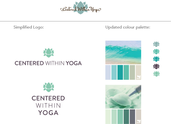
The logos both needed a more simplified treatment. For Centered Within Yoga, the client wanted to keep the lotus, but we opted for a san serif typeface that would be easier to read from the street view exterior of the building. Although we didn’t want the logos to be too matchy-matchy, we wanted them to family together a little better.

The updated logos and color palette(s):

CenteredWithin-branding

The logo treatment was a little trickier with Okinawan, as the yellow crest is a traditional martial arts crest and so to alter it too much would be disrespectful. We opted for a slightly simplified version of the crest (#4 below), and the red and white Okinawan flag for the main logomark.

Okinawan-logos-ideas

Here are the final logo treatments we went with, which we chose for their simplicity and optimum street visibility:

Okinawan-logo-final

CWY_logo_vertical

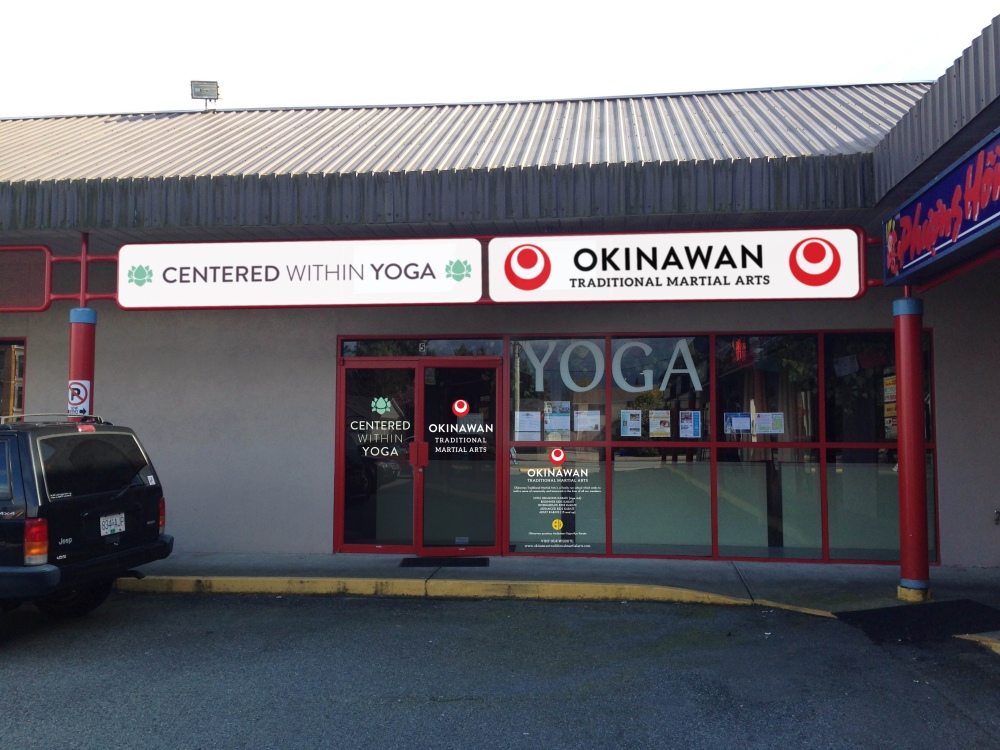
Back in March, I provided the client with a photoshop comp of what the exterior signage would look like after completion:

Shopfront-mockup-2

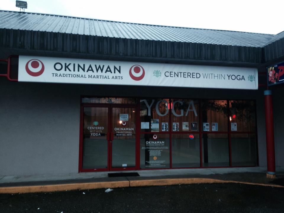
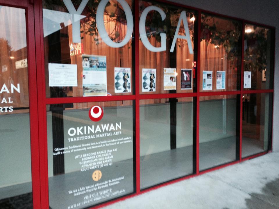
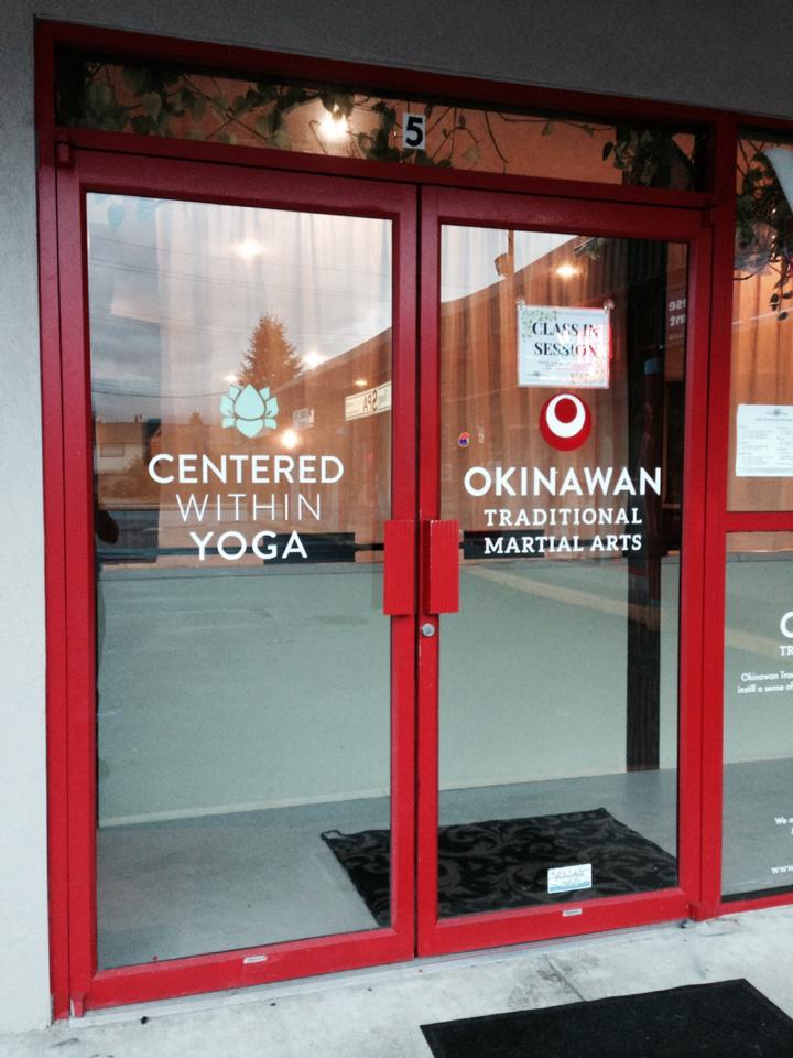
And this is the actual completed project!

10726378_10152362788691962_1671801689_n

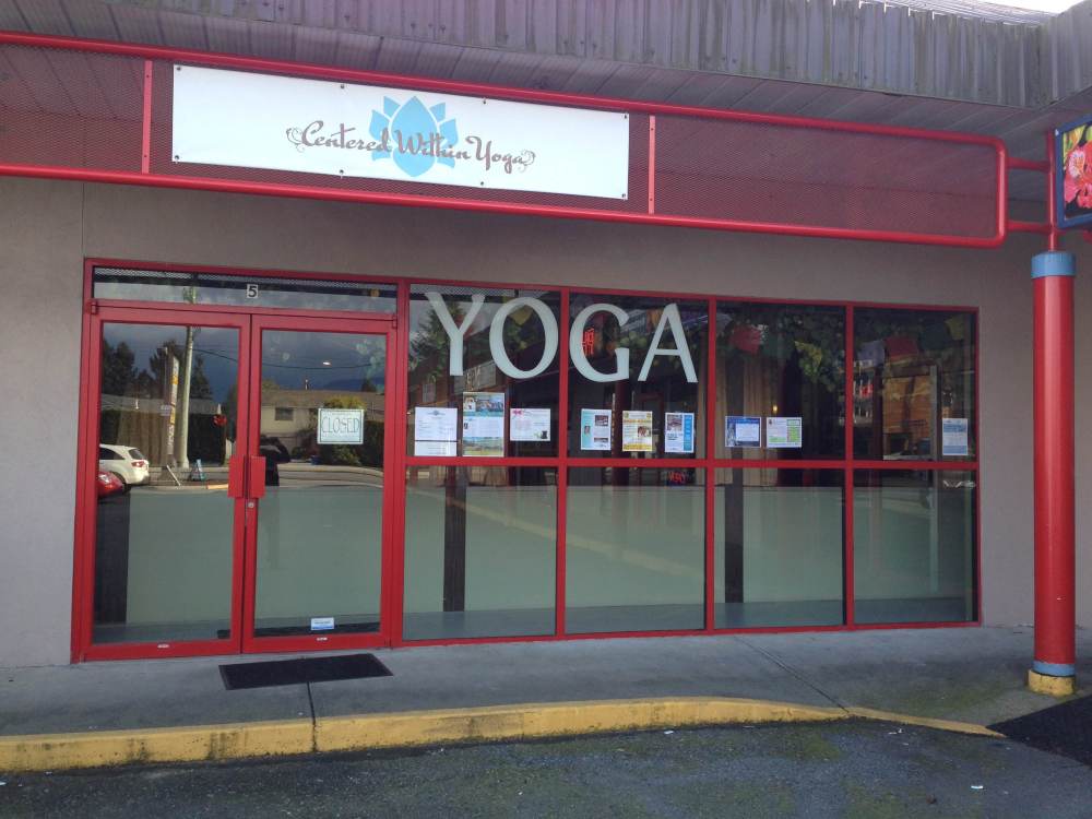
It’s really fun for me to look at the before and after.

photo2

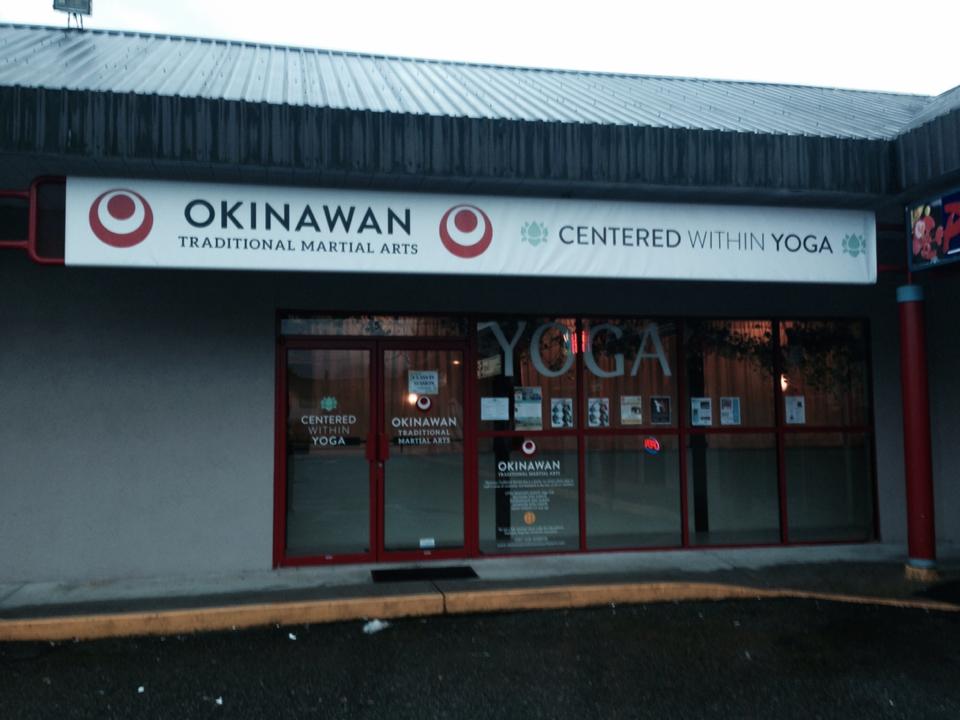
We branded the heck out of that storefront!

10728785_10152362788306962_509096302_n

10728916_10152362788546962_1424854468_n

10735714_10152362788486962_698388080_n

I’m particularly happy with how the decals on the doors and windows turned out.

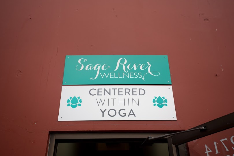
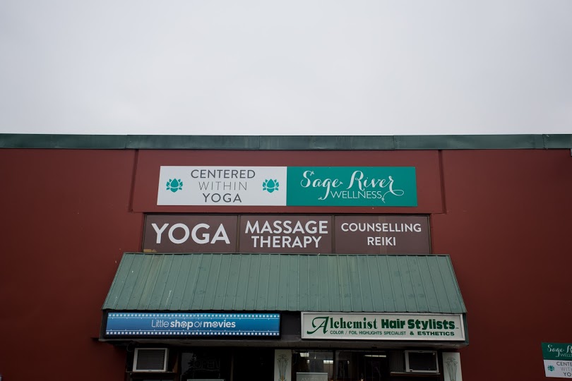
Then I did the signage for the second location. Although I can’t take credit for the Sage River Wellness logo, I did set up the signage for them (file set up, color palette and production), as well as the decals for the windows that say yoga, massage therapy, counselling and reiki.

0Y6A5019

0Y6A5016

0Y6A5005

This was a very fun project, as I love to see my designs out in the real physical world! I hope to work more with these clients going forward, on their promotional materials (mainly posters and flyers) and their business collateral. They were great people to work with!

This blog entry wouldn’t be complete without a big shout-out to Erik Ferguson, who not only helped me get this job, but acted as a terrific advocate for my creative ideas, and offered tons of second opinions and helpful feedback. Many thanks to you, Erik!!

Generational Health First – Logo revision

At the client’s request, I have completed a further iteration of the final logo, with some small structural changes:


ghf_logo-final


This will have to be all the work we do on the logo for now, as we will be focusing our full attention on building out the website. I have been uploading some content provided by the client and will continue to structure and style the site over winter break. For now, we have been working on the Home and About pages. I am happy with how the homepage is building out so far, but am having a couple of structural issues with the advanced custom fields for the About page. I suspect with a little help these issues will be easy enough to solve.

Styling a homepage from a theme is a big learning curve for me and continues to have its challenges. I knew this would be a challenge from the beginning, but progress has been slow.

Here’s a link to the homepage: leannepadgett.com/ghf


Generational Health First – week 6

Due to technical glitches with Hostgator over  the past week, progress has been slow on the coding side. I have re-started the GHF homepage several times, trying various themes and approaches. Due to hosting conflicts with required plugins, I am unable to continue coding the theme I have chosen, Pytheas, so I have decided to code the site from a subfolder on my personal domain and move it to the GHF site once it is completed. In the meantime, I will have to convince the client to move their domain to a host that will support this theme (I have installed and tested the theme and all required plugins on another host and it works perfectly there). Since my personal domain is in the midst of a transfer to Blue Host, all web coding is on hold but it seems likely it will be back up in a few days.

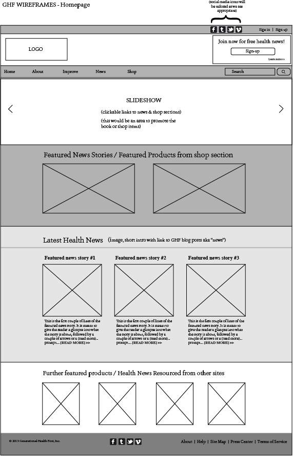
Originally, I had decided to take a more agile development approach and wireframe as I was coding. I felt that this would be better suited to illustrating to the client exactly what the site will look like. This pause in development has provided a nice opportunity to prepare some more detailed wireframes. This is the wireframe I have prepared for the homepage.

GHF-wireframes-HOME

As you can see, my wireframes are a pretty basic interpretation of the structural elements of the theme, but this was useful in determining how the client wants the content to be structured and for placement of specially requested items (eg. the client asked to have double-navigation — a second navigation bar at the uppermost portion of the screen, just above the logo).

Screen Shot 2013-10-29 at 8.01.10 PMScreen Shot 2013-10-29 at 8.01.25 PM

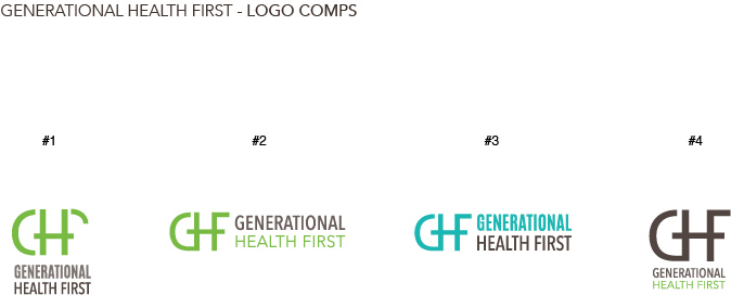
I shared some more refinements of the logo with the client last week. They liked #2 the best, which is the one I liked the best as well. I was instructed to further refine #2 and to provide final comps with more color and typographic approaches.

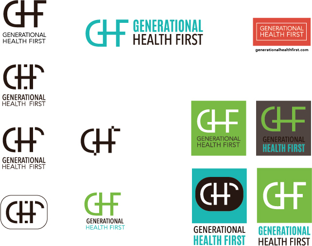
GHFlogos-comp

Aside from the domain hosting glitches, the project is on schedule. I am aiming to have the logo completed in the next week, and the basic framework of the site built for the end of the quarter. I predict that I will be refining the site into next quarter, which the client is okay with as they are still working on creating content.


Generational Health First – week 5

Last week, I installed Starkers and began to build the GHF homepage. Things were going pretty swell, albeit slow. But then, all of a sudden, Erik taught us about parent / child themes in interaction class, which blew my mind because I knew that this could potentially make building this site a lot easier.

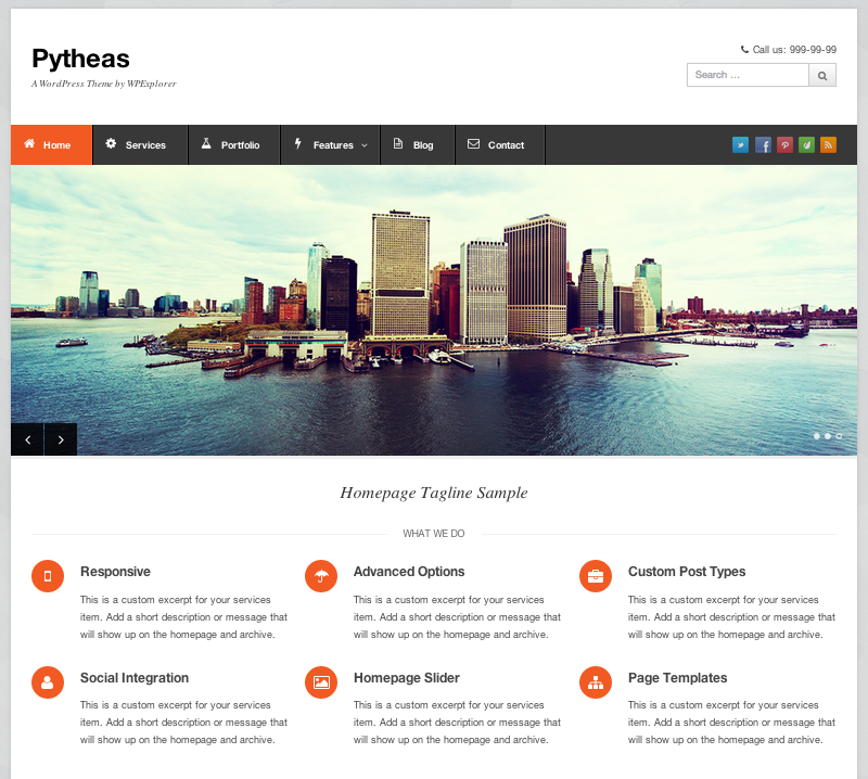
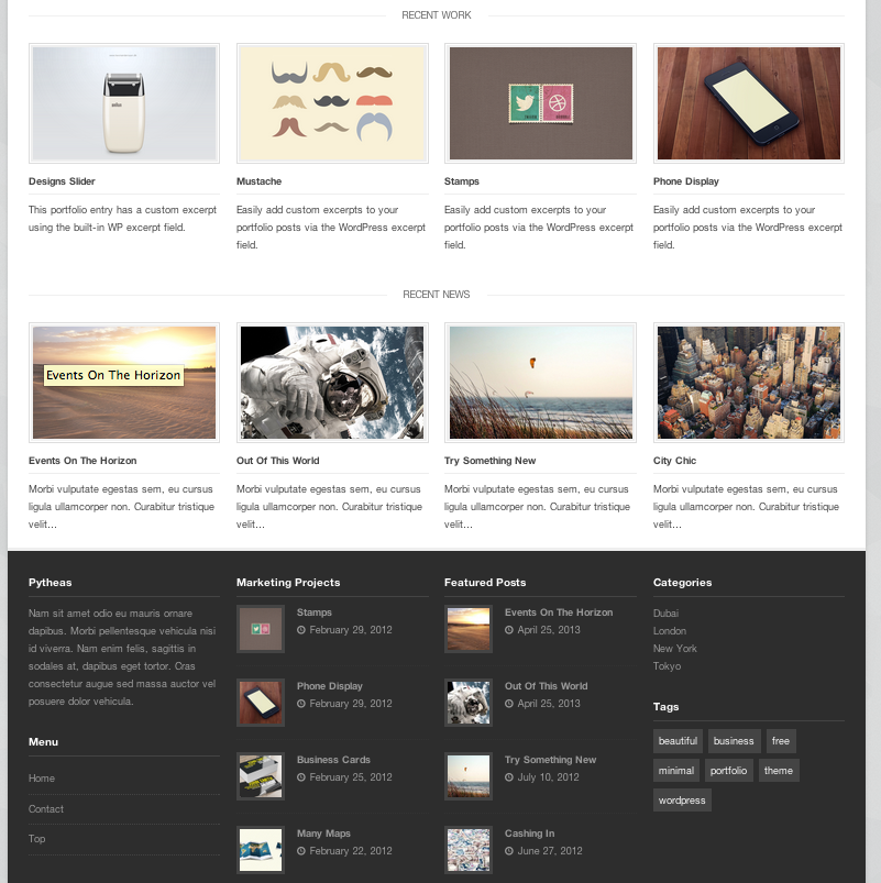
Since the onset of this project I have been a little concerned with keeping on schedule and being able to meet the fairly tight timeline I have created for myself. I know that I could build this website from scratch using Starkers, but I was not sure if I would be able to see it to completion by the end of the quarter. So, in an effort to keep this project on schedule, I have decided to use a customizable theme for the Generational Health First site. It took quite a bit of research but I think I have decided upon using Pytheas, which is responsive (of course) very customizable and already looks close to what the client said he is looking for. It looks organized and clean. Here are a couple of screen shots of Pytheas:

Screen Shot 2013-10-29 at 8.01.10 PM Screen Shot 2013-10-29 at 8.01.25 PM

After the client reviewed the logo iterations I sent, he indicated that he liked the look of the three letters all connected. Here are some further iterations of the logo.

GHFlogos2

I want the logo to express the layers of multi-generations and passing on of information from one generation to the next. I am sure a few more rounds of drafts are to come, before the logo is finalized.

I also opened an account with mailchimp last week, to aid with email newsletters that the client would like to distribute in the future.


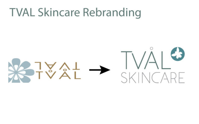
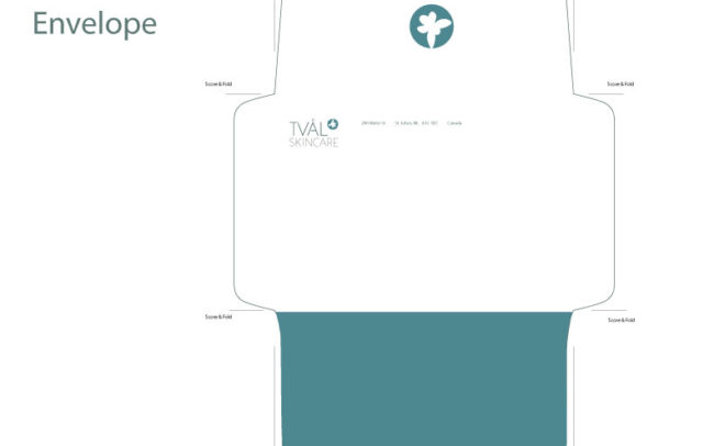
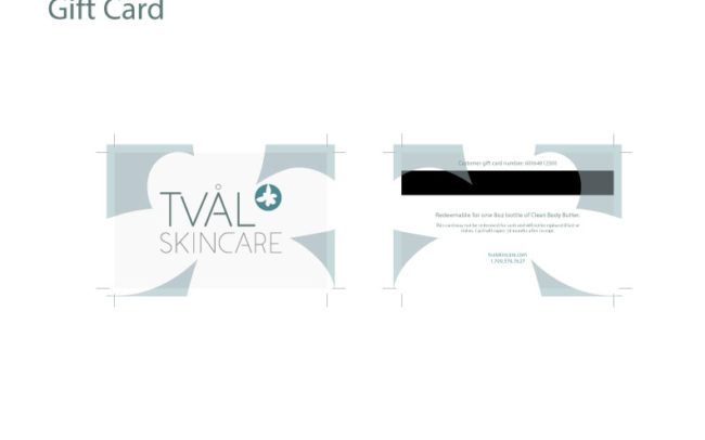
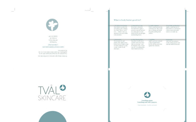
Tval Skincare Rebrand

Our project for the quarter for our typography class was to perform a rebrand for a real company.  We had our choice of four different companies.  I chose Tval Skincare, an online skincare distributor based out of St. John’s, Newfoundland, Canada.

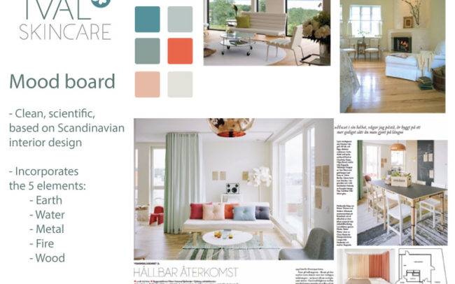
When I thought about St. John’s, Newfoundland, I thought of weather.  When the project was assigned, at the beginning of January, St. John’s had just been on the news for having “the storm of the century” — businesses and schools had been closed due to subzero temperatures and snow.  I was walking through the park on my way to my car after class, my umbrella buckling against the wind, battling a little Seattle version of an ice storm.  That got me thinking about protection from the elements.  After all, that’s what any skincare product’s primary function is: to protect you from the sun, UV rays, the wind, and the cold.  Then I thought — wait a second.  The owners and operators of the company, a husband and wife, both have PhDs in biology.  Then I thought of the periodic table of elements, and decided that my concept would be “Elements” as in, protection from the elements, as well as the periodic table, and the science behind the manufacturing their skincare products.

Logo

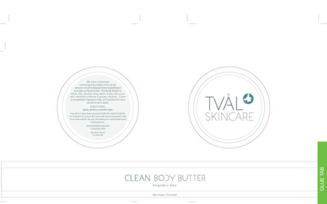
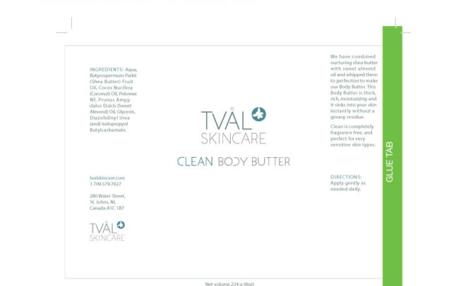
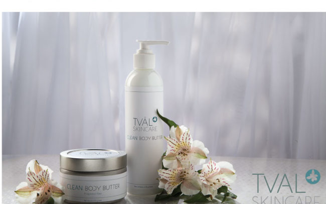
I made the custom typeface for the logo typeface and “Clean Body Butter” letters, and the “blossom” in the logo is a drawing I made of an atom, raised ‘to the power of’ the Tval Skincare name.  My mood board and concept incorporated the five elements: earth, water, metal, fire and wood.

A special thank you to Sean Balko, product photographer extraordinaire, for doing an amazing job of my promo photo.  I am still completely blown away with his finished product, not to mention his outstanding professionalism.  Even though he was doing me a tremendous favor, he treated this project with professionalism and integrity.  Thank you so much, Sean.  I owe you a big one!

Here are my slides from my final presentation.