Back when I was still in school, my friend Erik contacted me to ask if I could do a logo and some signage for a yoga studio (Centered Within Yoga) that also doubled as a karate dojo (Okinawan Traditional Martial Arts).
The reason this project sounded like so much fun is that the people who run the studio are so cool and happy, and they seemed to trust my creative ideas. This can make the hugest difference between a fun project and a not-so-fun one. So, I incorporated the project into a class at school so that I could get credit and also get paid at the same time, which I thought was pretty smart.
We have just finished the exterior signage for both storefronts (the project ended up growing a bit, and that is why it has taken a little longer to complete), and I thought I would share!
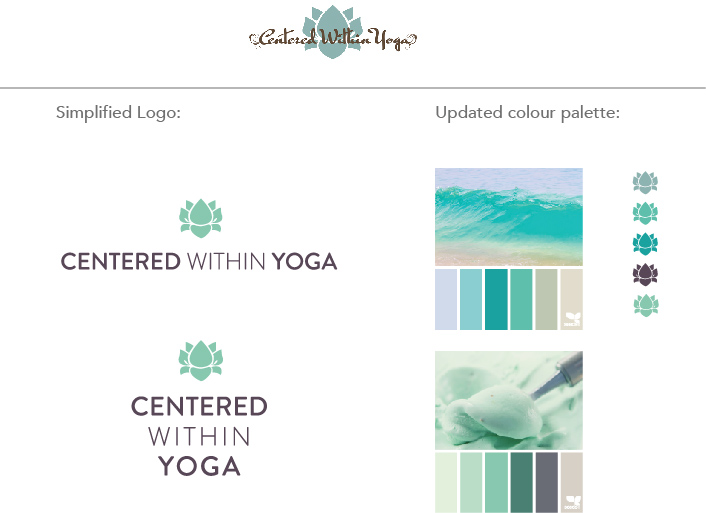
The logos both needed a more simplified treatment. For Centered Within Yoga, the client wanted to keep the lotus, but we opted for a san serif typeface that would be easier to read from the street view exterior of the building. Although we didn’t want the logos to be too matchy-matchy, we wanted them to family together a little better.
The updated logos and color palette(s):
The logo treatment was a little trickier with Okinawan, as the yellow crest is a traditional martial arts crest and so to alter it too much would be disrespectful. We opted for a slightly simplified version of the crest (#4 below), and the red and white Okinawan flag for the main logomark.

Here are the final logo treatments we went with, which we chose for their simplicity and optimum street visibility:
![]()
![]()
Back in March, I provided the client with a photoshop comp of what the exterior signage would look like after completion:
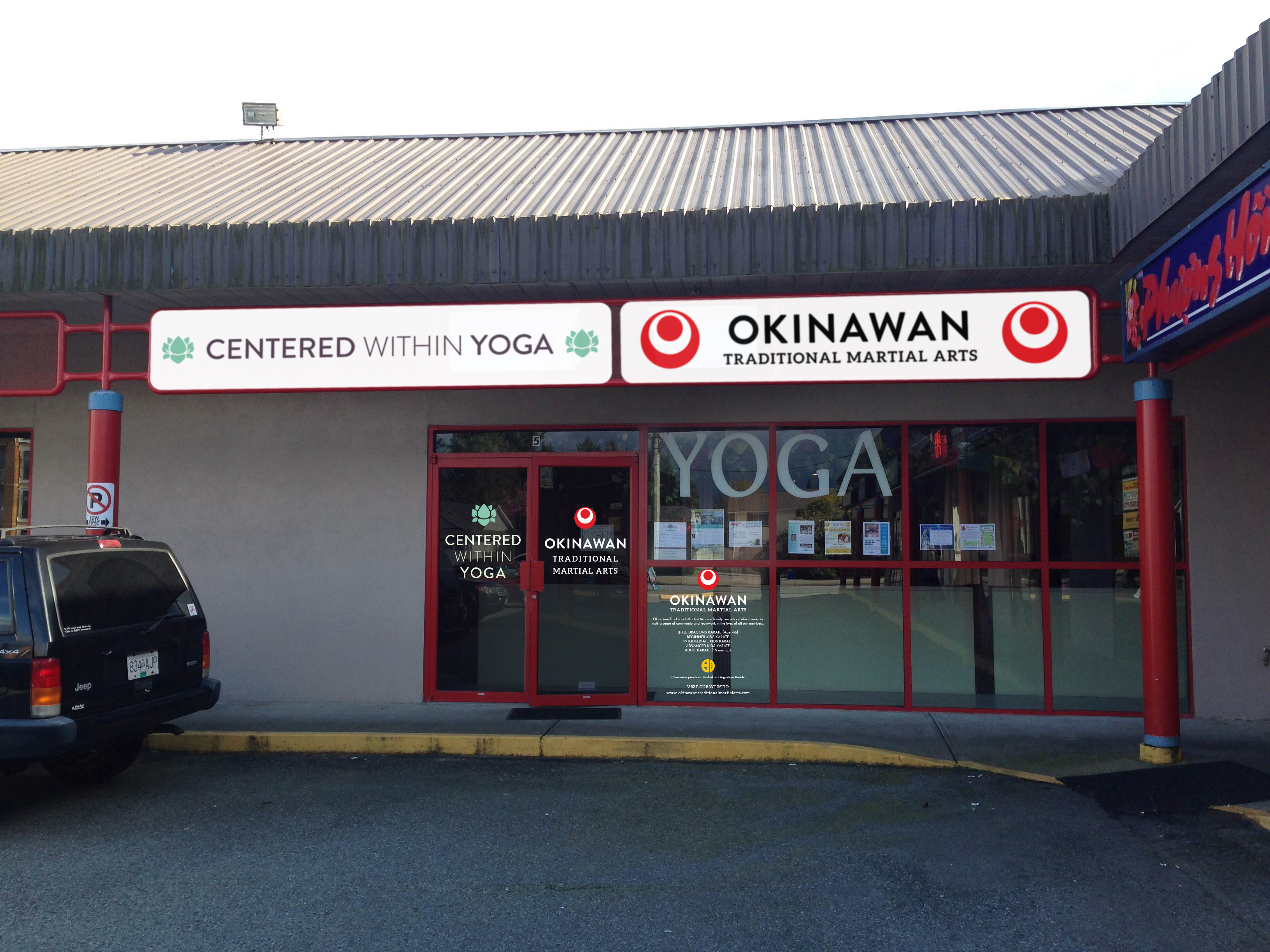
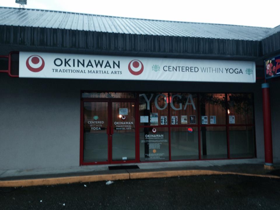
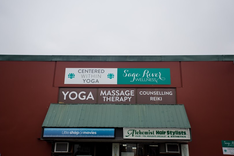
And this is the actual completed project!
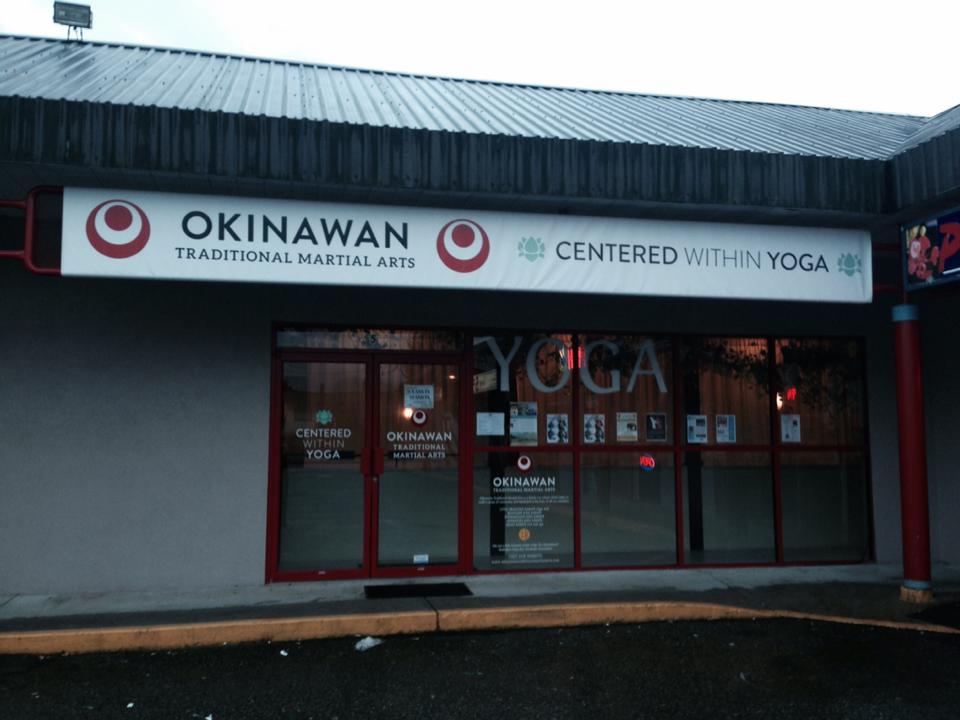
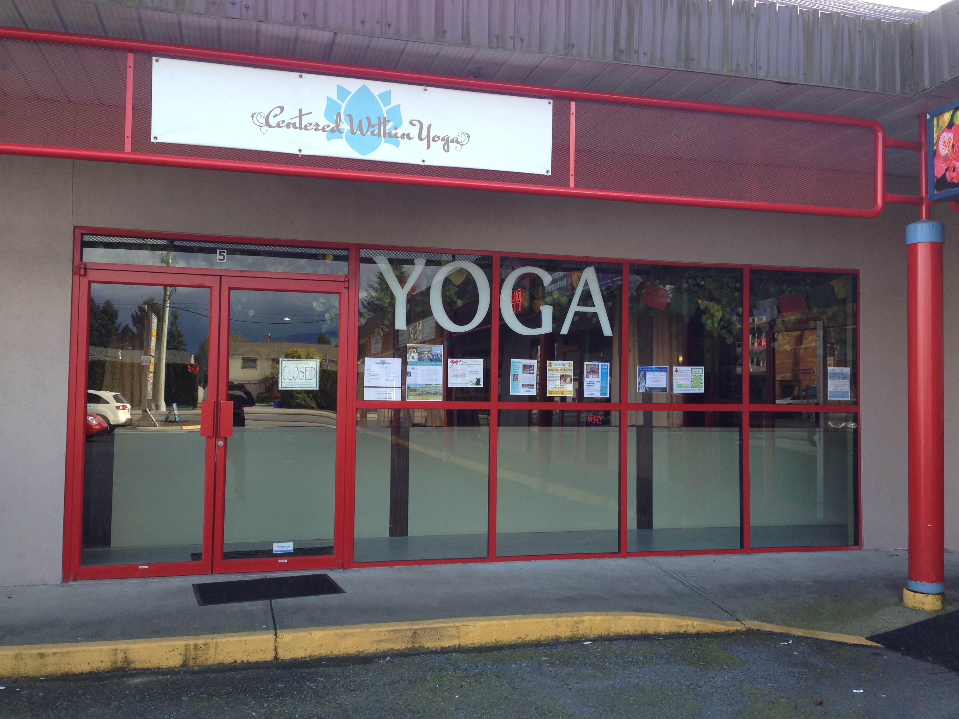
It’s really fun for me to look at the before and after.
We branded the heck out of that storefront!
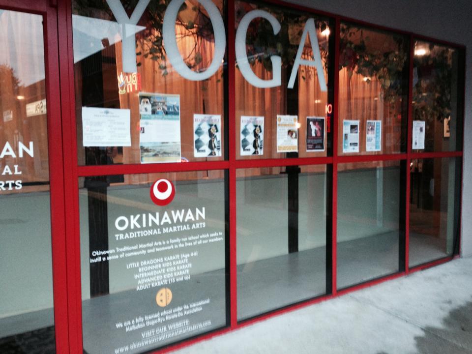
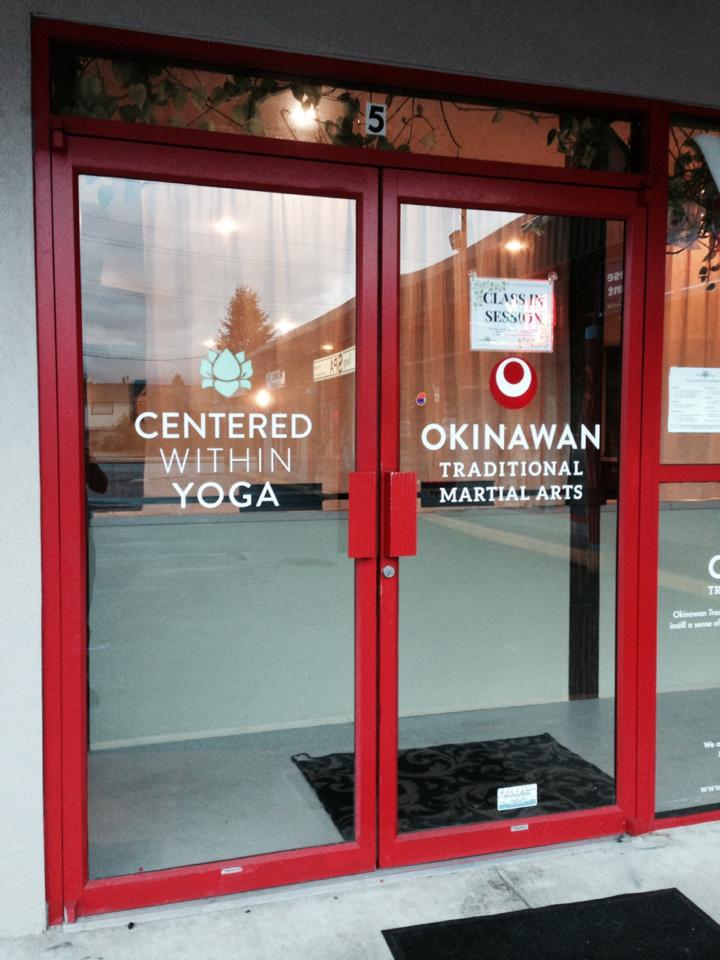
I’m particularly happy with how the decals on the doors and windows turned out.
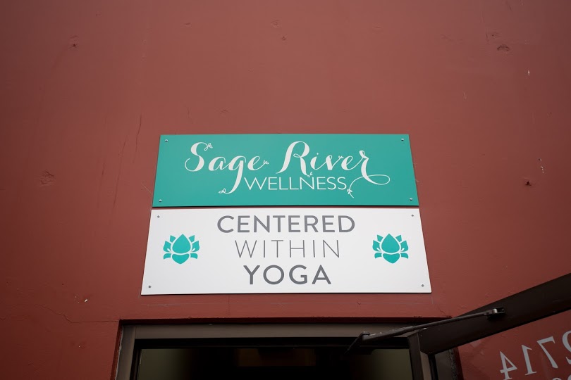
Then I did the signage for the second location. Although I can’t take credit for the Sage River Wellness logo, I did set up the signage for them (file set up, color palette and production), as well as the decals for the windows that say yoga, massage therapy, counselling and reiki.

This was a very fun project, as I love to see my designs out in the real physical world! I hope to work more with these clients going forward, on their promotional materials (mainly posters and flyers) and their business collateral. They were great people to work with!
This blog entry wouldn’t be complete without a big shout-out to Erik Ferguson, who not only helped me get this job, but acted as a terrific advocate for my creative ideas, and offered tons of second opinions and helpful feedback. Many thanks to you, Erik!!