AWESOME FOOD TRUCKS!!
Oh and also, here are some links to two totally awesome food trucks we found today, The Grillenium Falcon and Guactruck!
The Grillenium Falcon:


Oh and also, here are some links to two totally awesome food trucks we found today, The Grillenium Falcon and Guactruck!
The Grillenium Falcon:
As I mentioned last week, I am so excited to be designing my (imaginary) sandwich truck, and couldn’t be more thrilled that my colleague, Michelle Booth, has decided to team up with me to design the mobile app. Michelle has already been my unofficial creative advisor on this project since the beginning of this quarter and I already am over-the-moon appreciative of her keen eye for detail. (She argues with me about this regularly. And I tell her to shut up. This is becoming our routine.)
We have made quite a bit of progress in the past week. On the weekend, we got together and compiled and analyzed the data collected from our sandwich survey (thank every single one of you for participating! It made a big difference to the research process). Michelle designs and paints roller derby helmets on her very few off-hours, so we sat in her basement workshop and she painted glitter onto helmets while we figured out the nitty gritty of the menu. Then we jammed out a bunch of heavy braining on how the app ordering process would work, incorporating ideas on how the back end would respond and process orders. Then, we took a beer break, during which we decided upon having two windows: an order window and a pick-up window, and one cash register situated somewhere between them. We came up with a plan for how employees would prepare food and even where food stations would be located inside the limited space of the truck. If I have time, I am thinking about drawing up a floor plan of the truck as part of the truck design part. I feel like we covered a lot of ground. We even discussed what the sticker would look like that would label each order. Some visuals of that process are included in the slides below.
I am happy to have a team member who is as excited about these little details as I am. We had a couple of heated debates over meat and cheese pairings. It got intense!
Ever since last year, I had been looking for an excuse to get some more practice doing food photography. I really love it! I mean, it’s stressful because I’m always afraid I’m going to screw something up and waste food, and something weird always happens, but that’s sort of part of the fun. The funny part about this is, I remember when my packaging design teacher last year told me that I should take my own photos of pancakes for my River Hog Flapjacks box, I was so stressed about it. Doing my own photos seemed ridiculously difficult. And photos of food??? What did I know about that? I was totally expecting to screw it up, but the results actually turned out well and I really enjoyed it. So anyway, here we are almost a year later and I finally got to do it again! So, I am super proud to admit that the photos below of the BLT and the tomato basil soup were done by me (the iced tea shot, however, was not done by me. I found that one on the internet. But I felt like it matched the look and feel of what I have been trying to accomplish, so I included it). I am planning a second photo shoot this weekend and am very much looking forward to it.
The coming week will be all about further development of the app and the menu. We have task flows and wireframes for the app, and will keep working to flesh those out, and as always, lots of user testing. The hard copy menu will be finalized and styled this week as well. Here are some slides showing this week’s progress:


Big news for Annie’s Sammies today!! Michelle Booth has been officially added to the Annie’s staff, as we have decided to team up on the app design portion of this rebrand, which I am stoked about.
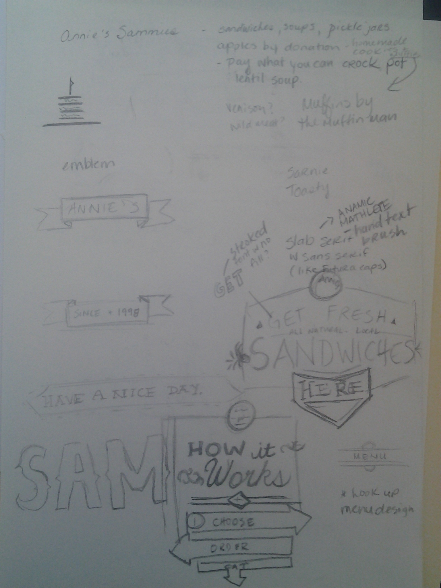
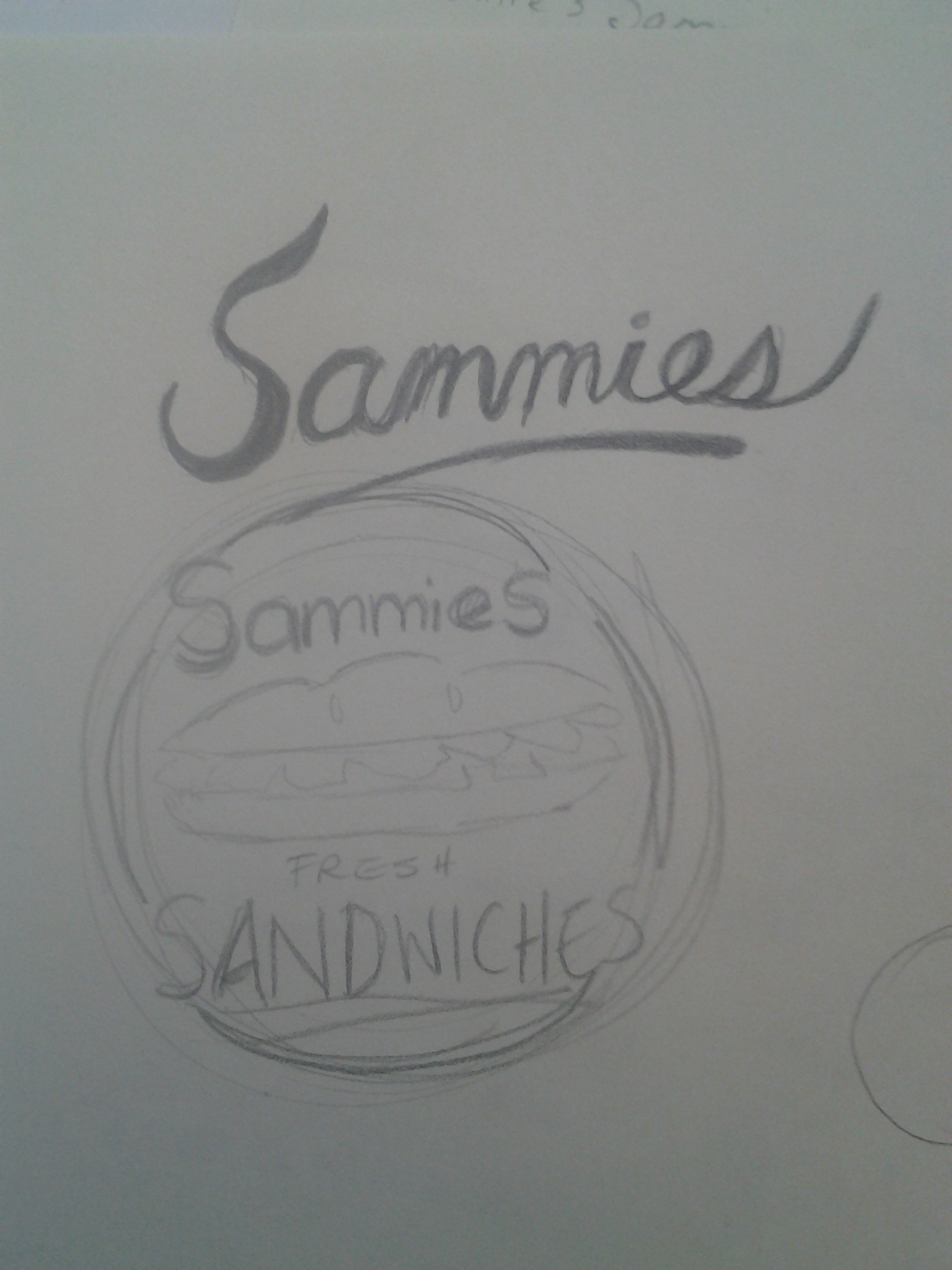
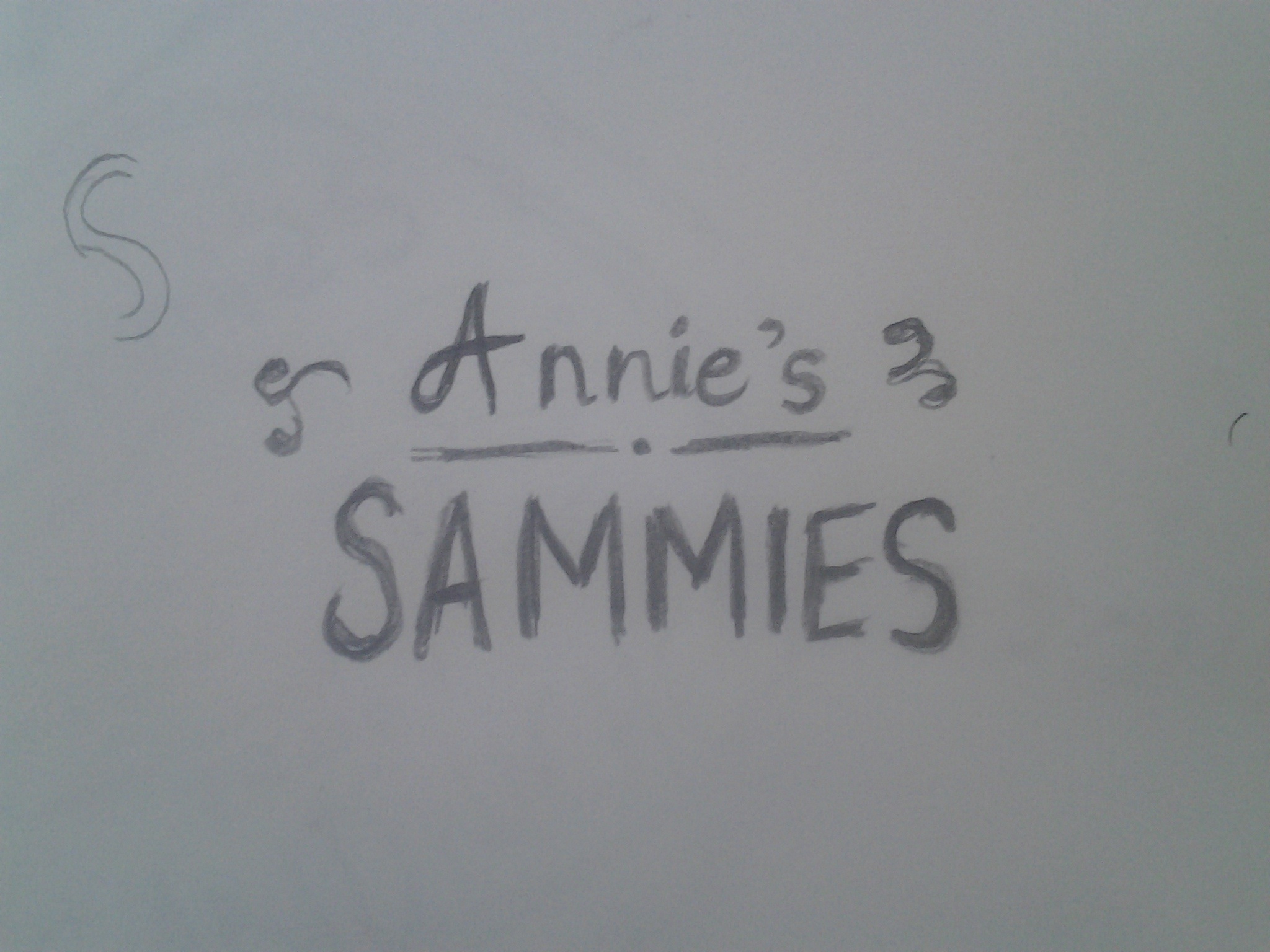
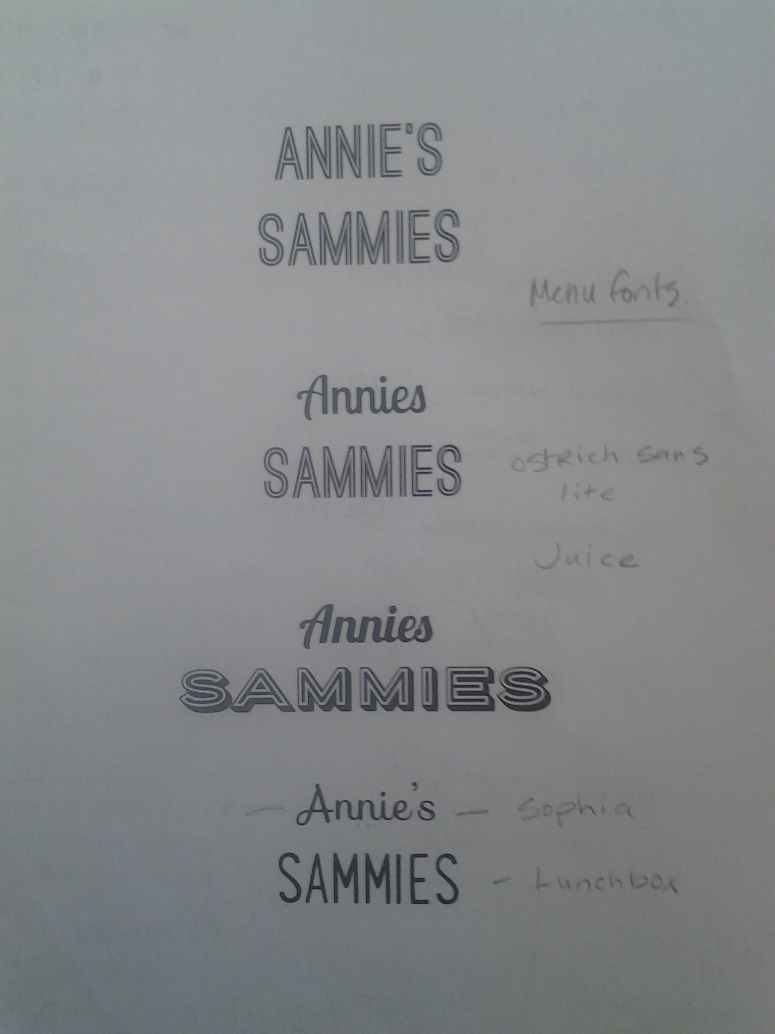
Logo is almost ready… just working on some illustrative elements. Based on my research, I decided to take a typographic approach. I feel like the logo still needs work, but will develop over the course of the project. Here are some sketches:
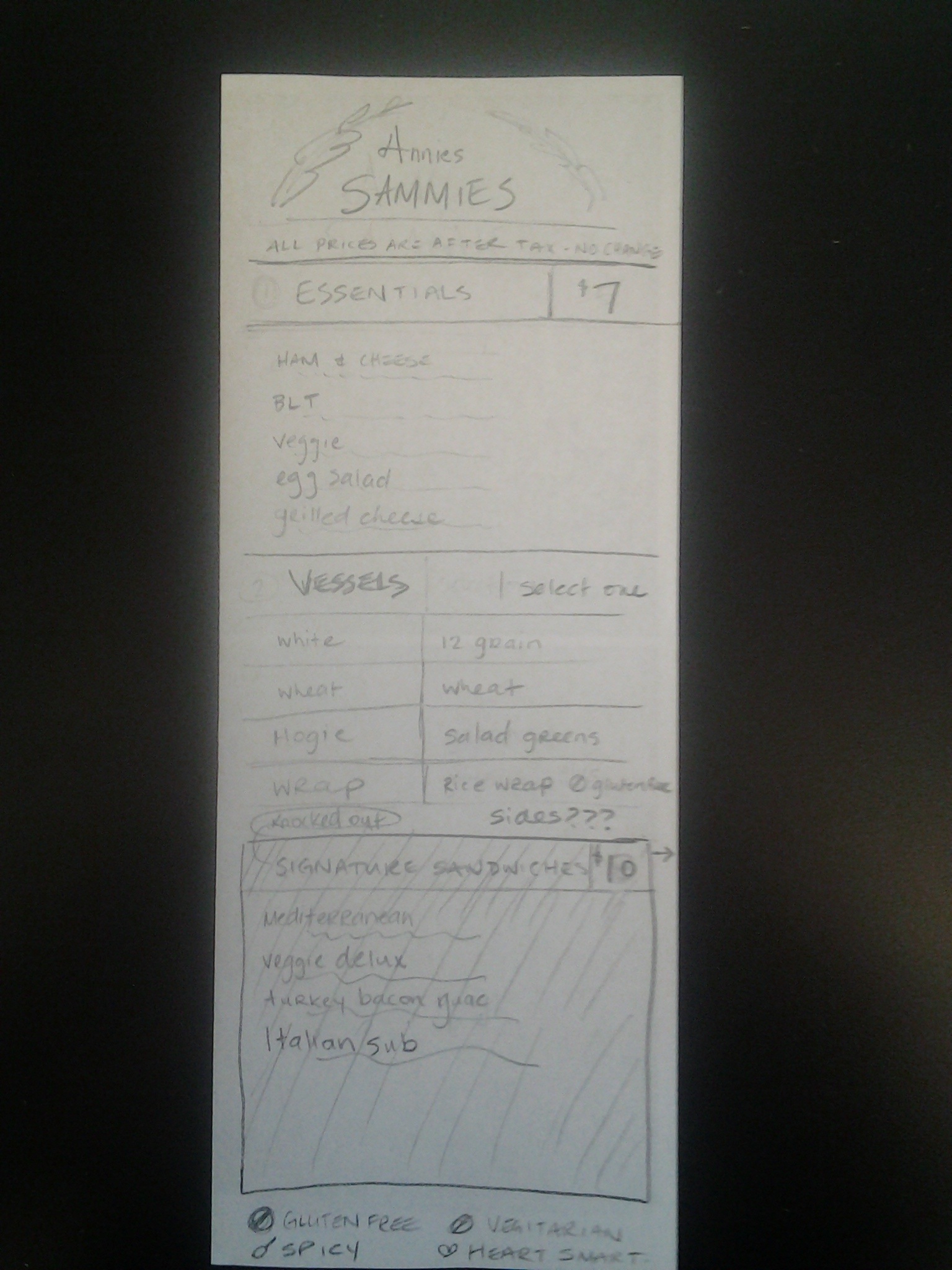
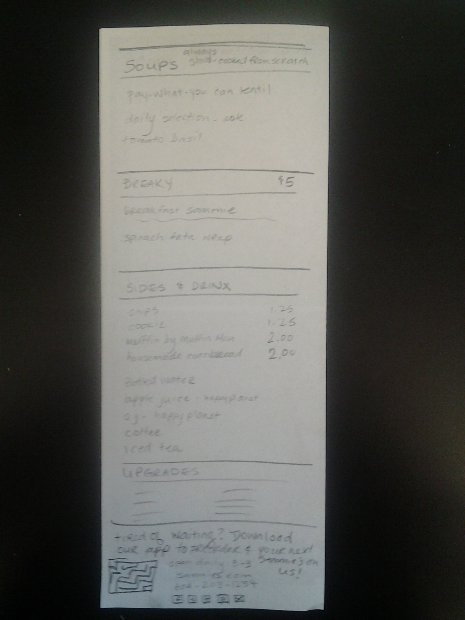
As for the menu, I have never designed a menu before, so it was a fun challenge for me. I have the dimensions and most of the basic elements figured out and sketched. The menu will be 4.25 X 11 double-sided, so printing will be at a standard size. (The app will feature an abridged version of the print menu with breakfast & lunch “combos”).
Here’s an earlier sketch:
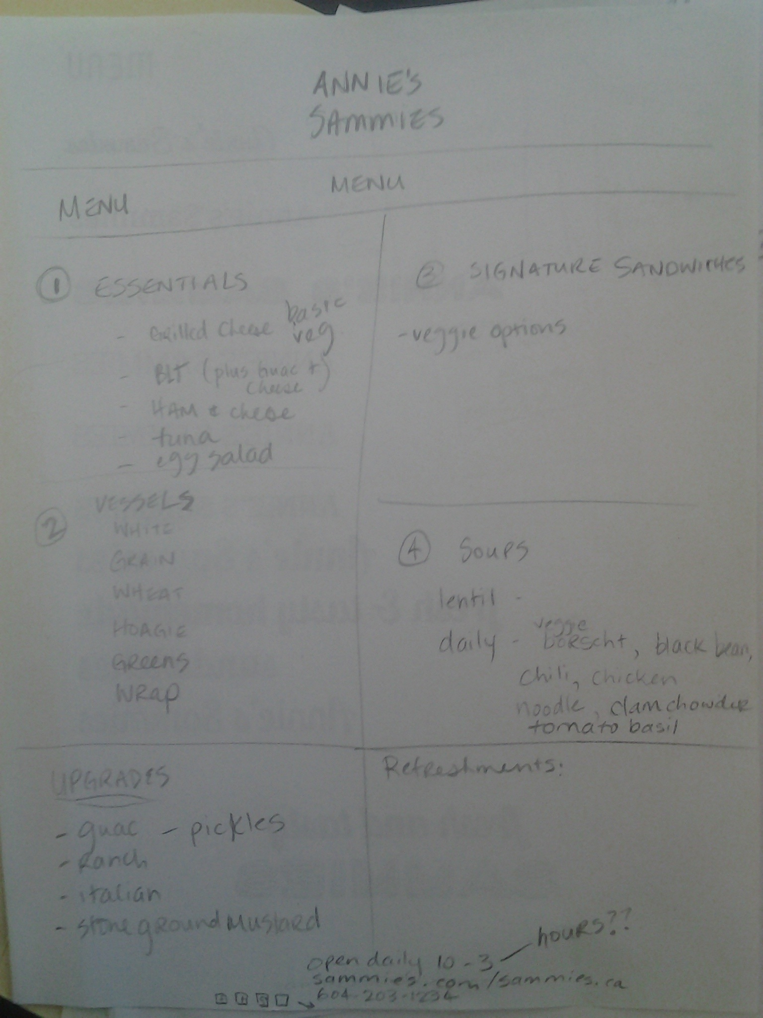
And a more refined sketch of the menu plan (this sort of reminded me of doing a wireframe for a menu!):
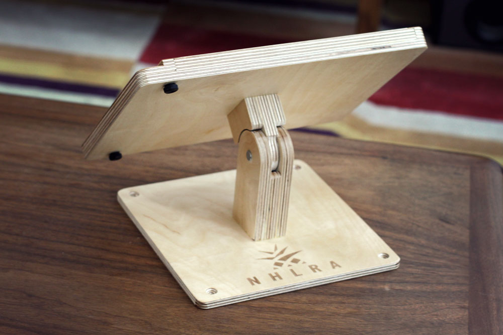
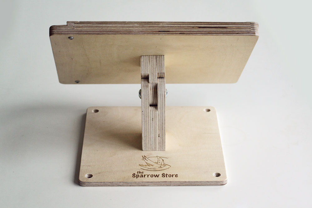
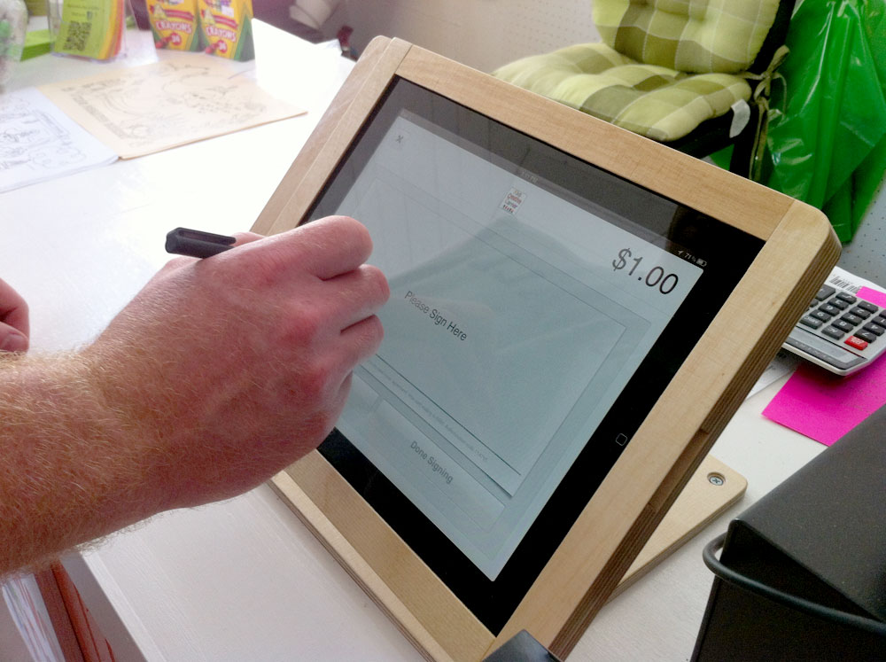
The P.O.S. system will be run from a tablet which will fit into a wooden stand that will be manufactured by Tinkering Monkey. Photos below.
Payment options:
– Square Wallet App – 2.75% of all purchases – in-app payment is encouraged, but the following options are also available:
– Cash (all prices are after tax, so all round numbers. No change.)
– Credit & Debit
Tinkering Monkey P.O.S.
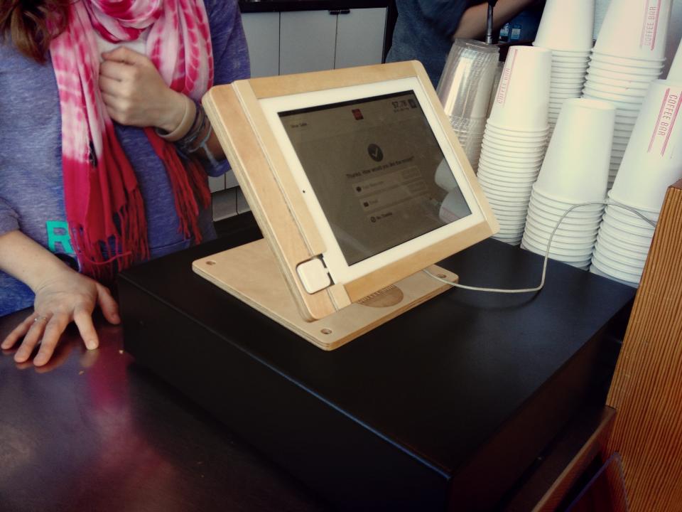
Square Wallet App
– dongle attached to an IOS or Android tablet
– App will alert workers when the customer is near and when they should start preparing their food.
Product photography will commence this weekend.
That’s all for now! I am super stoked about this assignment!
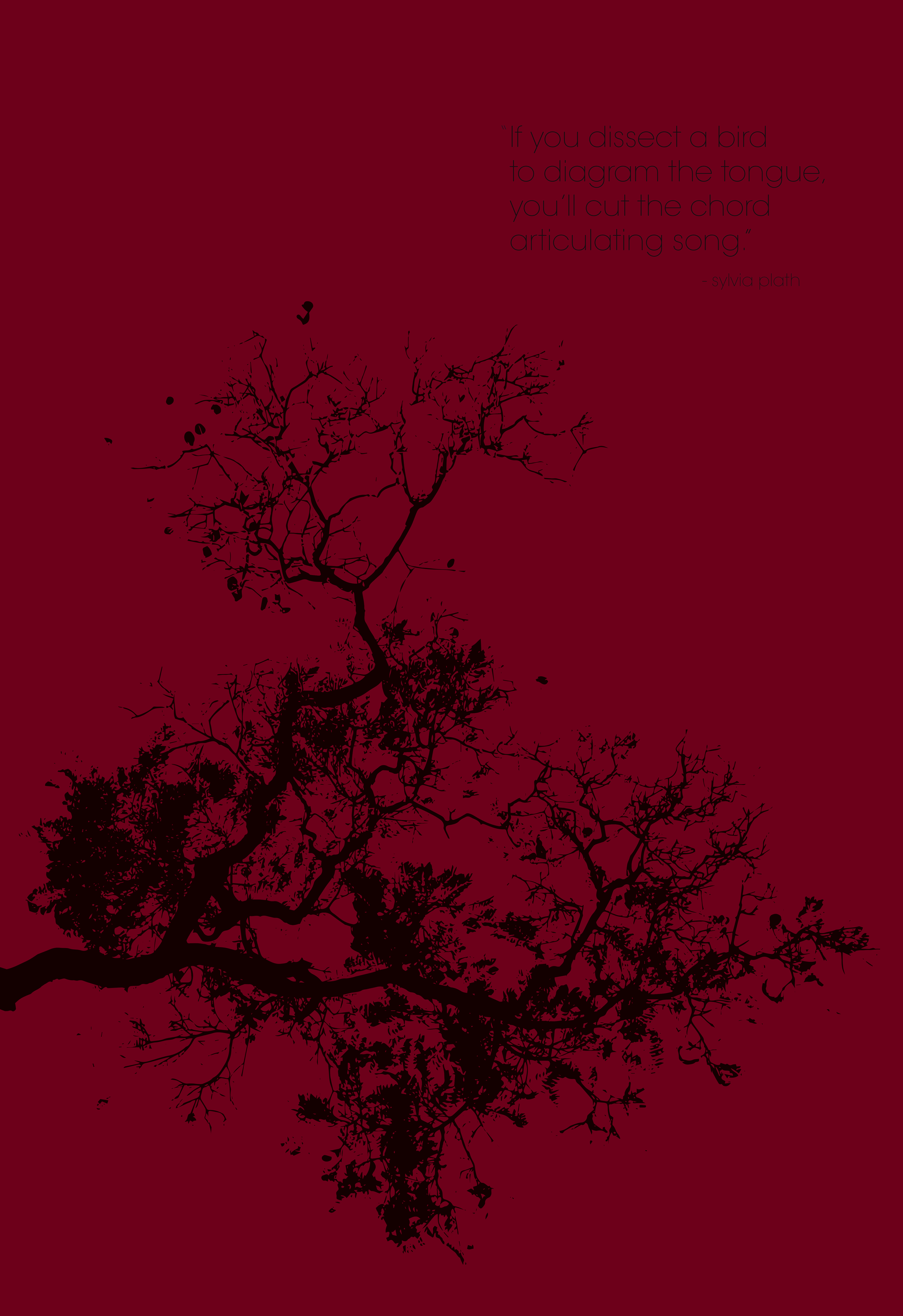
We had an open poster assignment over the winter break and I tried so many different ideas but I felt they all looked weird / failed in some way. This is one of the ideas I came up with. I love Sylvia Plath, and was excited to do something to honor her writing. In the meantime, I will keep working on those other posters and see what I come up with!
Last Wednesday, we were given the following (terrific) design exercise. Give it a shot, it was a lot of fun!!
Today’s Graphic Design Exercise by Alex Griendling
It really is quite genius.
He says “I do these as experiments, and use the below formula. It doesn’t matter if the finished design is any good or not, only that I’m challenging myself to think on the fly, and develop an interesting solution to the problem presented.”
Here are the rules:
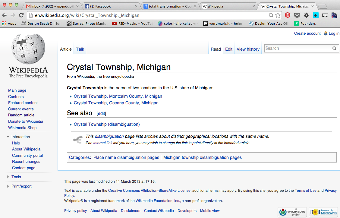
1 – Go to “wikipedia.” Hit “random” or click
en.wikipedia.org/wiki/Special:Random
The first random wikipedia article you get is the name of your band.
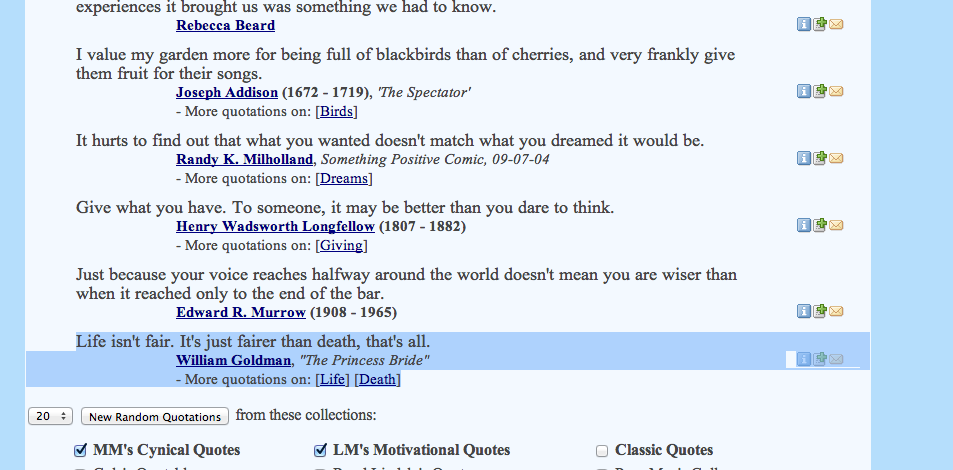
2 – Go to “Random quotations” or click
www.quotationspage.com/random.php3
The last four or five words of the very last quote of the page is the title of your first album.
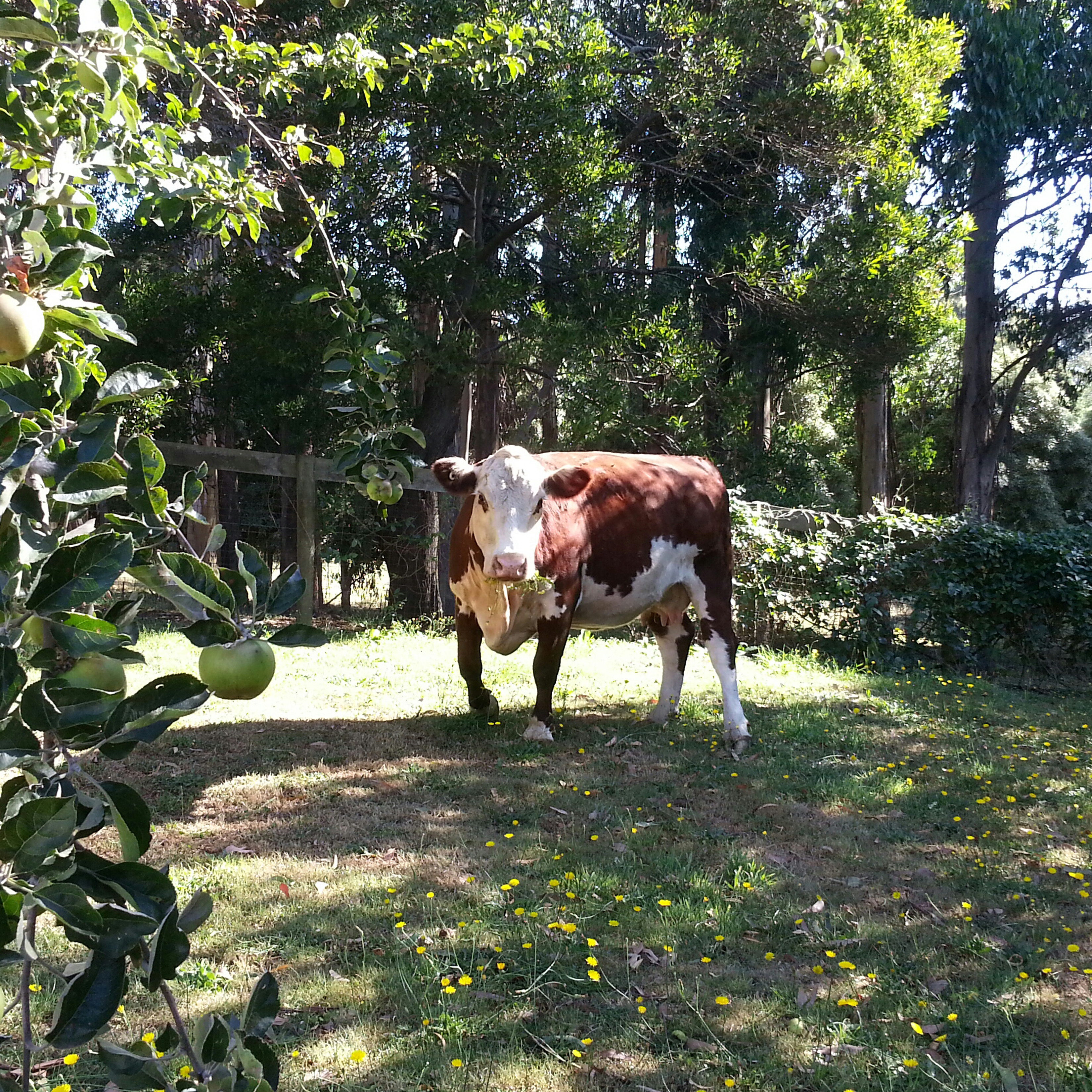
3 – Go to flickr and click on “explore the last seven days” or click
www.flickr.com/explore/interesting/7days
Third picture, no matter what it is, will be your album cover.
4 – Use photoshop or similar to put it all together. Your finished piece should be 11″ X 11″ trimmed and put on the white board.
You have one hour…..ready, set, GO.
*****
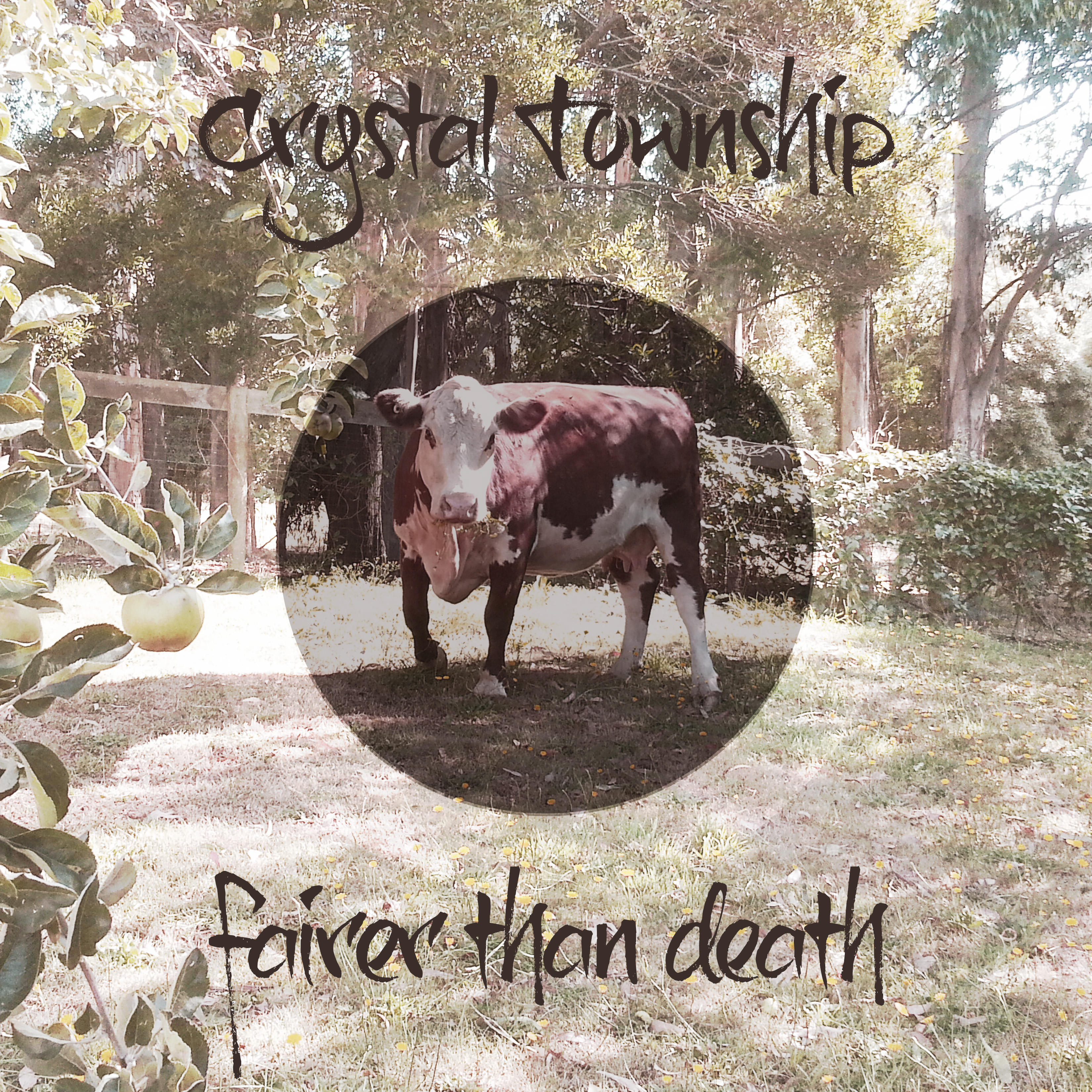
My random article was about Crystal Township, Michigan, and my random quotation was
“Life isn’t fair. It’s just fairer than death, that’s all.”
from the Princess Bride.
For the picture, I chose a photo of a cow from flickr.
And here’s my album cover! It was so much fun to make!
As you may already know, I love sandwiches. I also love cooking for people. Making people sandwiches is one of my favorite things. In fact, now that I am poor again, I have been using my sandwiches as a form of currency in the past few months, and I am not ashamed to admit that I have grown a sort of cult-following of sandwich appreciators (I have at least two major fans, or perhaps even more than two).
So, for winter quarter of Special Topics I have decided to do some more branding. SANDWICH BRANDING!! My favorite kind of branding!! I am going to create a brand for a (pretend) sandwich truck that sells breakfast and lunch sandwiches, homemade soups and possibly some dessert items such as cookies and muffins. To be honest, this is a project that has been taking up real-estate in my imagination for quite some time now. PLUS, this project will tie-in nicely with my upcoming app assignment, where I will develop an app that you can use to pre-order lunches, among a few other things… stay tuned for that part.
My experience with food trucks at lunch time in Vancouver is that I spend most of my break standing in a lineup. The app will allow customers to order their lunches in advance, avoiding long lineup and will streamline the order process. In my research I have not found any food trucks in Vancouver that are currently doing preorders by app.
Here’s the first draft of the mood board / style tile for Annie’s Sammies (name subject to change):
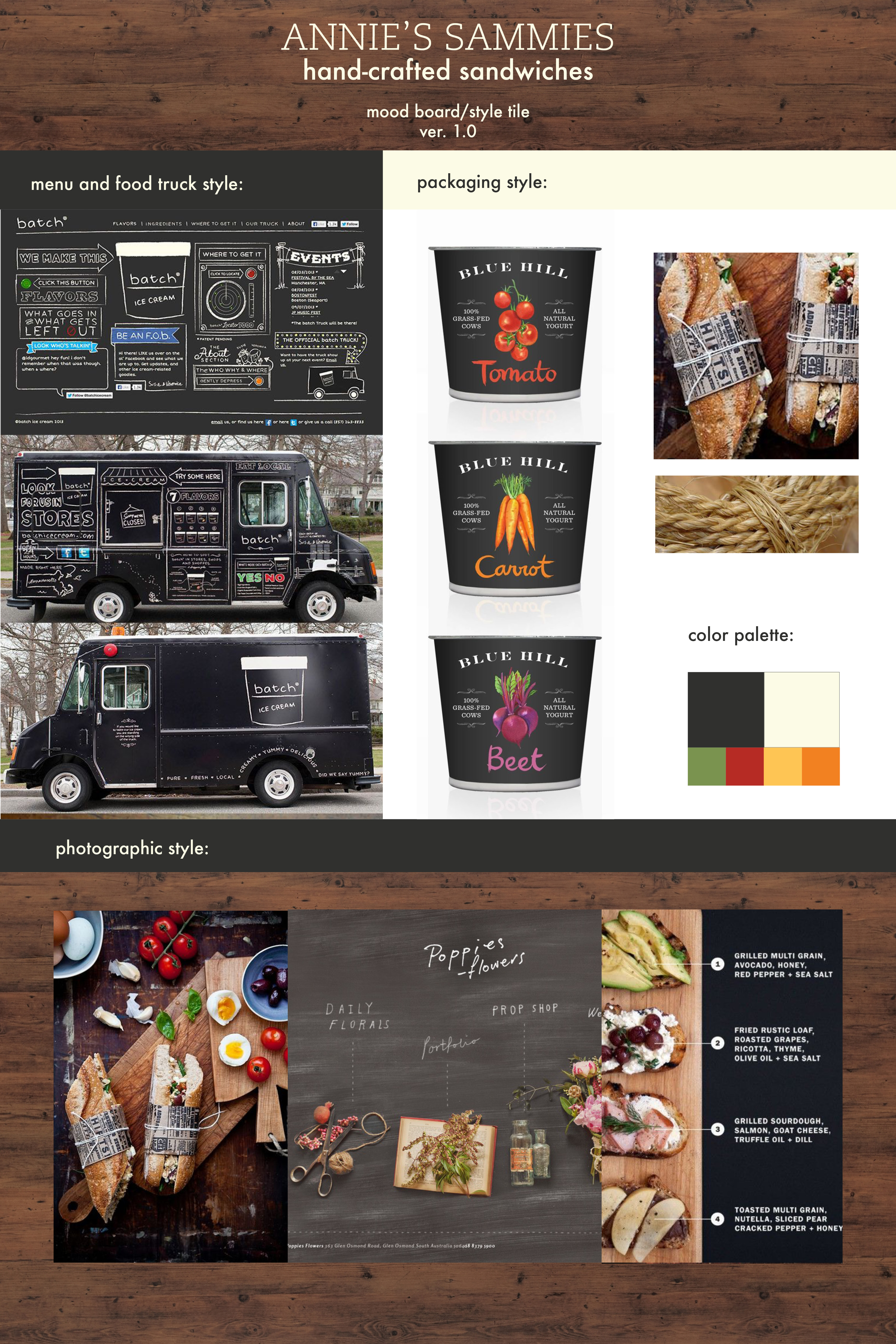
These style tiles usually go through a series of iterations before I settle on my look and feel for a project, but this gives you an idea of what I sort of want it to look like.
I have written some sample copy for this as well.
Some sample copywriting to further indicate client’s style & positioning:
Not your mother’s sandwich shop. But pretty close.
At Annie’s Sammies, we aren’t gonna pick up your dirty socks. We aren’t gonna clean your room, or do your dishes, either. What we will do is make you a good sandwich. Are you hungry? Good. Let’s eat.
I’m sure your mom would agree that you screw around too much. Don’t get any further behind. Get your food and get on with your day. Your mom will thank you for it.
Made from scratch sandwiches, crock pot soups, and other warm stuff to keep you going.
What I am aiming to accomplish this quarter:
– logo design
– signage / food truck design
– menus
– sandwich packaging & possibly napkins
– soup containers
– paper bags
– app (for Web class)
At the client’s request, I have completed a further iteration of the final logo, with some small structural changes:
![]()
This will have to be all the work we do on the logo for now, as we will be focusing our full attention on building out the website. I have been uploading some content provided by the client and will continue to structure and style the site over winter break. For now, we have been working on the Home and About pages. I am happy with how the homepage is building out so far, but am having a couple of structural issues with the advanced custom fields for the About page. I suspect with a little help these issues will be easy enough to solve.
Styling a homepage from a theme is a big learning curve for me and continues to have its challenges. I knew this would be a challenge from the beginning, but progress has been slow.
Here’s a link to the homepage: leannepadgett.com/ghf
Due to technical glitches with Hostgator over the past week, progress has been slow on the coding side. I have re-started the GHF homepage several times, trying various themes and approaches. Due to hosting conflicts with required plugins, I am unable to continue coding the theme I have chosen, Pytheas, so I have decided to code the site from a subfolder on my personal domain and move it to the GHF site once it is completed. In the meantime, I will have to convince the client to move their domain to a host that will support this theme (I have installed and tested the theme and all required plugins on another host and it works perfectly there). Since my personal domain is in the midst of a transfer to Blue Host, all web coding is on hold but it seems likely it will be back up in a few days.
Originally, I had decided to take a more agile development approach and wireframe as I was coding. I felt that this would be better suited to illustrating to the client exactly what the site will look like. This pause in development has provided a nice opportunity to prepare some more detailed wireframes. This is the wireframe I have prepared for the homepage.
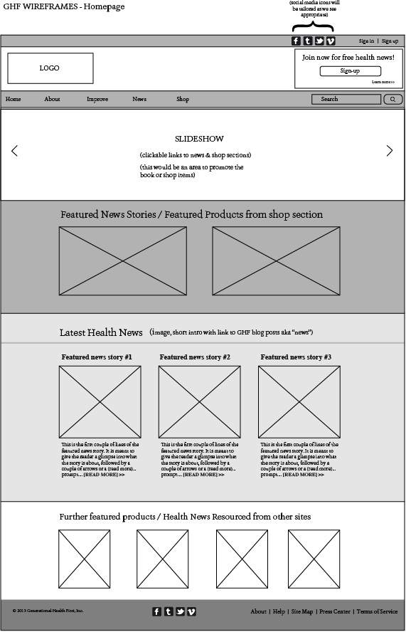
As you can see, my wireframes are a pretty basic interpretation of the structural elements of the theme, but this was useful in determining how the client wants the content to be structured and for placement of specially requested items (eg. the client asked to have double-navigation — a second navigation bar at the uppermost portion of the screen, just above the logo).
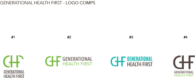
I shared some more refinements of the logo with the client last week. They liked #2 the best, which is the one I liked the best as well. I was instructed to further refine #2 and to provide final comps with more color and typographic approaches.
Aside from the domain hosting glitches, the project is on schedule. I am aiming to have the logo completed in the next week, and the basic framework of the site built for the end of the quarter. I predict that I will be refining the site into next quarter, which the client is okay with as they are still working on creating content.
Last week, I installed Starkers and began to build the GHF homepage. Things were going pretty swell, albeit slow. But then, all of a sudden, Erik taught us about parent / child themes in interaction class, which blew my mind because I knew that this could potentially make building this site a lot easier.
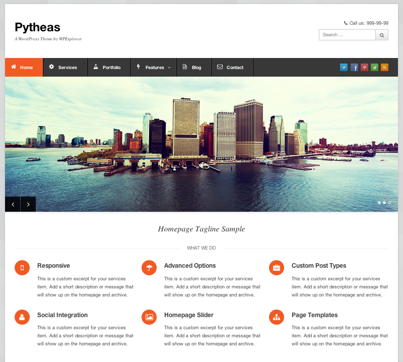
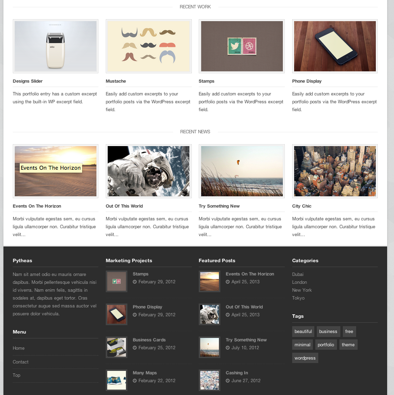
Since the onset of this project I have been a little concerned with keeping on schedule and being able to meet the fairly tight timeline I have created for myself. I know that I could build this website from scratch using Starkers, but I was not sure if I would be able to see it to completion by the end of the quarter. So, in an effort to keep this project on schedule, I have decided to use a customizable theme for the Generational Health First site. It took quite a bit of research but I think I have decided upon using Pytheas, which is responsive (of course) very customizable and already looks close to what the client said he is looking for. It looks organized and clean. Here are a couple of screen shots of Pytheas:
After the client reviewed the logo iterations I sent, he indicated that he liked the look of the three letters all connected. Here are some further iterations of the logo.
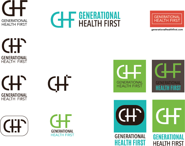
I want the logo to express the layers of multi-generations and passing on of information from one generation to the next. I am sure a few more rounds of drafts are to come, before the logo is finalized.
I also opened an account with mailchimp last week, to aid with email newsletters that the client would like to distribute in the future.
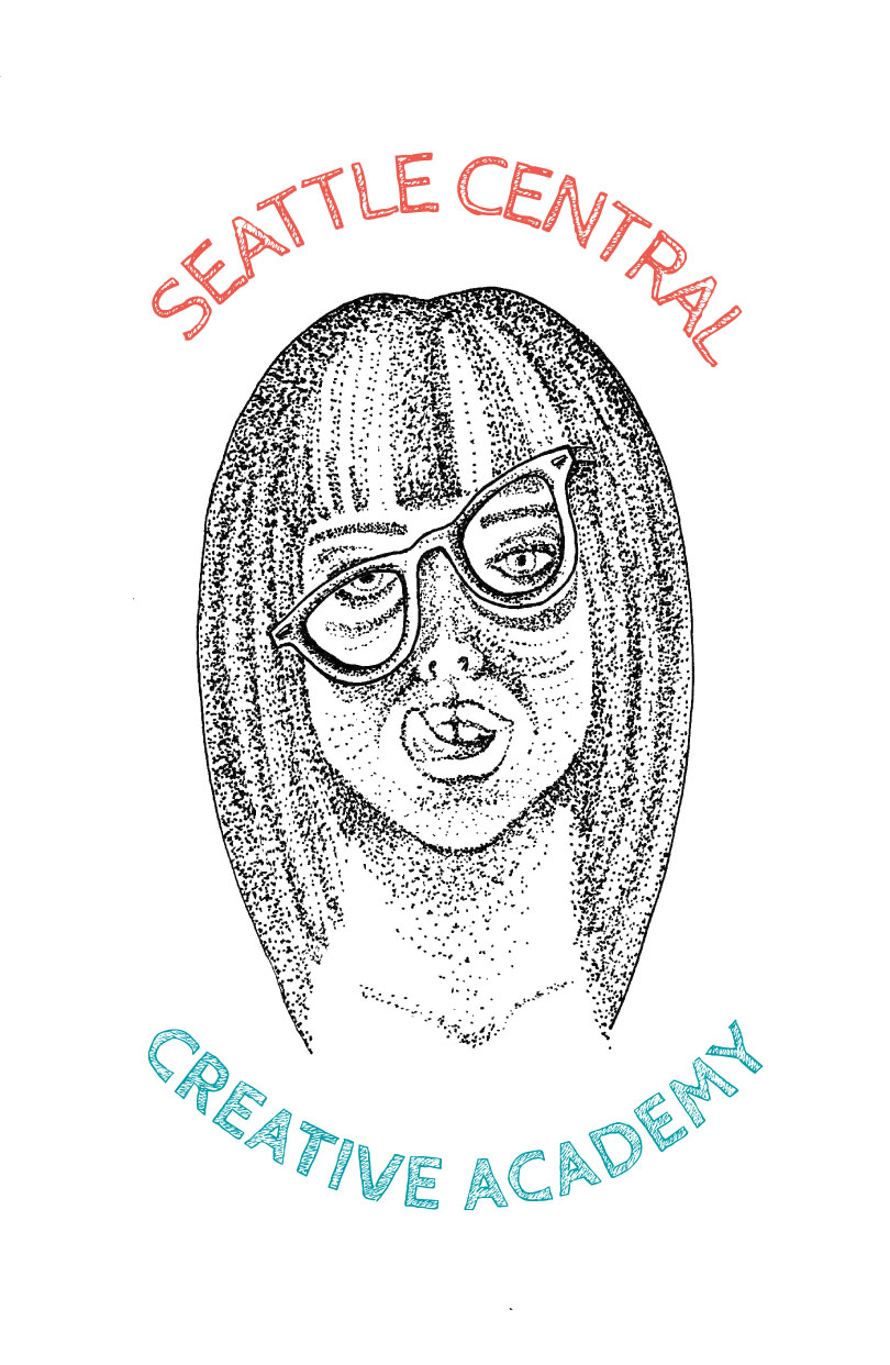
This is a design I made for a contest to design a shirt for our program. Immediately as soon as this project was due, I got sick with a terrible cold. In my delirious state, I had a detailed dream wherein I won the contest. In real life, once the fever cleared, I did not win. Oh well, at least I am rich in spirit and my mom thinks I’m cool.