Do The Thing

I’ve been working hard on some really exciting projects this year and I am so freaking stoked to finally share some stuff with you.

First off, there never seems to be enough time to update my online design portfolio, keep my blog current and self-promote. The end result is that even the closest people in my life don’t really know what I’m up to. Don’t get me wrong, it’s a good problem to have! I’ve been so busy with freelance jobs from word of mouth alone, as well as with my day job as a Graphic Designer at Expedia, that I haven’t really had a chance to stop and breathe. But I’ve promised myself that I would try to make this more of a priority. Try.

Earlier this year, I pulled my portfolio website down (www.leannepadgett.com) and rebuilt it. It was time for a facelift. I made me a logo. Thanks to my fabulous and talented photog friend Erik Ferguson, I got some new photos taken. I decided it was time to get serious about this freelance business I’ve been running off the corner of my desk for the past few years.

A few months ago a colleague, Jill Binder, approached me with an idea for a productivity web app that she wanted me to design. She’s a developer so it was already wireframed, but in multiple iterations. She wanted my help with illustration, look & feel, and helping organize the iterations into one unified set of skins. Working with Jill was a genuine pleasure. Working with a developer who knows the biz makes a big difference on a project like this. She’s also a freelancer so she understands the roadblocks and challenges of balancing freelance and life. She was very patient with me, but gave me the little pokes when I needed them and helped me stay on track. I feel like I have grown and developed a lot over the course of this project and this year.

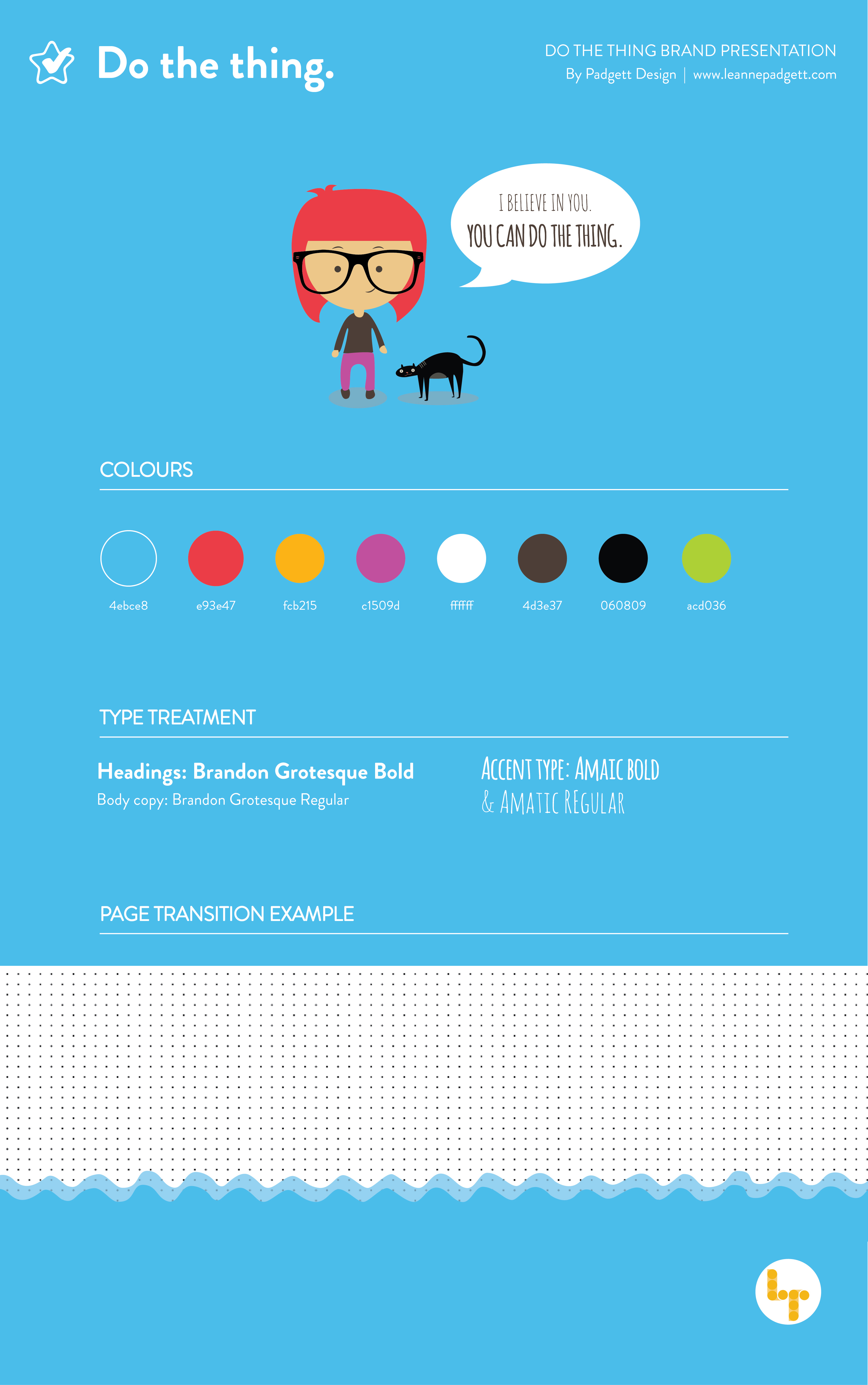
Here is the initial mood board I created for the project.

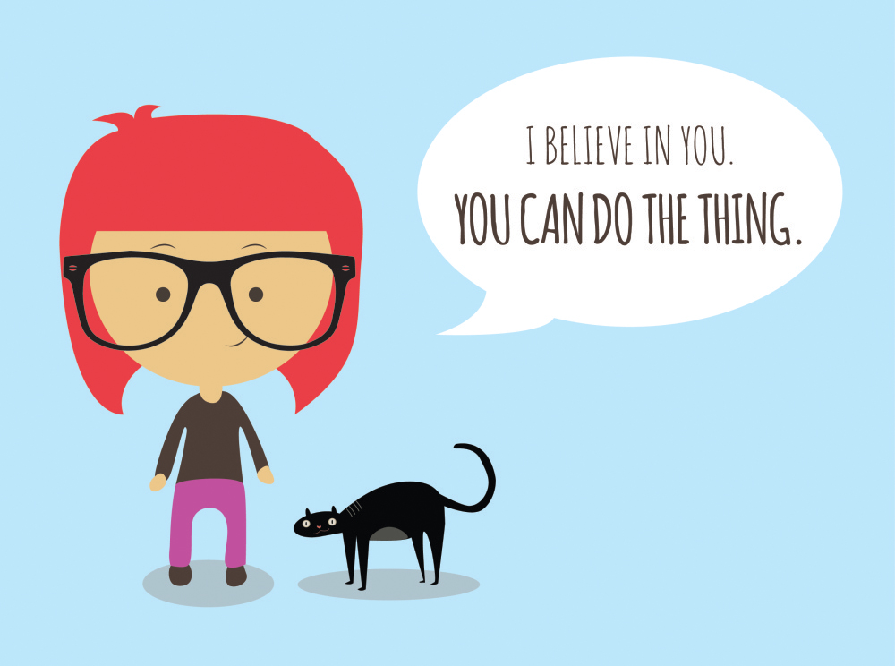
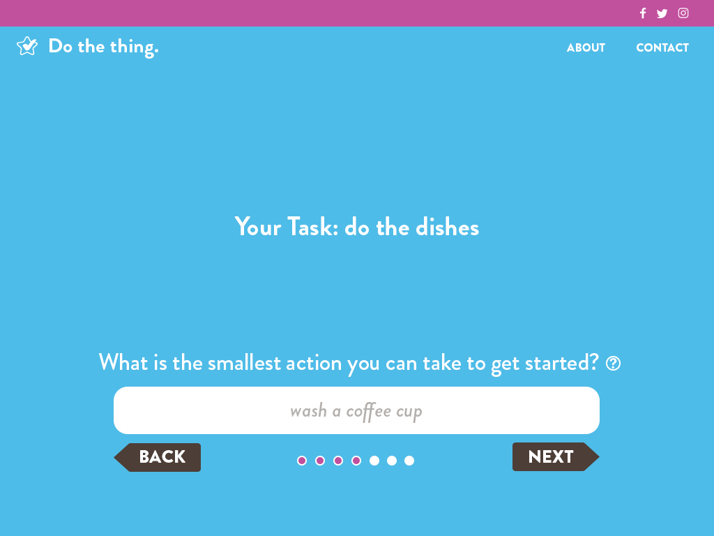
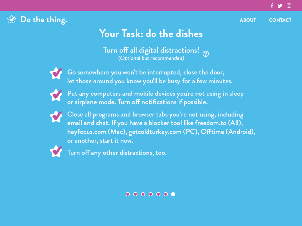
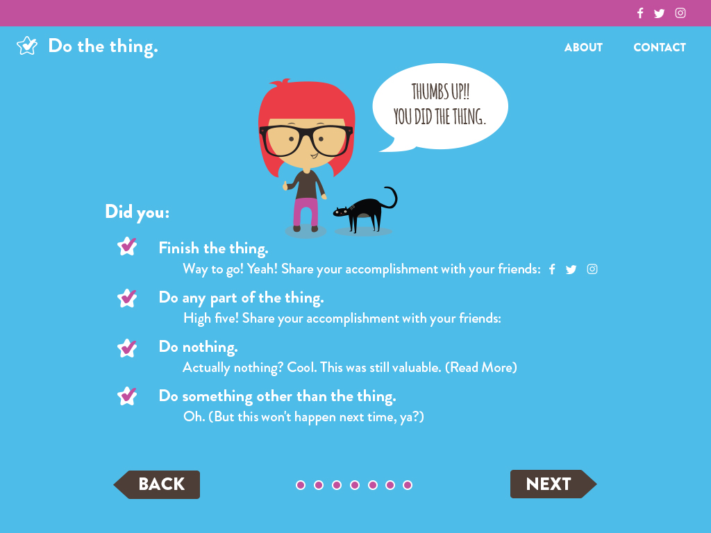
The app is called Do The Thing, and I ended up adopting “Do The Thing” as a personal motto. I reached the (now obvious) conclusion that there is only one way to build this business of mine, and that’s with a lot of freaking hard work. If I was feeling tired or overwhelmed, I would make a list and tell myself to start by doing one thing, one little item, and that was often enough to create momentum for myself.

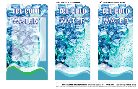
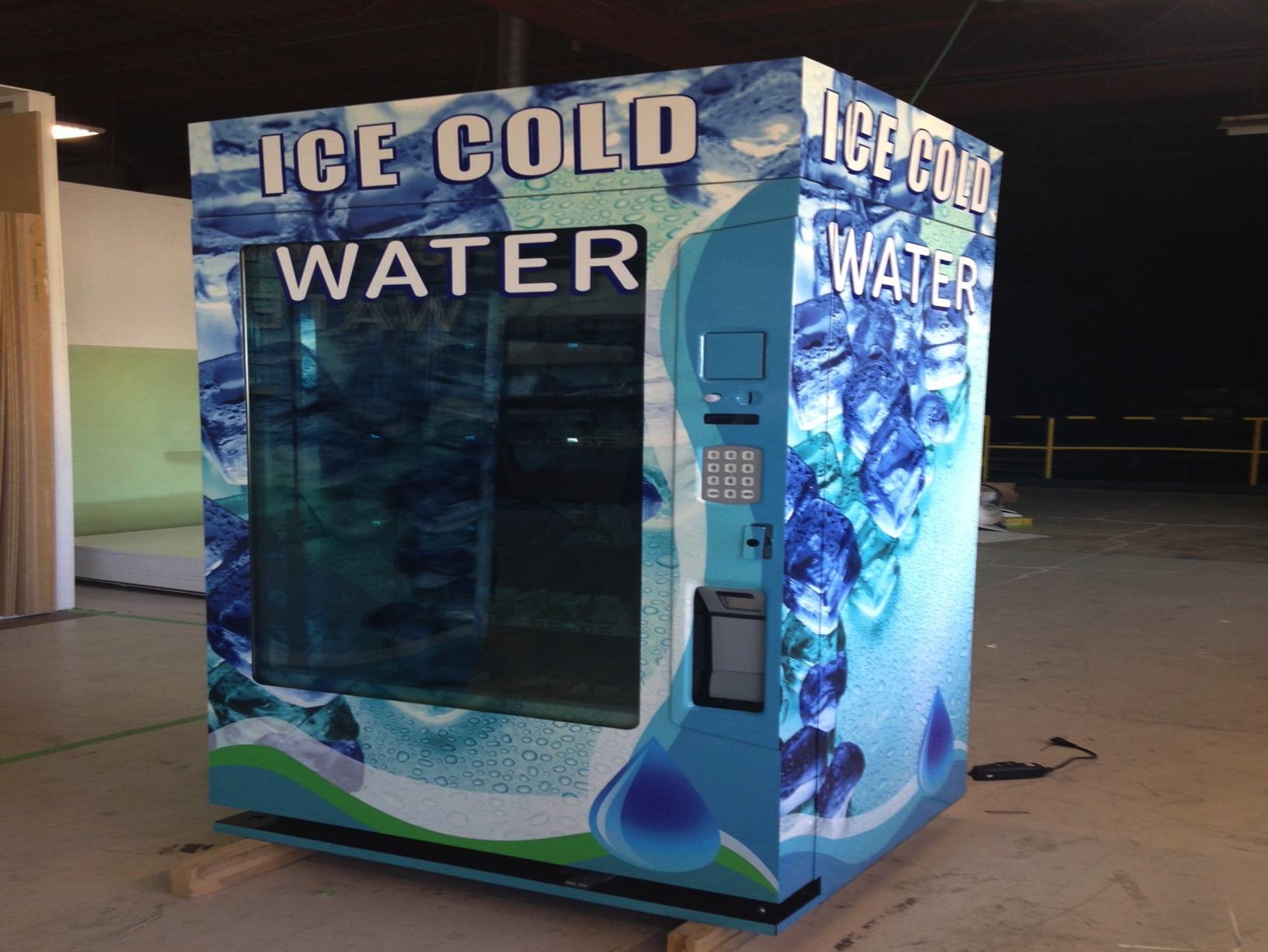
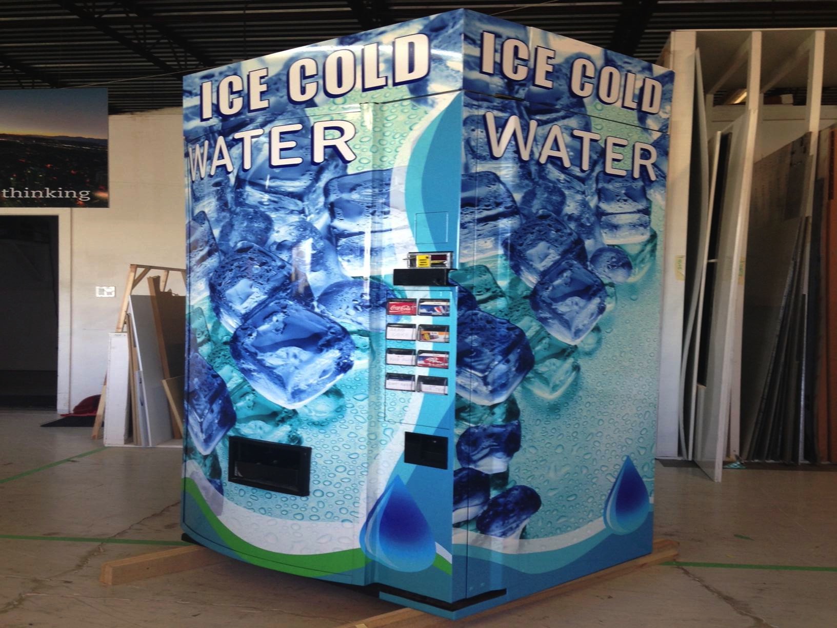
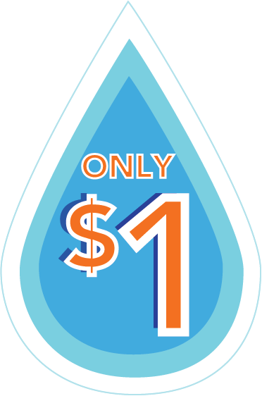
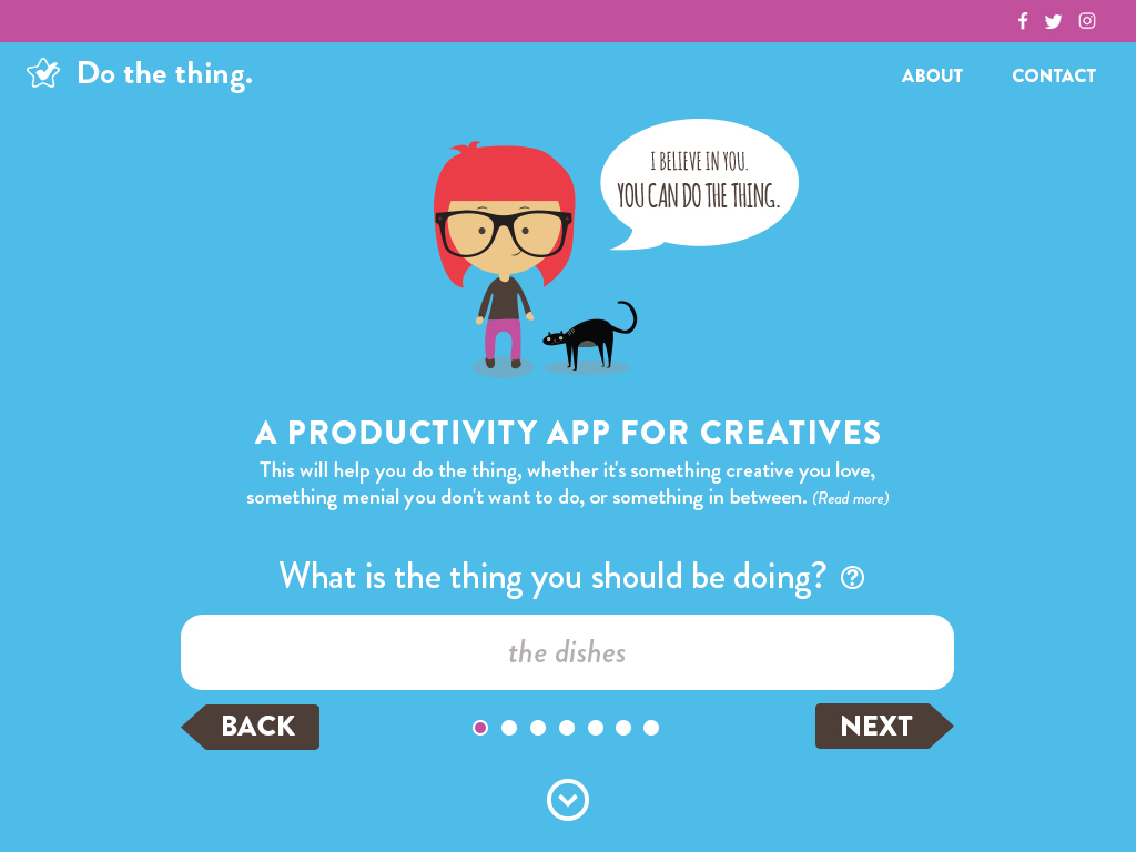
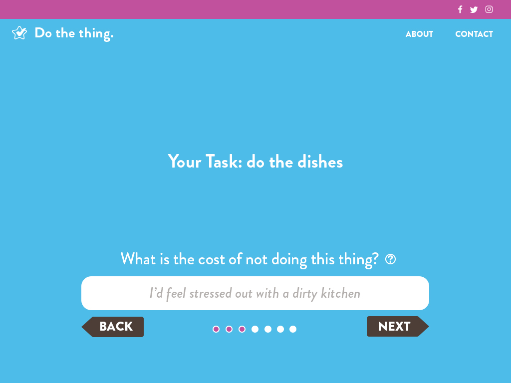
Here are a few of the skins:

That’s all for now. I’m off to do more things! More updates still to come. Happy Friday, friends!


Lady of the Night CD has arrived!

So this came in the mail yesterday!! I couldn’t wait to share. I also can’t wait for the album release party this Sunday at the awesome Biltmore Cabaret. It’s going to be a lot of fun. Shirley Gnome will be playing her smutty and hilarious tunes with a full band. Plus, she will be accompanied by hot burlesque dancers from Kitty Nights, which is sure to be a super sexy and fun time, as Kitty Nights always is. More photos of the final product coming soon!

10959572_10203025318988679_2196507302244602651_n


The Lady of the Night

Disk-and-Cover-Presentation-Mock-up-cropped

To say I have always wanted to design an album is an understatement. When I was little, I used to spend hours listening to records while looking through the insert and studying lyrics with a thirst that I believe only a nerd living in a remote Canadian town before the internet was invented can truly understand.

So, when I found out through my friend Suzy Rawsome that our mutual acquaintance Shirley Gnome was looking for a graphic designer for her next album, jumped on it and sent her a message. I really wanted this project for my portfolio. But also, if you have never heard Shirley’s songs or seen her on stage, she has the voice of an angel and writes the dirtiest and most hilarious songs I have ever heard, which naturally was right up my alley.

Seeing Shirley on stage in her polyester sequined costumes and listening to her dirty folksy-country songs summons an image that is a little bit 70s Dolly Parton, a little Elvis and a little disco. The woman is in love with glitter. The choice was clear, I really wanted to opt for a vintage 1970s aesthetic, and luckily Shirley agreed.

We started a Pinterest board with album covers that inspired us:
http://www.pinterest.com/padgettmeister/cool-and-bad-album-covers/

A short Photoshop tutorial later, I learned how to accomplish those oh-so-important 70s light flares:

ed44b6aed538b2ff3ed85174efc163a1

Shirley wanted the cover image to be her in the streets under a streetlamp. Due to time constraints, we weren’t able to put together a photo shoot, and I had already fallen in love with a photo that was taken of her during the live recording of the album. So we went with that and altered it with Photoshop.

Here is the final album cover:

CaseRGB-coveronly

We definitely wanted to include Shirley Gnome’s signature pink cowboy hat, since it was missing from the cover. Shirley had the great idea to put the hat on the cd, so when you pick it up, the top of her head would be revealed. I loved it! Here is what the inside of the cd case will look like, with and without the cd:

inside-nohat


inside-hat

I felt like Shirley’s lyrics were just way too funny not to include, so we made a 4 panel booklet of lyrics, so people could sing along at home! We used some photos that Shirley had taken after a show, and used Photoshop to give them a similar look and feel.

Booklet-mockup-cropped


Shirley_Gnome_Booklet

Shirley_Gnome_Booklet2

For the type, We used Angel Tears by Billy Argel for the cover and Thirsty Rough on the song titles.

Disk-and-Cover-Presentation-Mock-up-type

Disk-and-Cover-Presentation-Mock-up-title

CaseRGB

I am so happy to share with you this very big, awesome project! Now, I just can’t wait for the cd release party on February 8th at the Biltmore!


Vending Machine Design Fun

fresh_green-refreshing_green_leaves_02_1280x960

During the summer of 2013, I was hired to design two vending machines that lived inside a hardware store in Vancouver. This was a freaky job because I barely knew how to set up a production job this large in scale, and it was actually one of my very first real-life (non-school project) design jobs.

I always find creating a mood board for a project helpful for keeping a consistent design aesthetic. This project didn’t really require one, but I made one for my own purposes. This is part of a mood board that I created for this project.

Screen Shot 2014-11-11 at 6.23.22 PM

My only regret was not using as many colors on the final vending machines as I could have, but I was hoping to do the labels for the water bottles with the colors from my original mood board. The client ended up keeping the generic labels and didn’t have a budget for the water labels, and I got all caught up and busy with school again and so never ended up doing the labels, which is a bummer.

Anyway, it took me a while just to find an image on iStock that best represented what the client had in mind for his machines. He told me from our initial meeting that he wanted the image of ice falling down the side of the machine, so that’s what we went with.

I then found a picture and altered it in Photoshop to make the colors more vibrant, added more ice cubes and tried to make it look as refreshing as possible by lightening the color. This was the result:

Vending-front

After laying out the type, we were ready to go to print and wrap this thing! I made a few iterations and sent them to the printer:

Screen Shot 2014-11-11 at 6.43.35 PM

There were quite a few iterations and revisions, back and forth with the printers, who were, thankfully, quite patient and understanding of my graphic design rookie status.

And here is the end result! My very first very big and very real-life package design project:
image001

image002

image003

Later, the client asked for a price decal to be applied to the following circled areas:

circles

Here is what the price decal ended up looking like:

Droplet - $1

This was a really exciting, and really scary project just because of how new I was at design. But, I always say yes to a project that I think I can learn from, and this one presented a big learning challenge. It is fun to look back and see how far I have come with my design knowledge.

I didn’t originally blog about this project because I wasn’t sure if I really liked the final outcome of it. Of course there are things that I would have done differently if I had this project now, but I am very happy for this first job and how cool it was to work on such a large object, having only completed one year of school! Yay!

I keep thinking about doing the water bottle labels, just for a fun package design exercise. We’ll see if I can make time!