During the summer of 2013, I was hired to design two vending machines that lived inside a hardware store in Vancouver. This was a freaky job because I barely knew how to set up a production job this large in scale, and it was actually one of my very first real-life (non-school project) design jobs.
I always find creating a mood board for a project helpful for keeping a consistent design aesthetic. This project didn’t really require one, but I made one for my own purposes. This is part of a mood board that I created for this project.
My only regret was not using as many colors on the final vending machines as I could have, but I was hoping to do the labels for the water bottles with the colors from my original mood board. The client ended up keeping the generic labels and didn’t have a budget for the water labels, and I got all caught up and busy with school again and so never ended up doing the labels, which is a bummer.
Anyway, it took me a while just to find an image on iStock that best represented what the client had in mind for his machines. He told me from our initial meeting that he wanted the image of ice falling down the side of the machine, so that’s what we went with.
I then found a picture and altered it in Photoshop to make the colors more vibrant, added more ice cubes and tried to make it look as refreshing as possible by lightening the color. This was the result:
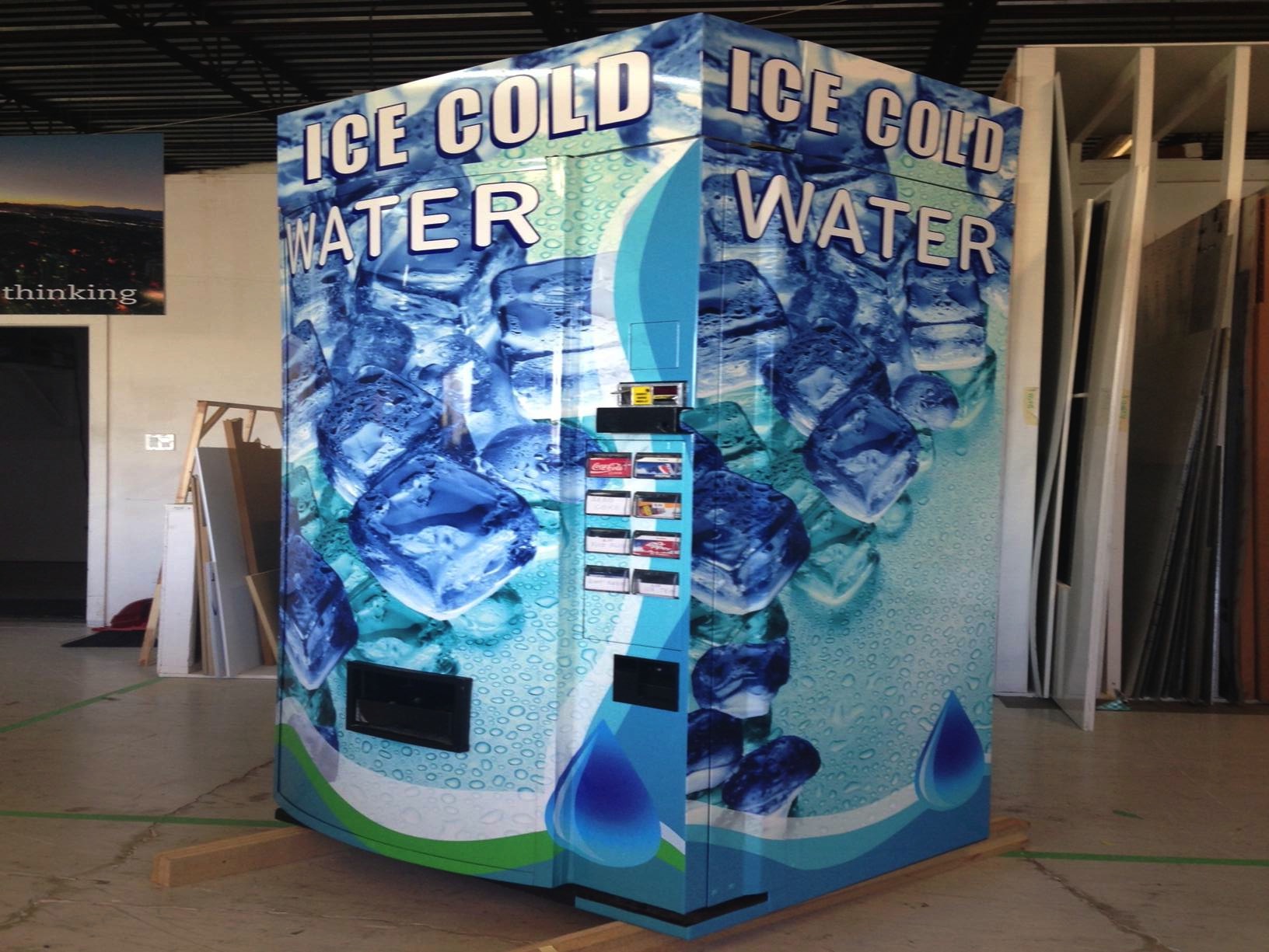
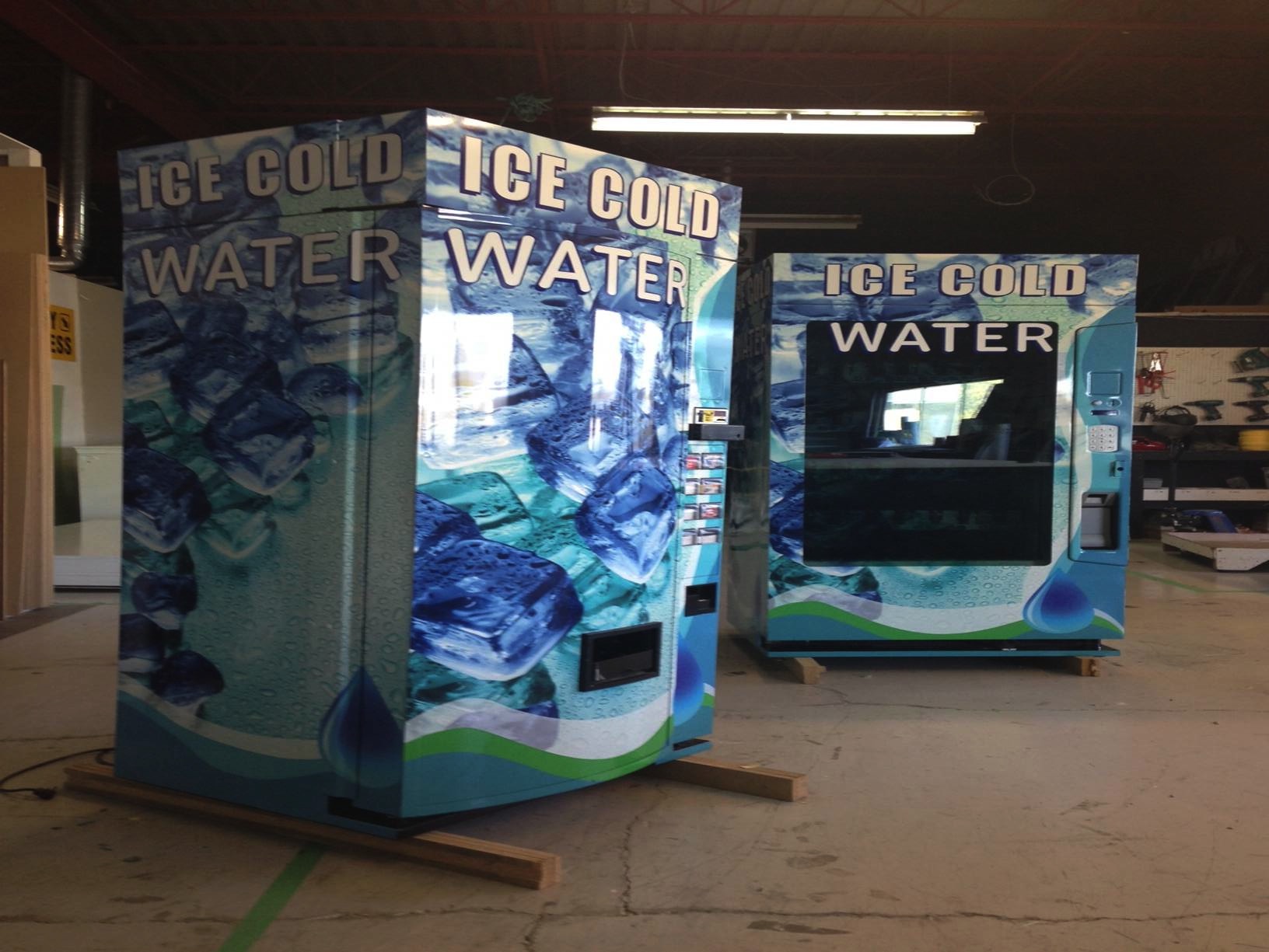
After laying out the type, we were ready to go to print and wrap this thing! I made a few iterations and sent them to the printer:
There were quite a few iterations and revisions, back and forth with the printers, who were, thankfully, quite patient and understanding of my graphic design rookie status.
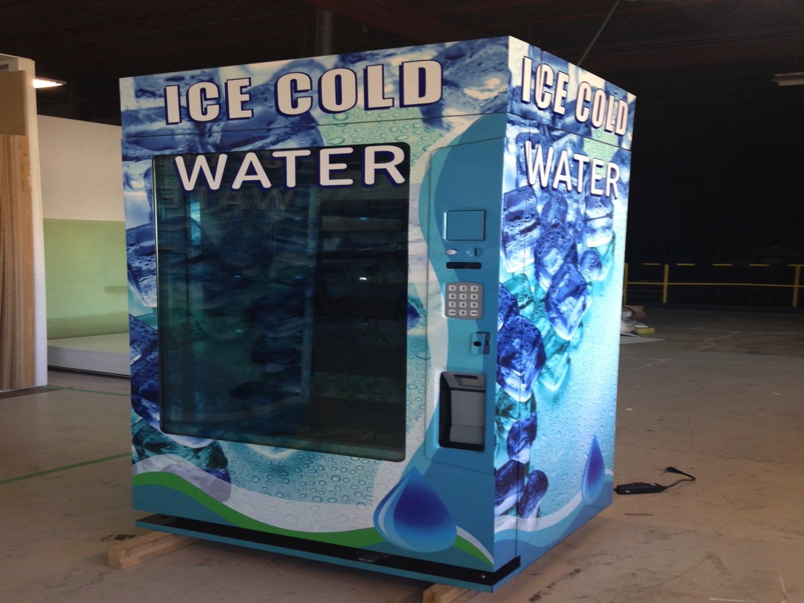
And here is the end result! My very first very big and very real-life package design project:
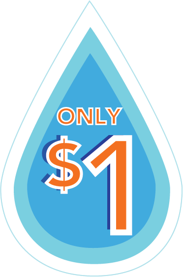
Later, the client asked for a price decal to be applied to the following circled areas:
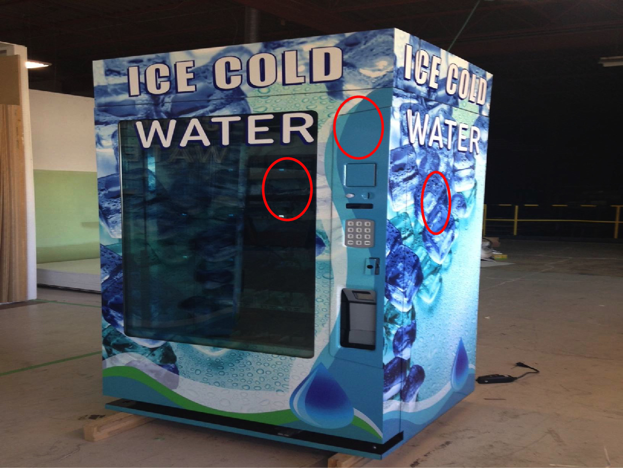
Here is what the price decal ended up looking like:
This was a really exciting, and really scary project just because of how new I was at design. But, I always say yes to a project that I think I can learn from, and this one presented a big learning challenge. It is fun to look back and see how far I have come with my design knowledge.
I didn’t originally blog about this project because I wasn’t sure if I really liked the final outcome of it. Of course there are things that I would have done differently if I had this project now, but I am very happy for this first job and how cool it was to work on such a large object, having only completed one year of school! Yay!
I keep thinking about doing the water bottle labels, just for a fun package design exercise. We’ll see if I can make time!