/* SC_TH_END:4.0.3:ee51d1f6 */ BLOG – Page 978 – Leanne Padgett Design

Cartwheel App Not Quite on Target
landingBarcode

It was early on a Thursday morning and I needed twinkle lights. Like the kind you string up on a Christmas tree. A bizarre thing to be looking for, it was nowhere near Christmas. But I needed a string of lights to act as lighting fixtures for my group’s scale model for a school wayfinding project.

The only place near my apartment that I figured might have them and would be open at that time was Target. A little tingle of excitement rushed through me.

I have a confession to make. I freaking love Target. Which is strange because I usually abhor the “big box store” shopping experience. It’s stressful. It’s crowded. It’s sometimes a little smelly. But I don’t feel that way about Target. The stores are bright, clean and airy, not crowded like most other box stores, and colorful. Target’s use of color inside and outside their stores makes me feel like I’m being transported to some magical carnival land of fun and savings. Even the logo, the happy red target, reminds me of a ferris wheel. They even have popcorn there! For me, Target turns the mundane shopping experience into a fun and transportive little getaway.

(I don’t even get upset when kids cry around me at Target. The tears just roll off my back. That is how you know I love Target.)

So I hopped into my car, my keys merrily jingling in my hand, and headed to Target on my way to school. I was in a hurry so I went directly to the electronics department. The place was bright and empty and had that quiet hunger of an empty store first thing in the morning. Most of the staff were stocking shelves. The girl working behind the electronics counter wore her blue hair in short pigtails and looked round and happy. I asked the girl where I could find twinkle lights, she whipped out her tablet and looked them up and a minute later she was showing me to the seasonal lighting department. As we were walking the freshly polished and gleaming white path, she told me that my twinkle lights were on sale and asked me if I had ever tried the Target Cartwheel app. As a student of all things mobile and a new mobile user, I got excited. She told me it was free and gave me a brief synopsis on how to use it. I am not going to lie, I was pretty stoked to check it out.

I looked the item up, added it to my list, got my discount at the checkout and I was on my way. Pretty slick.
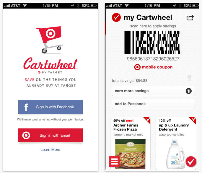
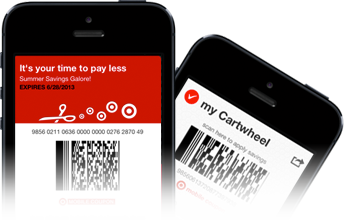
The login screen and the screen the cashier scans so you cheapskates can save yourself two bucks.

The login screen and the screen the cashier scans so you cheapskates can save yourself two bucks.

Skip ahead a few weeks. I was doing a little late night shopping and brought my four items up to the cash register. However, I had forgotten to search for these items on my phone to find out if they were on sale. The cashier told me that she thought at least one of my items was on sale, but to get the sale price, I had to pull up the deals on my smartphone.

“You’ll have to do a search. You’ve got two Merona tops and one pair of Denizen jeans,” she said over her shoulder, as she was ringing up my order.

“Wait, um. Where’s the search function again…?” I muttered, as I fumbled with my phone. The cashier politely waited while I jabbed at my phone with my sausage fingers until I found the search icon. “Okay, got it. Just a sec, how do you spell ‘Merona’?”

The cashier walked me through the scan function on my phone (which I learned pretty easily), with which you can scan your items to determine whether or not you get a discount. I stood in the bagging area, digging through my stuff to find barcodes.

The man behind me in line looked either confused or irate, or both. He just stared at me. I apologized to him and asked the cashier to suspend my transaction while I juggled my wallet, cash, car key and phone, and proceeded to dig through my items to find the tags. It was a little embarrassing. I realize this was my problem because I should have remembered to look the items up before I got to the register, but it brought up a bigger question: didn’t these discounts used to just come off automatically? I never remember having to clip coupons at Target before. I also thought there simply has got to be a better way of streamlining this process. I can’t imagine how frustrating this would have been if I had been purchasing more items. Or, heaven forbid, I had been shopping with children.

I finally got all my items scanned and checked for discounts, and saved myself a cool 4 bucks, which was totally not worth the effort.

As the cashier was handing me my receipt, she said, “You should download the app for more savings.”

“Um, I thought this was the app,” I replied, confused.

Then this was the kicker: “Yes, but there is another app for coupons.”

Wait, what? Two separate apps? This can’t be true.

When I got home I did some research. I discovered that Target has their main app (just called “Target”), which performs functions more in-line with the brick-and-mortar store, where you can make online purchases, locate which aisle a product is in, access the weekly flyer, find store locations and look for coupons. In June of 2013, they launched Cartwheel as a separate app and microsite (cartwheel.target.com) that just takes off additional in-store discounts. There is also a Facebook app, which I believe performs the same function as the Target mobile app, but I am unclear about the value of having a Facebook app for this purpose.

As a new mobile user, I am also confused about why everything isn’t all in one app. It is hard enough for me to remember to check one place for savings, and now Target is asking me to sign up for two. This is definitely taking the fun out of shopping.

Sure, it’s easy enough to add items to your savings / coupon list, but the search function isn’t great and the fact that the customer needs to remember to browse multiple apps in advance of a visit to the store in order to take advantage of savings doesn’t work.

Don’t get me wrong, this won’t stop me from shopping at Target. I still think it’s a carnival fun land of amazing savings, but this app issue is a head scratcher. After all, they have robots that return your shopping carts. I am really surprised a company of this size doesn’t have a more integrated system. We can only hope that Target does some further revisions and works out the kinks soon.

Target, I think a wheel just fell off your cart.
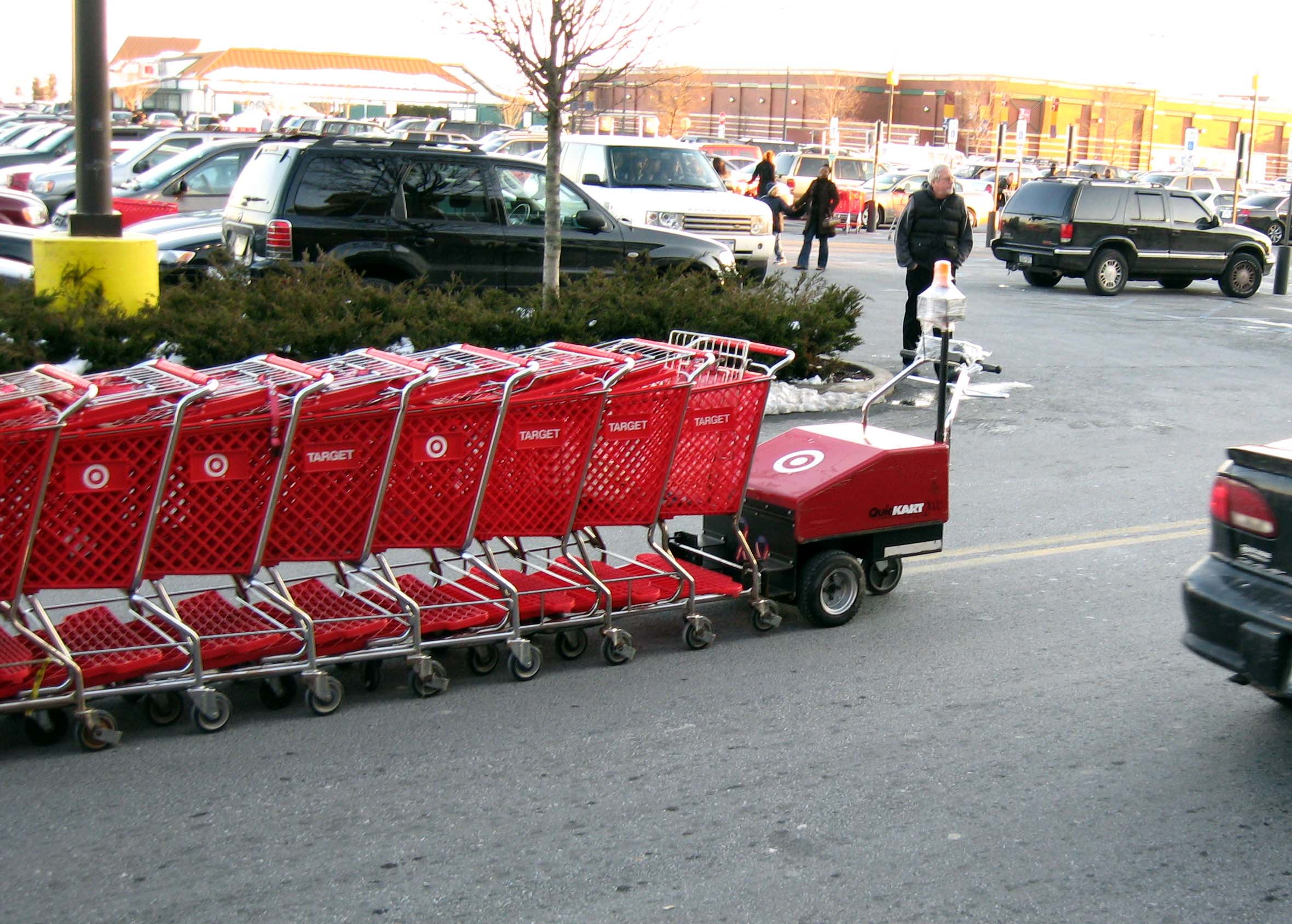
Target's Robot collects their shopping carts for them so lazy Americans don't have to.

Target’s Robot collects their shopping carts for them so lazy Americans don’t have to.


The Making of a Brand

sam bag

A few nights ago, Michelle and I really switched from high gear to EVEN HIGHER GEAR to produce some of the packaging and marketing collateral for Annie’s Sammies. We used a rubber stamp and brown ink to achieve a letterpress look for the napkins and the coasters.

20140316_181138 20140316_235805


The night before our final presentation for the app, I made little turkey and egg salad sandwiches, and branded them with a sticker bearing the company logo. I was happy with the results — they were tasty and very cute!
Sammies1 Sammies2 Sammies3 Sammies4 Sammies5

Annie making Sammies!

Sammies6 Sammies7

Fridge full of Sammies:


Sammies8 Sammies9

Annie’s Sammies lives!


Annie’s Sammies

As I mentioned last week, I am so excited to be designing my (imaginary) sandwich truck, and couldn’t be more thrilled that my colleague, Michelle Booth, has decided to team up with me to design the mobile app. Michelle has already been my unofficial creative advisor on this project since the beginning of this quarter and I already am over-the-moon appreciative of her keen eye for detail. (She argues with me about this regularly. And I tell her to shut up. This is becoming our routine.)
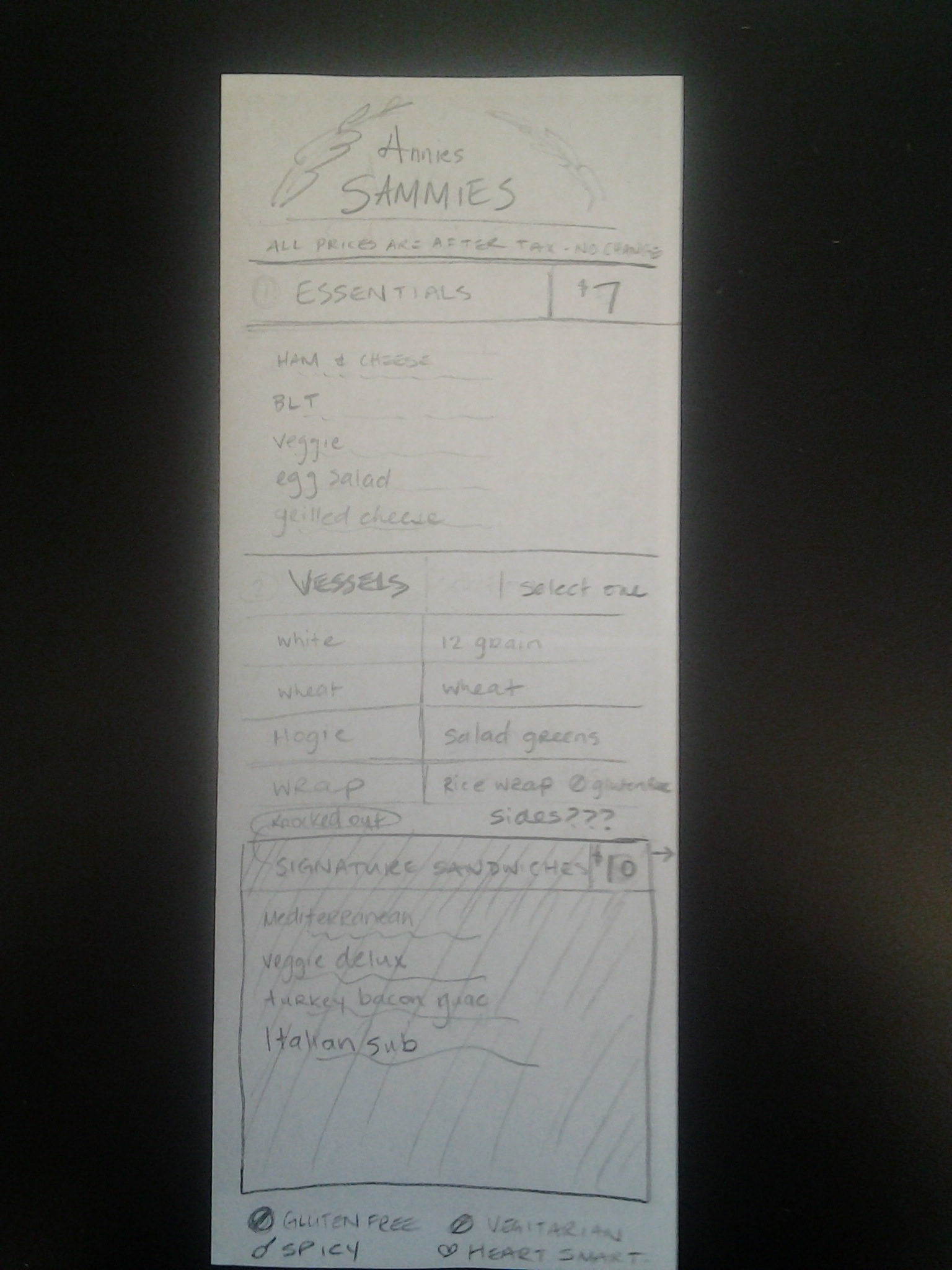
We have made quite a bit of progress in the past week. On the weekend, we got together and compiled and analyzed the data collected from our sandwich survey (thank every single one of you for participating! It made a big difference to the research process). Michelle designs and paints roller derby helmets on her very few off-hours, so we sat in her basement workshop and she painted glitter onto helmets while we figured out the nitty gritty of the menu. Then we jammed out a bunch of heavy braining on how the app ordering process would work, incorporating ideas on how the back end would respond and process orders. Then, we took a beer break, during which we decided upon having two windows: an order window and a pick-up window, and one cash register situated somewhere between them. We came up with a plan for how employees would prepare food and even where food stations would be located inside the limited space of the truck. If I have time, I am thinking about drawing up a floor plan of the truck as part of the truck design part. I feel like we covered a lot of ground. We even discussed what the sticker would look like that would label each order. Some visuals of that process are included in the slides below.

I am happy to have a team member who is as excited about these little details as I am. We had a couple of heated debates over meat and cheese pairings. It got intense!

Ever since last year, I had been looking for an excuse to get some more practice doing food photography. I really love it! I mean, it’s stressful because I’m always afraid I’m going to screw something up and waste food, and something weird always happens, but that’s sort of part of the fun. The funny part about this is, I remember when my packaging design teacher last year told me that I should take my own photos of pancakes for my River Hog Flapjacks box, I was so stressed about it. Doing my own photos seemed ridiculously difficult. And photos of food??? What did I know about that? I was totally expecting to screw it up, but the results actually turned out well and I really enjoyed it. So anyway, here we are almost a year later and I finally got to do it again! So, I am super proud to admit that the photos below of the BLT and the tomato basil soup were done by me (the iced tea shot, however, was not done by me. I found that one on the internet. But I felt like it matched the look and feel of what I have been trying to accomplish, so I included it). I am planning a second photo shoot this weekend and am very much looking forward to it.

The coming week will be all about further development of the app and the menu. We have task flows and wireframes for the app, and will keep working to flesh those out, and as always, lots of user testing. The hard copy menu will be finalized and styled this week as well. Here are some slides showing this week’s progress:

initial research notes-slides initial research notes-slides2initial research notes-slides3initial research notes-slides4initial research notes-slides5initial research notes-slides6initial research notes-slides7initial research notes-slides8initial research notes-slides9initial research notes-slides10initial research notes-slides11initial research notes-slides12


Annie’s Sammies

Big news for Annie’s Sammies today!! Michelle Booth has been officially added to the Annie’s staff, as we have decided to team up on the app design portion of this rebrand, which I am stoked about.

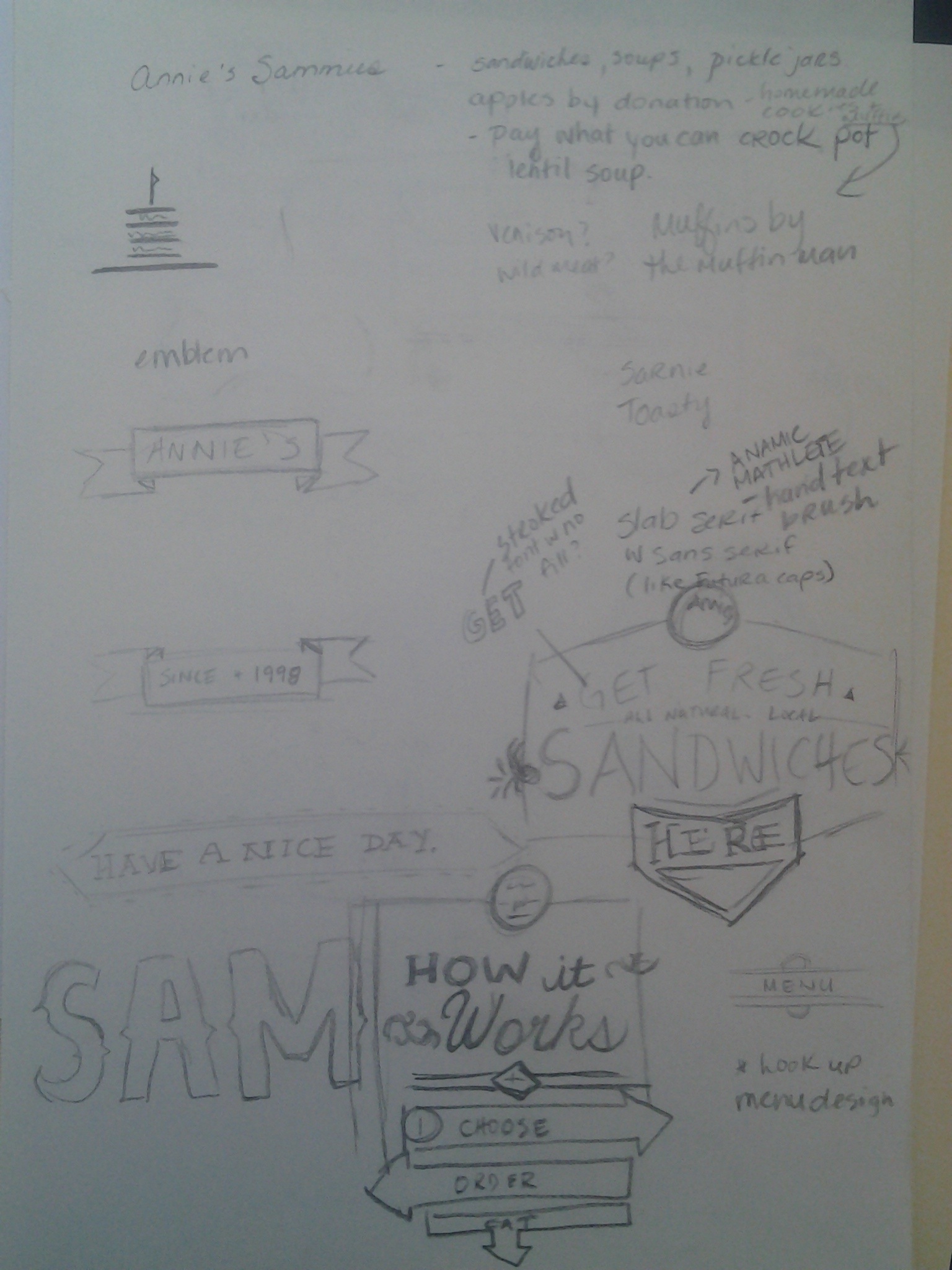
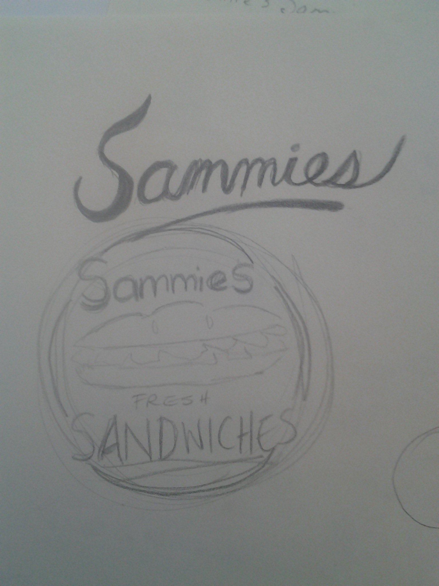
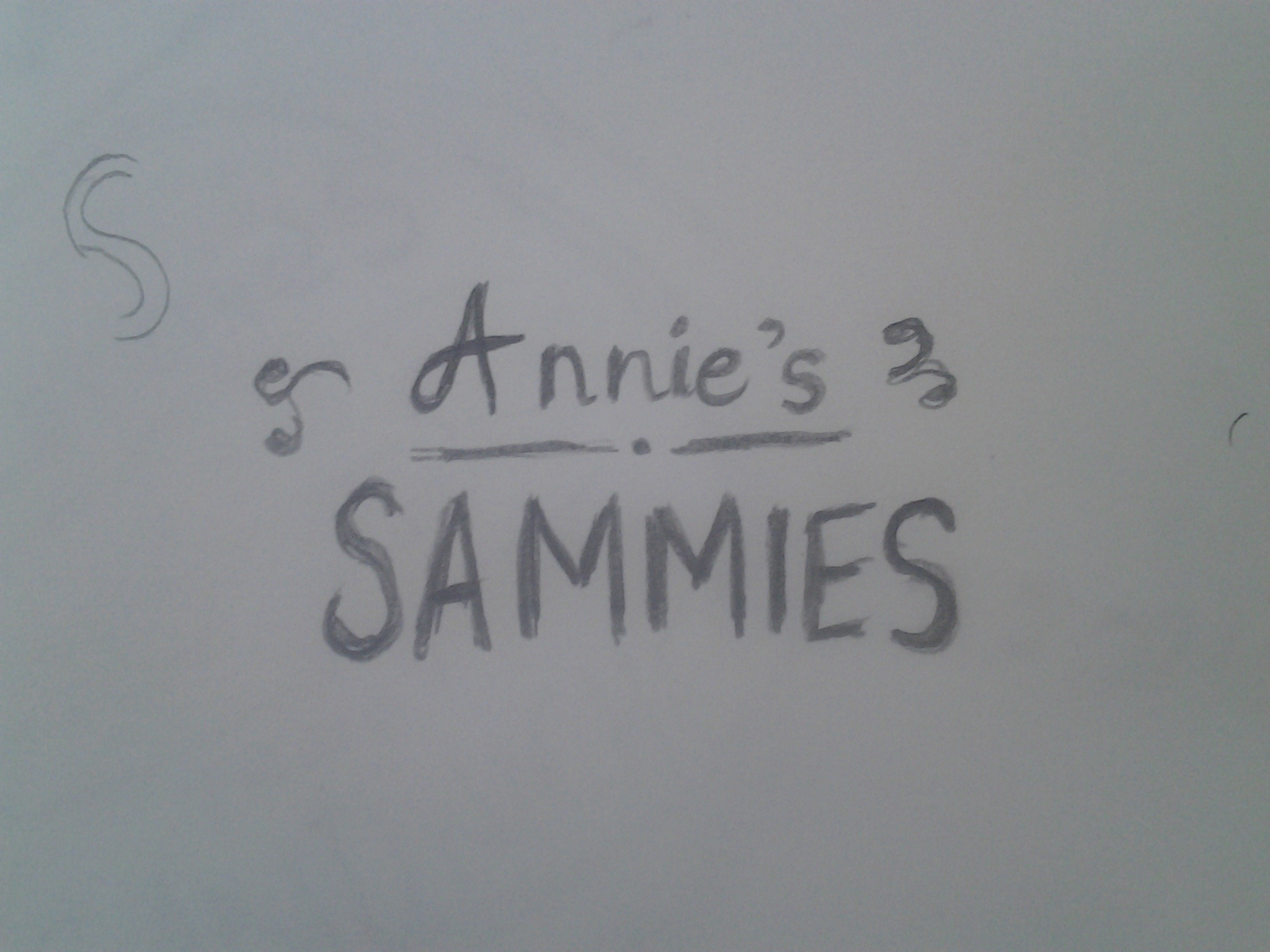
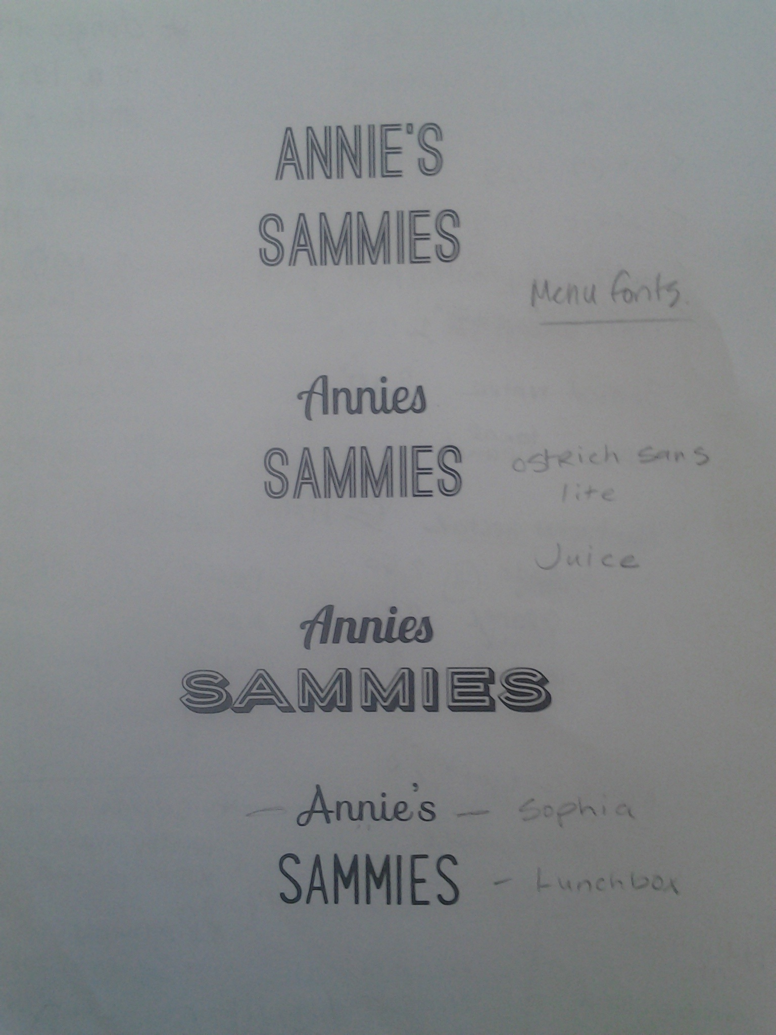
Logo is almost ready… just working on some illustrative elements. Based on my research, I decided to take a typographic approach. I feel like the logo still needs work, but will develop over the course of the project. Here are some sketches:

20140218_170551 20140218_170601 20140218_170608 20140218_170624

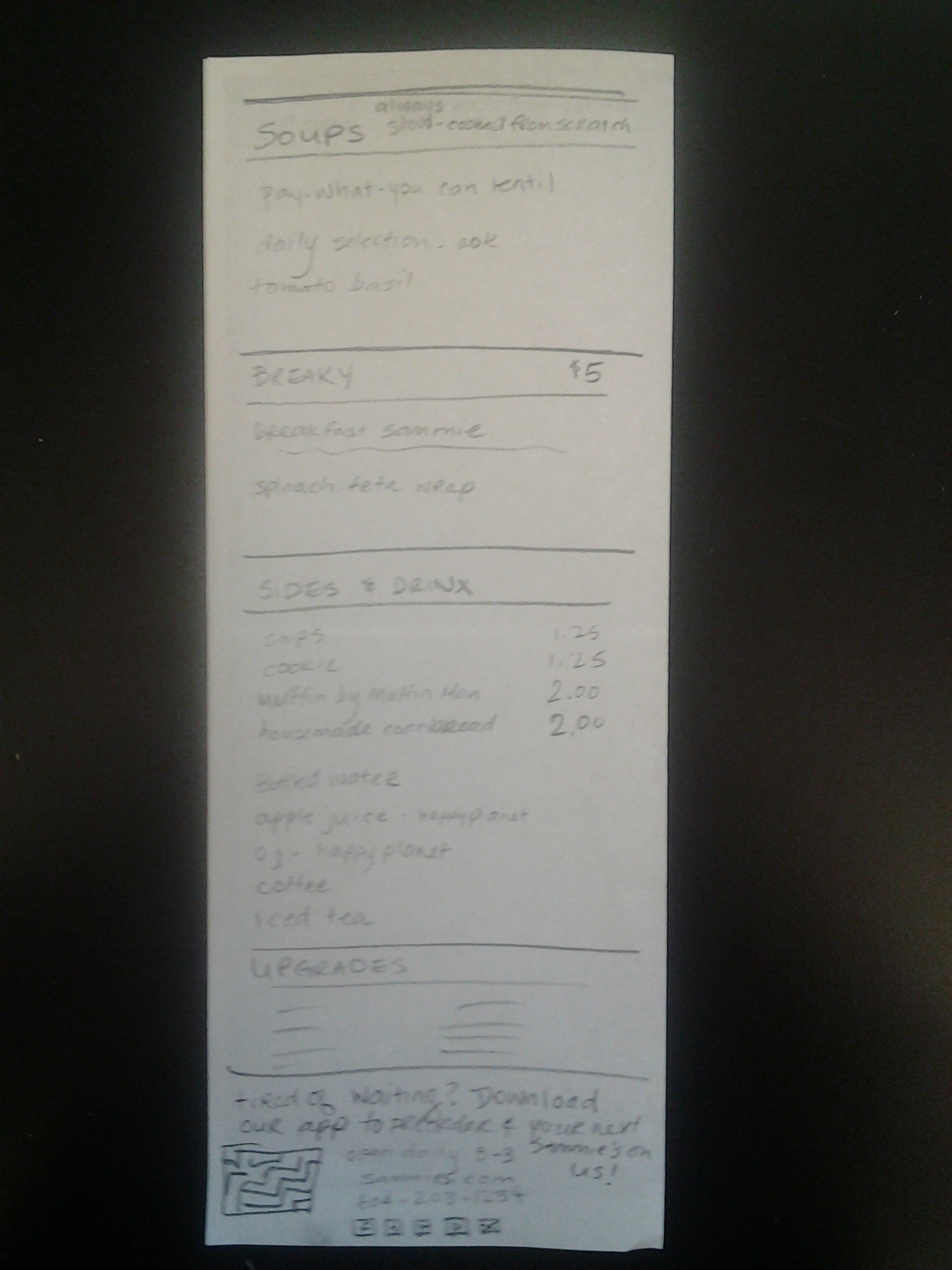
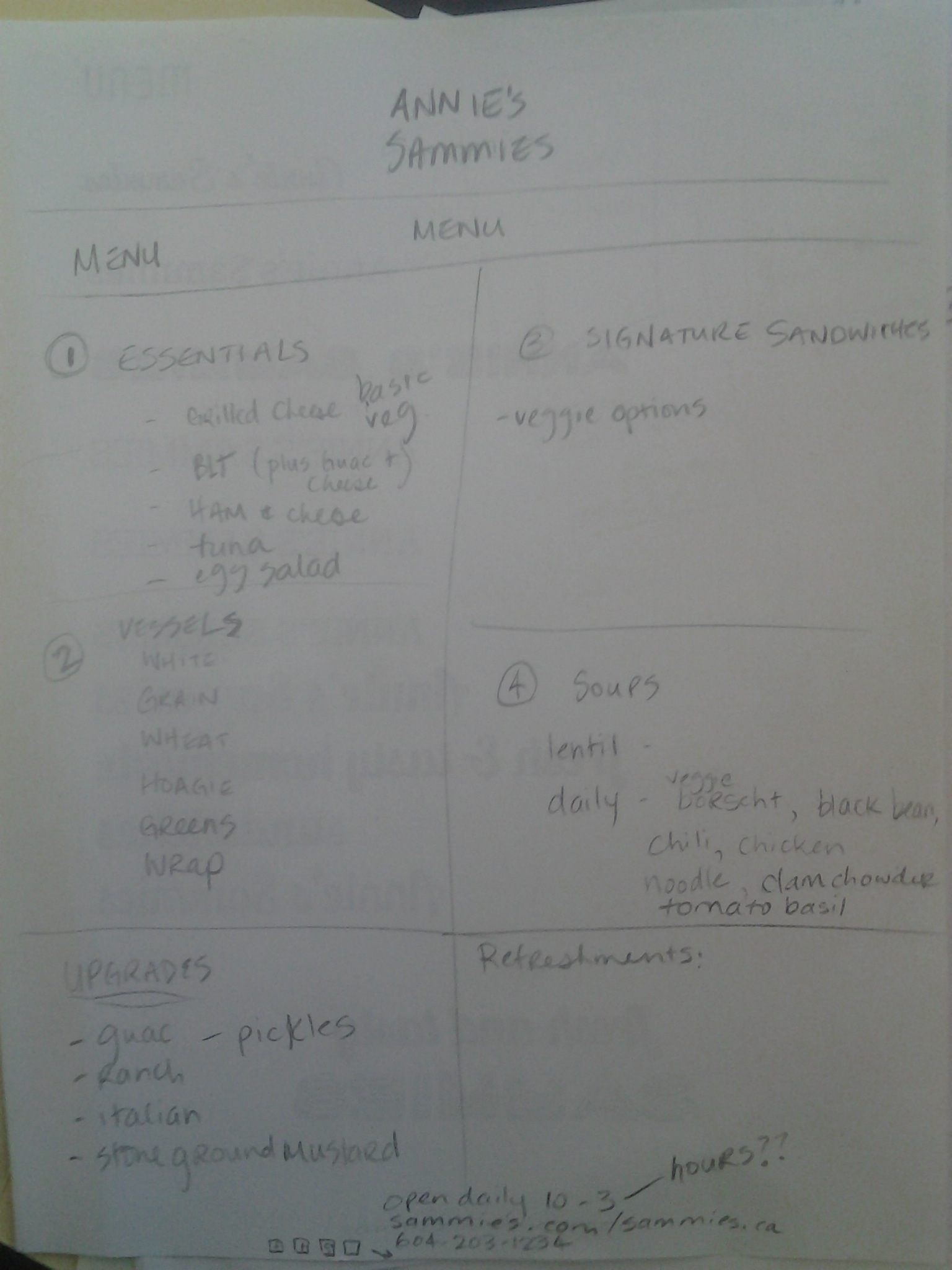
As for the menu, I have never designed a menu before, so it was a fun challenge for me.  I have the dimensions and most of the basic elements figured out and sketched. The menu will be 4.25 X 11 double-sided, so printing will be at a standard size. (The app will feature an abridged version of the print menu with breakfast & lunch “combos”).

Here’s an earlier sketch:

20140218_170639

And a more refined sketch of the menu plan (this sort of reminded me of doing a wireframe for a menu!):

20140218_170715 20140218_170724

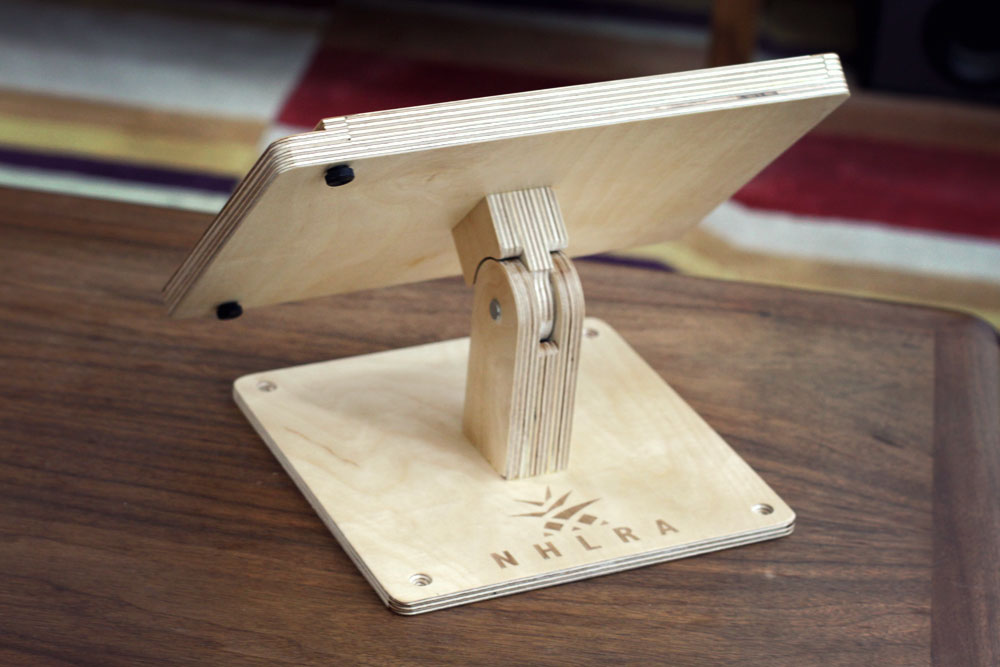
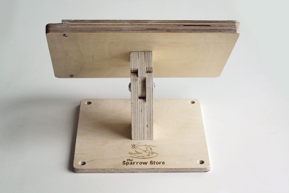
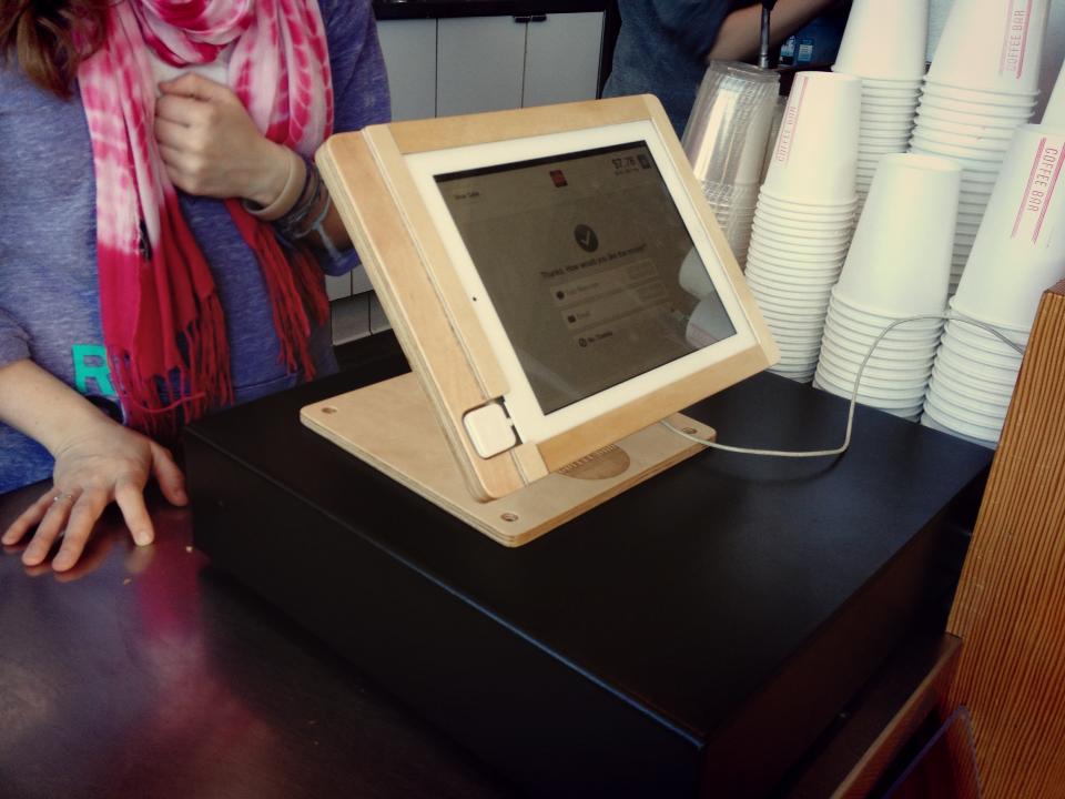
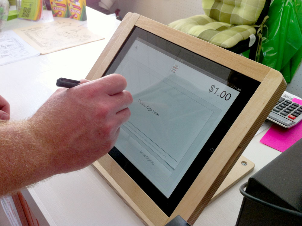
The P.O.S. system will be run from a tablet which will fit into a wooden stand that will be manufactured by Tinkering Monkey. Photos below.

Payment options:

– Square Wallet App – 2.75% of all purchases – in-app payment is encouraged, but the following options are also available:
– Cash (all prices are after tax, so all round numbers. No change.)
– Credit & Debit

Tinkering Monkey P.O.S.

nhlra2 sparrow-back 526925_644050086426_811863438_n matt-2

Square Wallet App
– dongle attached to an IOS or Android tablet
– App will alert workers when the customer is near and when they should start preparing their food.

Product photography will commence this weekend.

That’s all for now! I am super stoked about this assignment!


If you dissect a bird…

We had an open poster assignment over the winter break and I tried so many different ideas but I felt they all looked weird / failed in some way. This is one of the ideas I came up with. I love Sylvia Plath, and was excited to do something to honor her writing. In the meantime, I will keep working on those other posters and see what I come up with!

Poster3


Fairer Than Death

Last Wednesday, we were given the following (terrific) design exercise. Give it a shot, it was a lot of fun!!

Today’s Graphic Design Exercise by Alex Griendling
It really is quite genius.
He says “I do these as experiments, and use the below formula. It doesn’t matter if the finished design is any good or not, only that I’m challenging myself to think on the fly, and develop an interesting solution to the problem presented.”

Here are the rules:

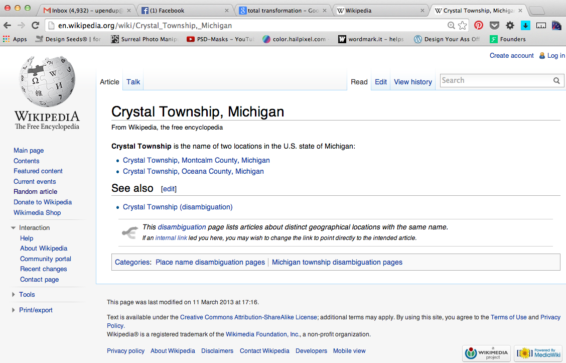
1 – Go to “wikipedia.” Hit “random” or click
en.wikipedia.org/wiki/Special:Random
The first random wikipedia article you get is the name of your band.

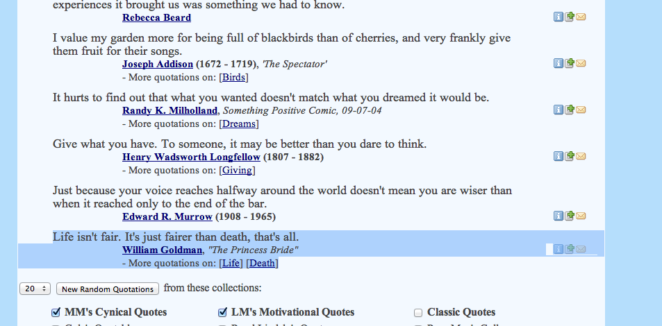
2 – Go to “Random quotations” or click
www.quotationspage.com/random.php3
The last four or five words of the very last quote of the page is the title of your first album.

3 – Go to flickr and click on “explore the last seven days” or click
www.flickr.com/explore/interesting/7days
Third picture, no matter what it is, will be your album cover.

4 – Use photoshop or similar to put it all together. Your finished piece should be 11″ X 11″ trimmed and put on the white board.

You have one hour…..ready, set, GO.

*****

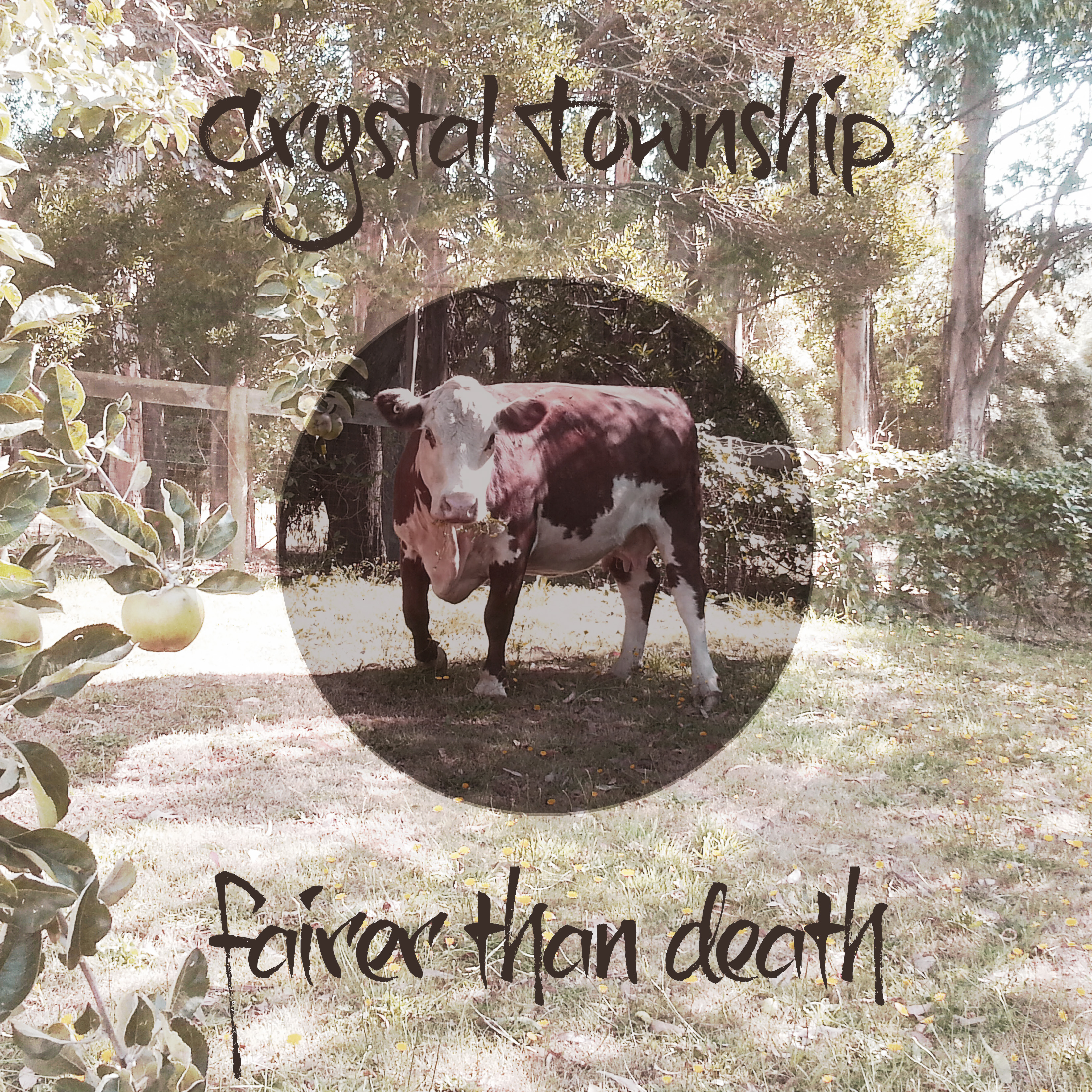
My random article was about Crystal Township, Michigan, and my random quotation was

“Life isn’t fair. It’s just fairer than death, that’s all.”
from the Princess Bride.

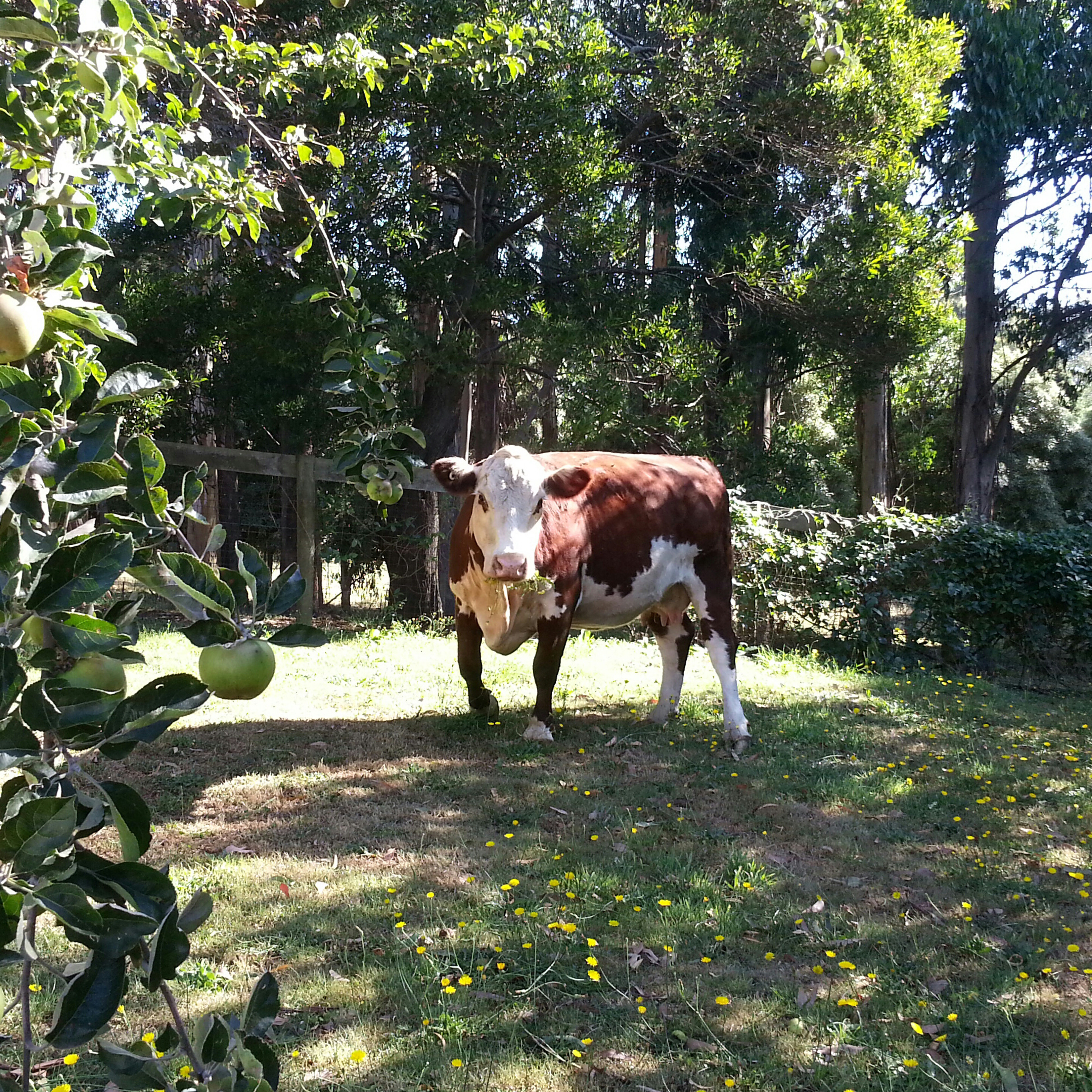
For the picture, I chose a photo of a cow from flickr.

Screen Shot 2014-02-05 at 11.36.14 AM Screen Shot 2014-02-05 at 11.38.56 AMFairer_than_death


And here’s my album cover! It was so much fun to make!

Fairer_than_death


Special Topics – Annie’s Sammies

As you may already know, I love sandwiches. I also love cooking for people. Making people sandwiches is one of my favorite things. In fact, now that I am poor again, I have been using my sandwiches as a form of currency in the past few months, and I am not ashamed to admit that I have grown a sort of cult-following of sandwich appreciators (I have at least two major fans, or perhaps even more than two).

So, for winter quarter of Special Topics I have decided to do some more branding. SANDWICH BRANDING!! My favorite kind of branding!! I am going to create a brand for a (pretend) sandwich truck that sells breakfast and lunch sandwiches, homemade soups and possibly some dessert items such as cookies and muffins. To be honest, this is a project that has been taking up real-estate in my imagination for quite some time now. PLUS, this project will tie-in nicely with my upcoming app assignment, where I will develop an app that you can use to pre-order lunches, among a few other things… stay tuned for that part.

My experience with food trucks at lunch time in Vancouver is that I spend most of my break standing in a lineup. The app will allow customers to order their lunches in advance, avoiding long lineup and will streamline the order process. In my research I have not found any food trucks in Vancouver that are currently doing preorders by app.

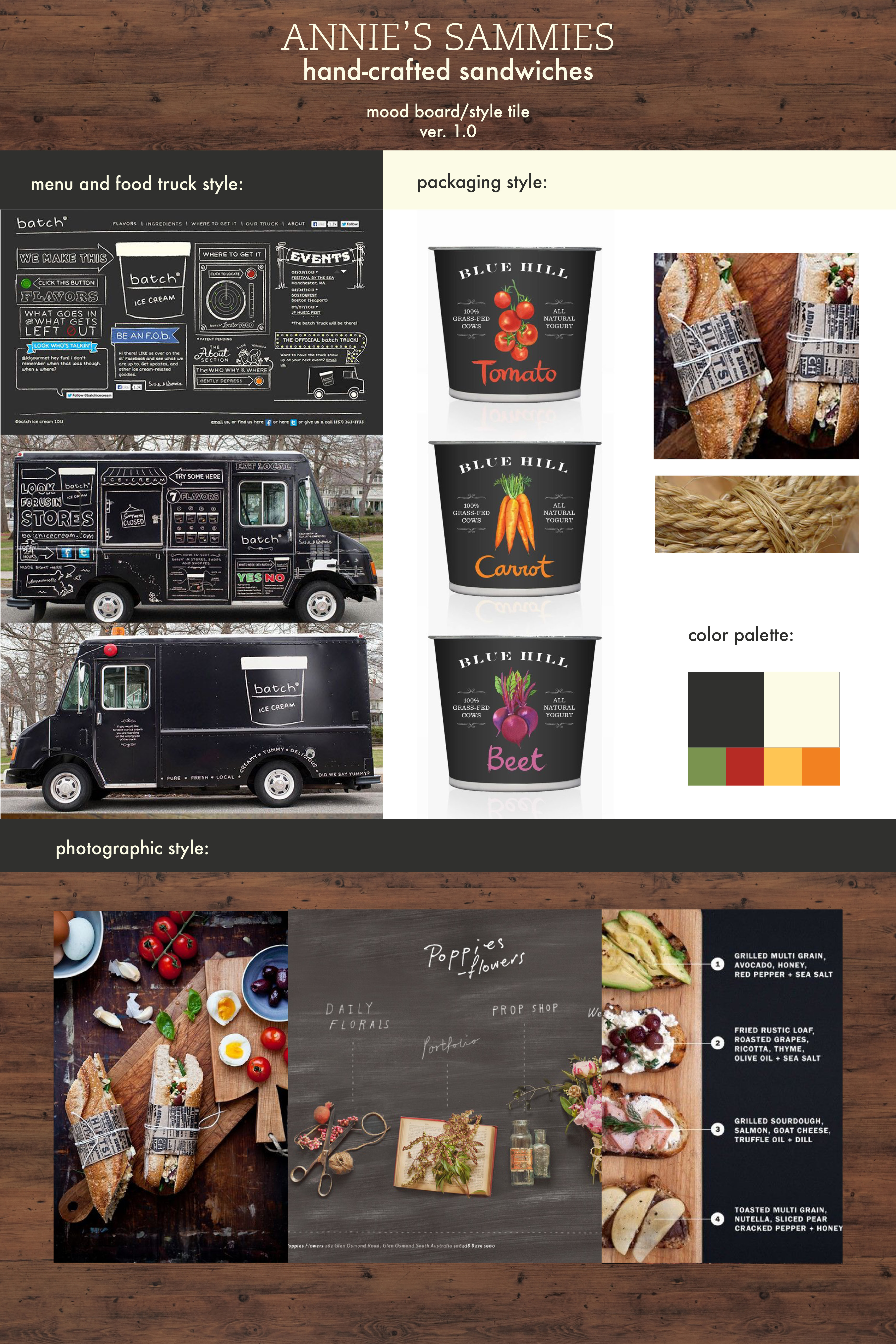
Here’s the first draft of the mood board / style tile for Annie’s Sammies (name subject to change):

Annie's-Mood Board
These style tiles usually go through a series of iterations before I settle on my look and feel for a project, but this gives you an idea of what I sort of want it to look like.

I have written some sample copy for this as well.

Some sample copywriting to further indicate client’s style & positioning:

Not your mother’s sandwich shop. But pretty close.

At Annie’s Sammies, we aren’t gonna pick up your dirty socks. We aren’t gonna clean your room, or do your dishes, either. What we will do is make you a good sandwich. Are you hungry? Good. Let’s eat.

I’m sure your mom would agree that you screw around too much. Don’t get any further behind. Get your food and get on with your day. Your mom will thank you for it. 

Made from scratch sandwiches, crock pot soups, and other warm stuff to keep you going.


What I am aiming to accomplish this quarter:

– logo design
– signage / food truck design
– menus
– sandwich packaging & possibly napkins
– soup containers
– paper bags
– app (for Web class)