/* SC_TH_END:4.0.3:ee51d1f6 */ BLOG – Page 977 – Leanne Padgett Design

Save-the-Date Postcards!

Print1

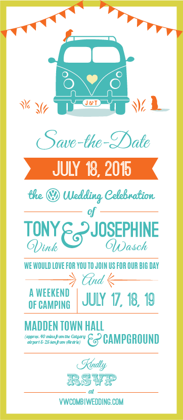
We got the postcards back from the printers! Just in time for Josephine to take with her overseas for the holidays. She originally didn’t want to do any print material for the wedding, she wanted to do all the RSVPs and Save the Date stuff electronically through the website. However, she changed her mind and requested that we have a small amount of 4 x 6 postcards made, to give to some of her overseas family who may not be quite as computer savvy.

We used Jukebox to print the cards, and I will definitely be back to use them again. They were awesome! Not only was their customer service superb, but the quality of the print job far surpassed my expectations.

Next, we will be working on fleshing out the website with all the important details. We are still looking for a theme that is easy to build on… More on that later!

Her color palette was so bright and fun and her idea to have a VW camper van-themed wedding has also been a blast to work with. I was also happy to have the opportunity to apply a typographic design to the Save-the-Date, as that was a challenge but an aesthetic that I really enjoy.
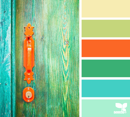
ADoorHues_8

Josephine’s color palette.

Jo & Tony's Save-the-date

The original electronic version of the Save-the-Date.


Print2

Print3


Design School Tears

tears-promo

This was a little project I did for fun during school. It was intended as a self-promo item, but I ended up going with another idea. School was hard work, and lots of tears were shed over the past couple of years. I thought it would be funny to bottle them to give to people to prove how hard we all worked.

I finally got time to work on this some more so I made the bottle into a fake ad. I have gone through so many versions of this project, but here are some earlier iterations:

old chemist bottle dropper-bottle-cropped

Here is the final version of the label and another version of the final ad layout with a brighter, more orange label. I drew the flourishes and graphic elements using Adobe Illustrator (except for the loop at the top, which was a glyph).

Tears-label-final

tears-promo-2


Vending Machine Design Fun

fresh_green-refreshing_green_leaves_02_1280x960

During the summer of 2013, I was hired to design two vending machines that lived inside a hardware store in Vancouver. This was a freaky job because I barely knew how to set up a production job this large in scale, and it was actually one of my very first real-life (non-school project) design jobs.

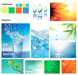
I always find creating a mood board for a project helpful for keeping a consistent design aesthetic. This project didn’t really require one, but I made one for my own purposes. This is part of a mood board that I created for this project.

Screen Shot 2014-11-11 at 6.23.22 PM

My only regret was not using as many colors on the final vending machines as I could have, but I was hoping to do the labels for the water bottles with the colors from my original mood board. The client ended up keeping the generic labels and didn’t have a budget for the water labels, and I got all caught up and busy with school again and so never ended up doing the labels, which is a bummer.

Anyway, it took me a while just to find an image on iStock that best represented what the client had in mind for his machines. He told me from our initial meeting that he wanted the image of ice falling down the side of the machine, so that’s what we went with.

I then found a picture and altered it in Photoshop to make the colors more vibrant, added more ice cubes and tried to make it look as refreshing as possible by lightening the color. This was the result:

Vending-front

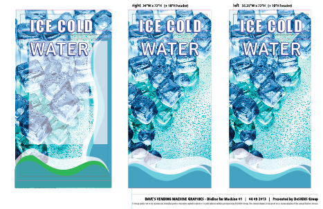
After laying out the type, we were ready to go to print and wrap this thing! I made a few iterations and sent them to the printer:

Screen Shot 2014-11-11 at 6.43.35 PM

There were quite a few iterations and revisions, back and forth with the printers, who were, thankfully, quite patient and understanding of my graphic design rookie status.

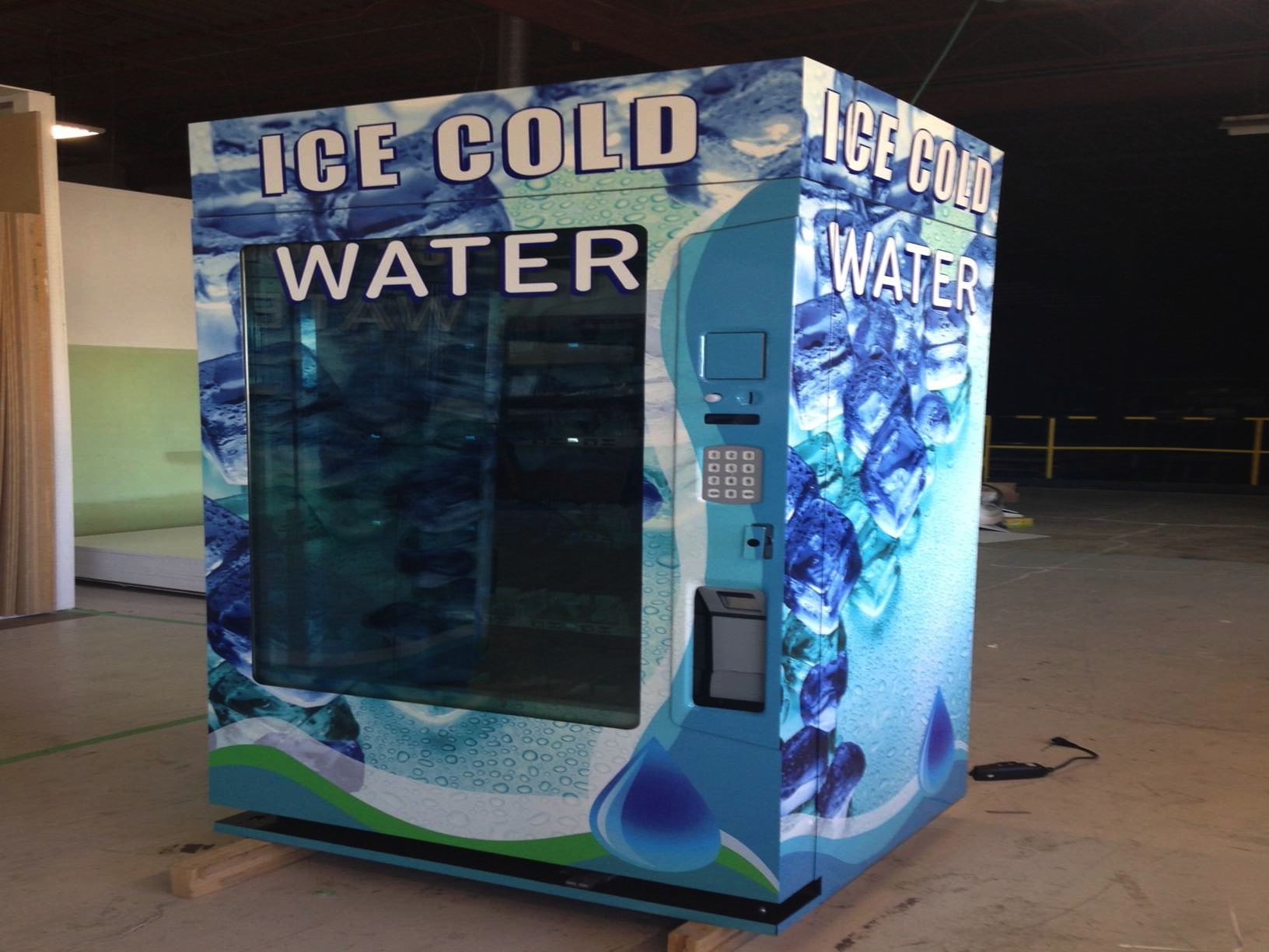
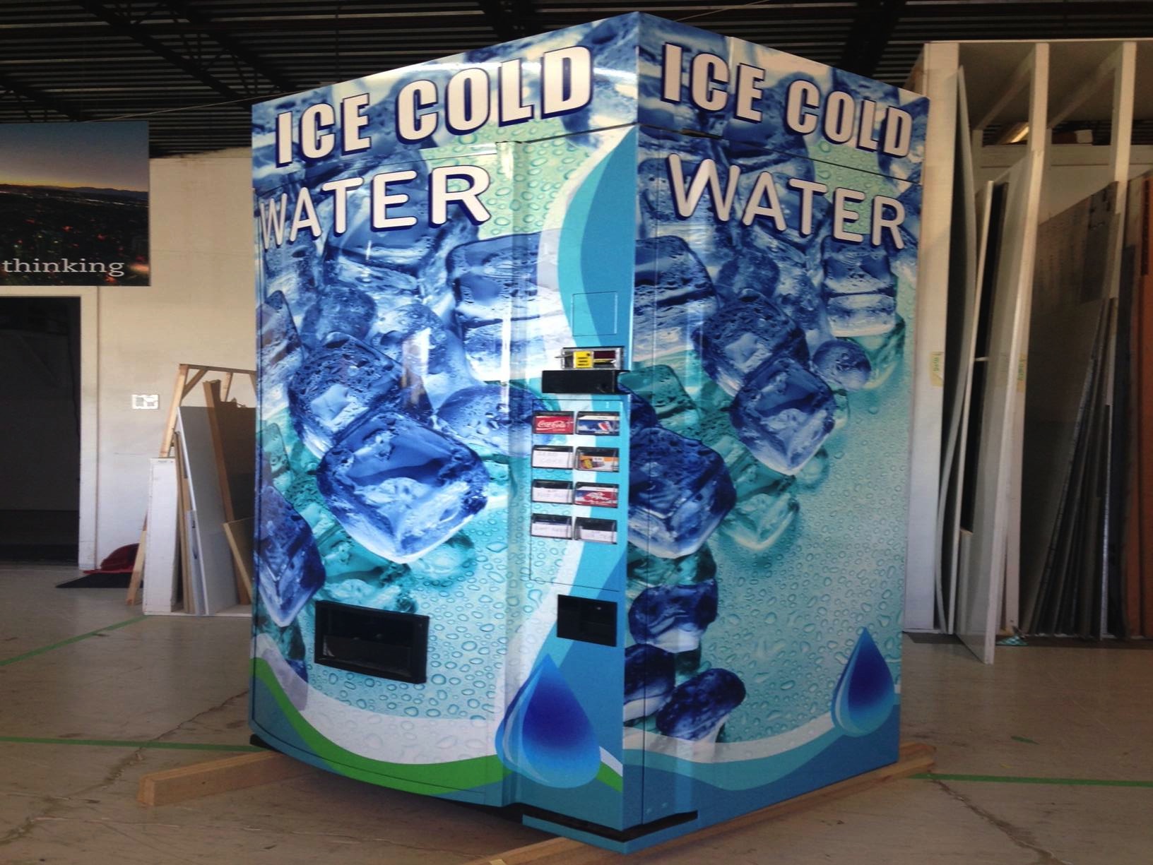
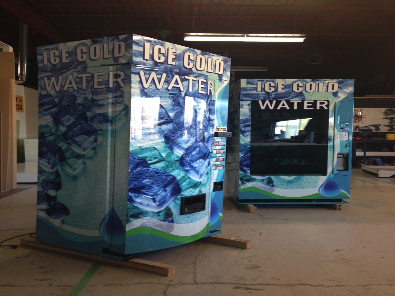
And here is the end result! My very first very big and very real-life package design project:
image001

image002

image003

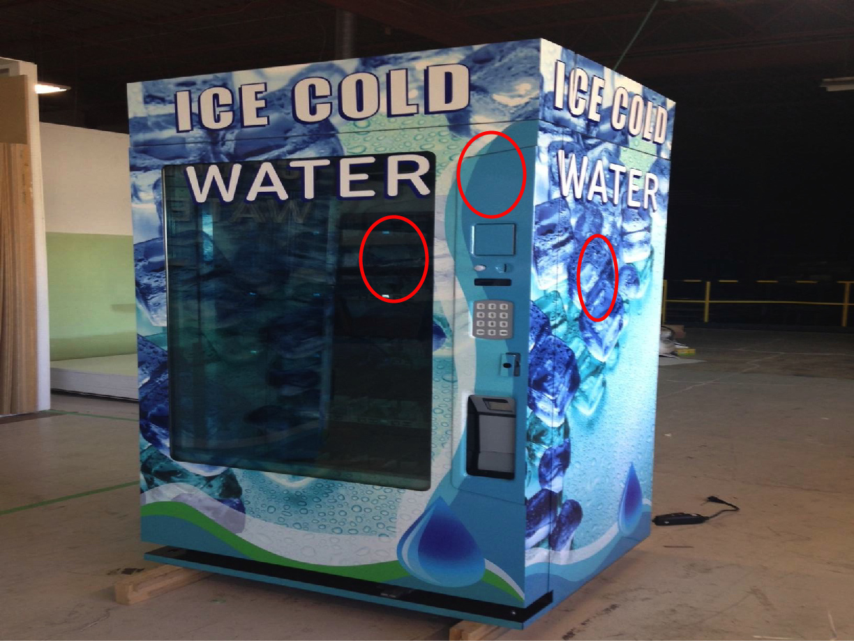
Later, the client asked for a price decal to be applied to the following circled areas:

circles

Here is what the price decal ended up looking like:

Droplet - $1

This was a really exciting, and really scary project just because of how new I was at design. But, I always say yes to a project that I think I can learn from, and this one presented a big learning challenge. It is fun to look back and see how far I have come with my design knowledge.

I didn’t originally blog about this project because I wasn’t sure if I really liked the final outcome of it. Of course there are things that I would have done differently if I had this project now, but I am very happy for this first job and how cool it was to work on such a large object, having only completed one year of school! Yay!

I keep thinking about doing the water bottle labels, just for a fun package design exercise. We’ll see if I can make time!


TEDX Vancouver 2014

0Y6A5172

Last weekend I had the extremely good fortune of being given a free ticket to TedX Vancouver. The theme of the event was TILT. It was overwhelming and awesome and I got to help out at the photo booth, which was great fun, helping people come up with their “TILT moment,” which is basically your most memorable moment during TedX. Here was mine:

0Y6A5241

For most of my adult life, I have had a familiar face. I have been been told by many, many people that they think they have met me before, or they ask if I have a sister, or even one time a person I didn’t know approached me at a party and started talking to me, thinking I was someone else.

The lady on the right was the one that thought she knew me from somewhere.

The lady on the right was the one that thought she knew me from somewhere.

So while I was volunteering at the photo booth, these two really nice ladies walked up and one of them asked me if her hair was alright, before getting her photo taken. I told her she looked great. After the picture we ended up all standing around and chatting for a while afterwards, and the hair woman just kept looking at me and smiling. She finally said she was sure we had met before, but she didn’t know where or when. I told her that I had lived in Vancouver for twelve years until 2010 and had just moved back recently, so I wouldn’t be surprised if we had crossed paths at some point. We never were able to figure out how we know each other, but I just loved one thing she said to me. She said, “I am certain that I know you from somewhere, and I know this because you don’t look like anyone else.”

What a cool thing to say to someone! That really stuck with me, because I have always been told I look like someone else, it was super awesome to hear someone tell me I don’t look like anyone else. I thanked her for the compliment! Even as I write this I am smiling! I wonder if anyone reading this knows her.

At TILT, artists were scattered throughout the building, doing collaborative paintings (“artist mash-ups”) and of course all of the speakers were pretty amazing. Especially, for me, Victor Chan, who was irreverent and hilarious, almost to the point of making the audience slightly uncomfortable (or I was, at first). He spoke about mindfulness and having the ability to control his body, even the amount that he sweats, through meditation (because he said he hates doing laundry. haha). Victor also told an amazing story of being kidnapped in Afghanistan in the 1970s, being told that he was going to be raped and killed, and then the truck he was being transported in crashed on an icy mountain road, leaving only himself and two other kidnap victims alive. This was not the focus of his talk, though, he was more interested in speaking about mindfulness and meditation. His delivery was dry and absolutely hilarious.

I unfortunately didn’t catch any shots of the inside of the theater, but I will leave you with a few shots of the amazing art collaborations that were going on. It was a very inspiring day. And maybe, just maybe, I will get some help remembering whether I actually know that lady from somewhere in my travels.

0Y6A5198

0Y6A5176

0Y6A5214

0Y6A5223

0Y6A5224

0Y6A5253

0Y6A5289

0Y6A5264

0Y6A5257

0Y6A5255

(Photo credit: Erik Ferguson)


Outstanding Rebranding!

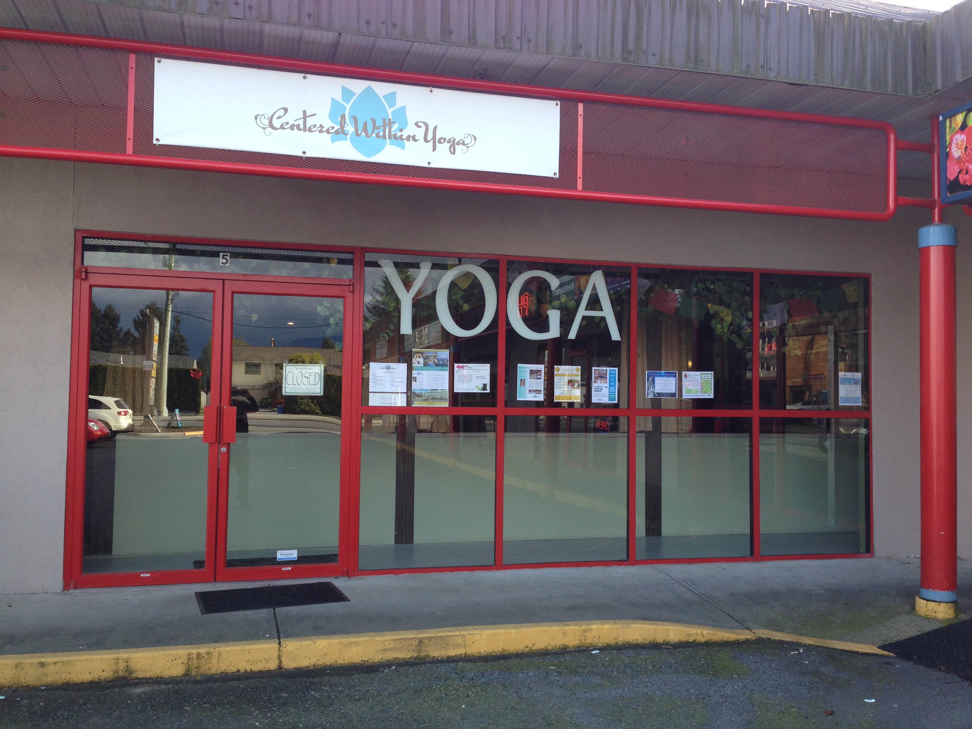
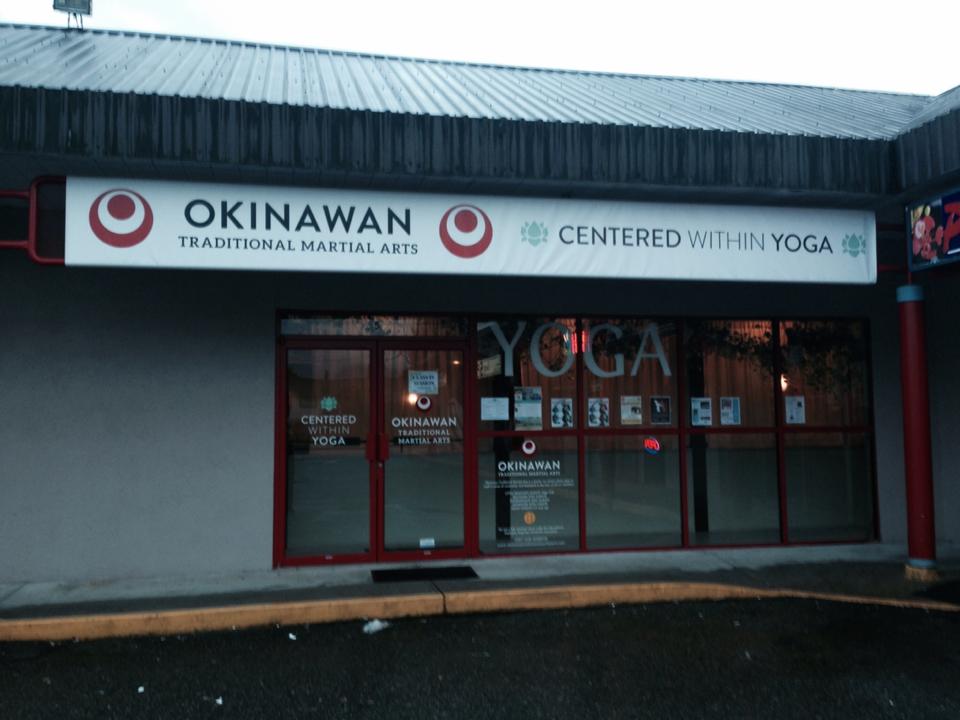
Back when I was still in school, my friend Erik contacted me to ask if I could do a logo and some signage for a yoga studio (Centered Within Yoga) that also doubled as a karate dojo (Okinawan Traditional Martial Arts).

The reason this project sounded like so much fun is that the people who run the studio are so cool and happy, and they seemed to trust my creative ideas. This can make the hugest difference between a fun project and a not-so-fun one. So, I incorporated the project into a class at school so that I could get credit and also get paid at the same time, which I thought was pretty smart.

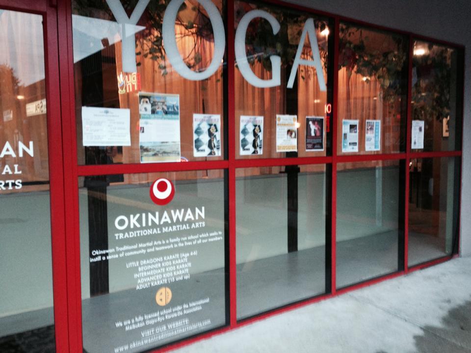
We have just finished the exterior signage for both storefronts (the project ended up growing a bit, and that is why it has taken a little longer to complete), and I thought I would share!

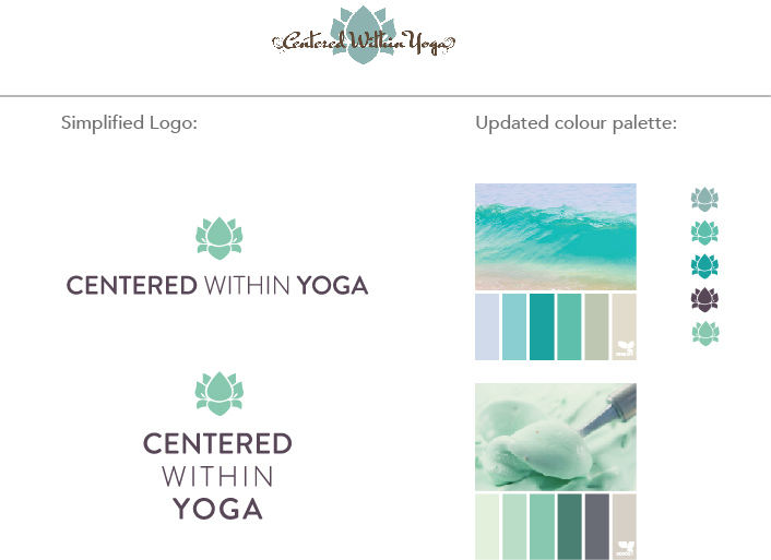
The logos both needed a more simplified treatment. For Centered Within Yoga, the client wanted to keep the lotus, but we opted for a san serif typeface that would be easier to read from the street view exterior of the building. Although we didn’t want the logos to be too matchy-matchy, we wanted them to family together a little better.

The updated logos and color palette(s):

CenteredWithin-branding

The logo treatment was a little trickier with Okinawan, as the yellow crest is a traditional martial arts crest and so to alter it too much would be disrespectful. We opted for a slightly simplified version of the crest (#4 below), and the red and white Okinawan flag for the main logomark.

Okinawan-logos-ideas

Here are the final logo treatments we went with, which we chose for their simplicity and optimum street visibility:

Okinawan-logo-final

CWY_logo_vertical

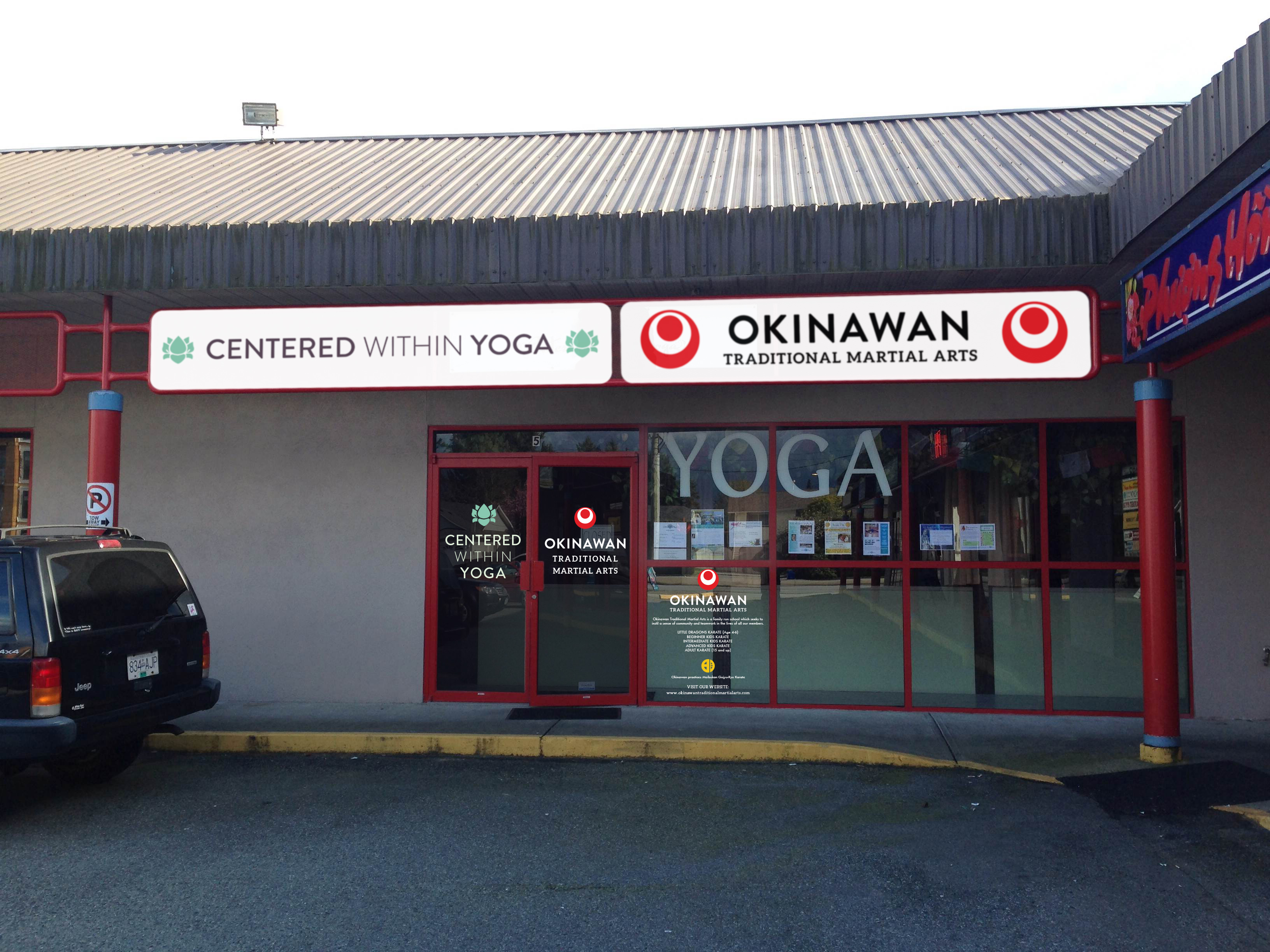
Back in March, I provided the client with a photoshop comp of what the exterior signage would look like after completion:

Shopfront-mockup-2

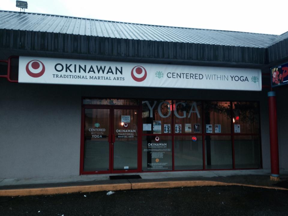
And this is the actual completed project!

10726378_10152362788691962_1671801689_n

It’s really fun for me to look at the before and after.

photo2

We branded the heck out of that storefront!

10728785_10152362788306962_509096302_n

10728916_10152362788546962_1424854468_n

10735714_10152362788486962_698388080_n

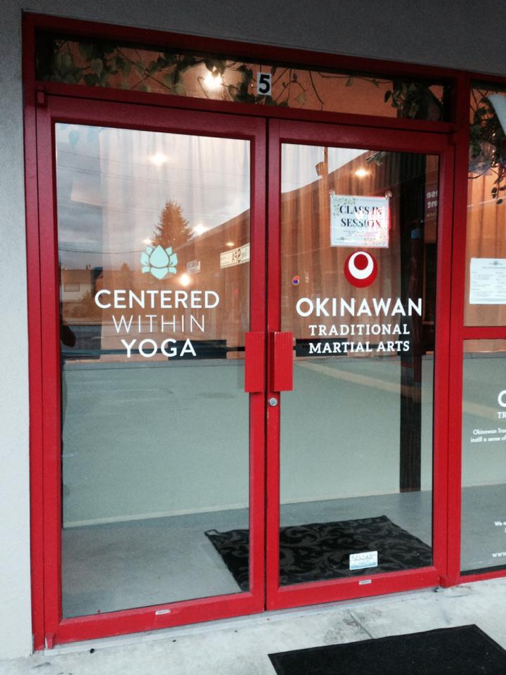
I’m particularly happy with how the decals on the doors and windows turned out.

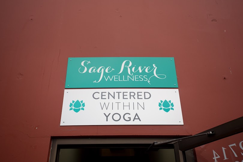
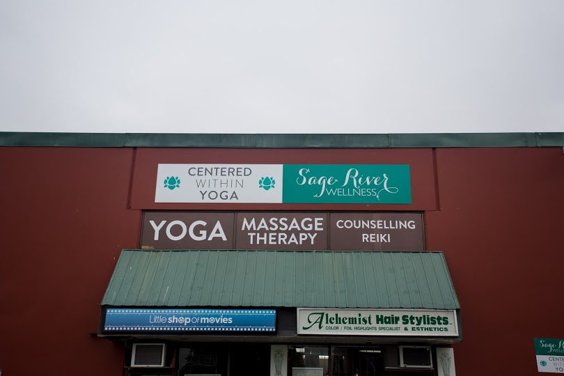
Then I did the signage for the second location. Although I can’t take credit for the Sage River Wellness logo, I did set up the signage for them (file set up, color palette and production), as well as the decals for the windows that say yoga, massage therapy, counselling and reiki.

0Y6A5019

0Y6A5016

0Y6A5005

This was a very fun project, as I love to see my designs out in the real physical world! I hope to work more with these clients going forward, on their promotional materials (mainly posters and flyers) and their business collateral. They were great people to work with!

This blog entry wouldn’t be complete without a big shout-out to Erik Ferguson, who not only helped me get this job, but acted as a terrific advocate for my creative ideas, and offered tons of second opinions and helpful feedback. Many thanks to you, Erik!!


Design Thinking for Social Innovation

If I’d asked my customers what they wanted, they’d have said ‘a faster horse.’

– Henry Ford

Last week was the first week of our Human-Centered Design course (provided by ideo.org and +Acumen). We were tasked with finding a group of 4 people, and to come up with a name and a logo for the group. We were so excited when we finally decided upon the name Rascal Studio and wrote a little mission statement, which I think encompasses the fun and playful vibe this group seems to have.

The Rascal Studio mission statement is:

We are Rascal Studio, made up of four Vancouver-based rascals who went rogue. We believe in bringing clever ideas to drive social change in our community and around the globe.

Yes, it rhymes.

I had only met one of my group members before (at Wordcamp Vancouver this summer) and we had kept in touch through Facebook. She is a graphic and web designer named Amelia. When I learned about the course, I got pretty excited and contacted Amelia right away to ask if she wanted to help me form an A-Team of terrific people to complete the course with. She said she had two people in mind for this almost immediately, and she asked them and they both agreed to join us. Obviously I was nervous, never having met the two other people, but I could not be more happy with my fellow group members. Rascal is made up of myself, Amelia, Jen, and Susan.

Here are some pics of our first A-Team meeting for happy hour brainstorming at Rogue Wet Bar:

IMG_2123 IMG_2125

Just a little about human-centered design, because I wasn’t sure what that meant until last week:

Human-Centered Design is design that is used to create innovative, effective and sustainable solutions for social change. It’s a process that starts with the people you are designing for and ends with new solutions that are tailor-made to suit their needs. As you can imagine, this process relies upon tons of user-testing, and sometimes both the problem and the solutions might change several times throughout the iteration process. It requires a deep knowledge of and empathy for the people you’re designing for, generating tons of ideas, and building and testing a bunch of prototypes. This design process can be applied to products, services, spaces, or systems. It is essential that we gain a deep understanding of the people we will be serving — not only what they need and desire, but what limitations they face, what motivates them, and what’s important to them.

Some examples of Human-Centered Design problems might be:

  • How might we design a cookstove that reduces the amount of smoke inhaled by a person while cooking?
  • How might we design new services engaging low-income parents in after-school education for their children?
  • How might we design hospital waiting rooms to mitigate the transmission of airborne diseases?
  • How might we redesign the common areas of a community housing structure to engage connecting and cooperation among neighbors?
  • How might we design a system linking social entrepreneurs from around the world?

One of the limitations or weaknesses that we could see with this design method would be that it probably isn’t very budget-friendly, and also solutions would have to be quite culturally-specific. Where to focus our efforts is an interesting dilemma, and opened up some compelling debate about whether we should focus on local issues or seek out issues in other countries that we feel may be more in need of help. We don’t have to decide right away, as we will be working on smaller assignments first.

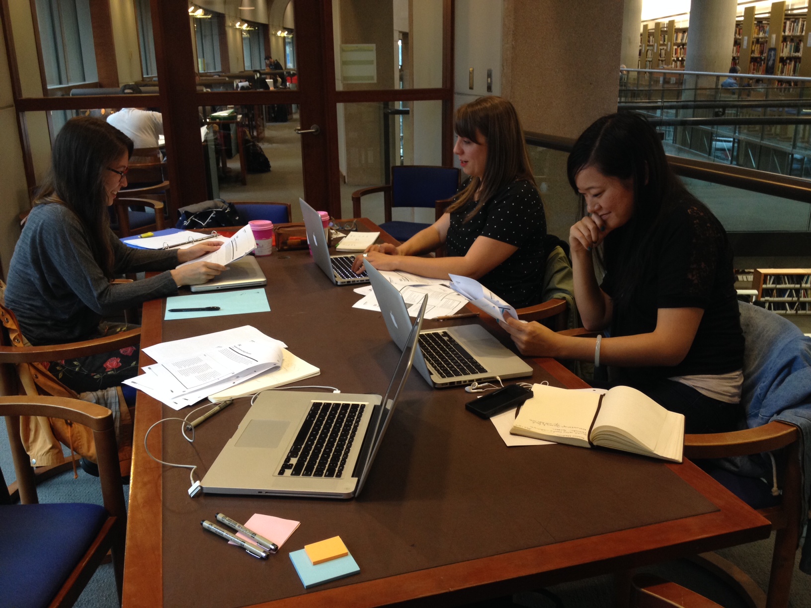
For our first workshop, we congregated at a meeting room at the Central Library.

Our little meeting room.

Our little meeting room.

The study group that will take on the world!

The study group that will take on the world!

Our first mini-assignment was to design a better commute. We went around the table and each shared some nightmare commute stories, and we realized pretty quickly that a lot of our stories involved incidents where our personal safety had been compromised. This led us to brainstorm on what would make a safer transit experience.
The top three needs that we felt would contribute to a better commute were:

  • Better transit safety & security
  • More regular busses
  • Better access to bus wait times (anticipated arrivals)

We came up with an idea for an app that would act as a fare card, and would provide GPS tracking information and specific bus location information, up-to-date bus schedules, street view, and emergency response functionality. In the event of an emergency, the app would notify transit security of your location and respond immediately. We thought it might also be useful to have the app connect to ferry and train schedules and information. There could be a section to add frequently used busses to a “favorites” list, that could notify you when your bus is close.
I had a chance to look at the existing Translink app, Next Bus, which provides bus departure information in real time, and it is quite limited.

We didn’t have time to prototype our app, but it was fun brainstorming ideas for it. I think the process helped us all get fired up about human-centered design, and get us thinking and ready for our next assignment this week!

Graphic Design extraordinaire, Jen!

Graphic Design extraordinaire, Jen!


TIM & ERIC’S AWESOME NEW GE AD, GREAT JOB!

This new G.E. ad is a perfect combination of three things I like very much: Tim & Eric, app-controlled devices, and Jeff Goldblum. Introducing the new GE smart bulb called Link!

https://www.youtube.com/watch?v=egIY7ushchU

Also, it is super funny. I love how weird it is, plus it made me laugh pretty hard. I am kind of surprised G.E. agreed to do it.

I usually find this style of advertising really corny and unfunny. For example, I didn’t like the OldSpice Guy on a Horse (“The Man Your Man Could Smell Like”) or the Mr. Wolfdog commercials because I felt like they went overboard on the cheese factor. But now I think maybe they didn’t go overboard enough. The ads that are directed by Tim & Eric push the boundaries even further, and the concept enters into the territory of bizarre and slightly uncomfortable.

Here’s a compilation of the Old Spice ads directed by Tim & Eric and starring Terry Crews, which I find disturbingly delightful (be prepared for some yelling and weird stuff):


Design Wedding Bells

I was recently approached by my friend Josephine, who asked me to design a save-the-date and invitation combination to let her friends and relatives know about her upcoming wedding next summer. She wanted it to be low on paper waste, so we combined the save-the-date and the invite in an effort to get people to RSVP on the website only. I was super excited, because knowing how playful and fun Josephine is, I knew this would be a fun project. Also, I’ve never done any wedding design before, so I was super stoked about the experience. I will also be setting her up with a WordPress site with RSVP functionality in the coming month or so.

Josephine said she wanted a color palette that is “vibrant and retro” and she wanted something playful and whimsical. Other than that, I had not too many other guidelines. She gave me complete creative freedom, which was so much fun! I knew that she likes orange and green, so I based my color research on that, and found this color palette at Design Seeds:

ADoorHues_8

The plan for the wedding is for it to be a very casual camping weekend in Alberta, and she said she wanted a VW camper van theme, which I was skeptical about at first, but thought could be really cute and fun.

Here’s what I came up with for the final electronic version:

Jo & Tony's Save-the-date

Josephine loved it so much that she has asked for postcards as well! (Which will mean changing the dimensions a little bit.)

The illustration originally had a bunny where the groundhog was, but I replaced it because Tony loves groundhogs.

I have to give a shout-out to Michelle Booth, who has taught me everything I know about wedding invitations, save-the-dates, funky typography and ampersands ;). She is a design force to be reckoned with! I believe I was channelling her on this project!

Anyway, this is one of many projects that have been keeping me busy lately. I will post more updates on other projects soon!