/* SC_TH_END:4.0.3:ee51d1f6 */ BLOG – Page 306 – Leanne Padgett Design

Souvenirs Movie Poster

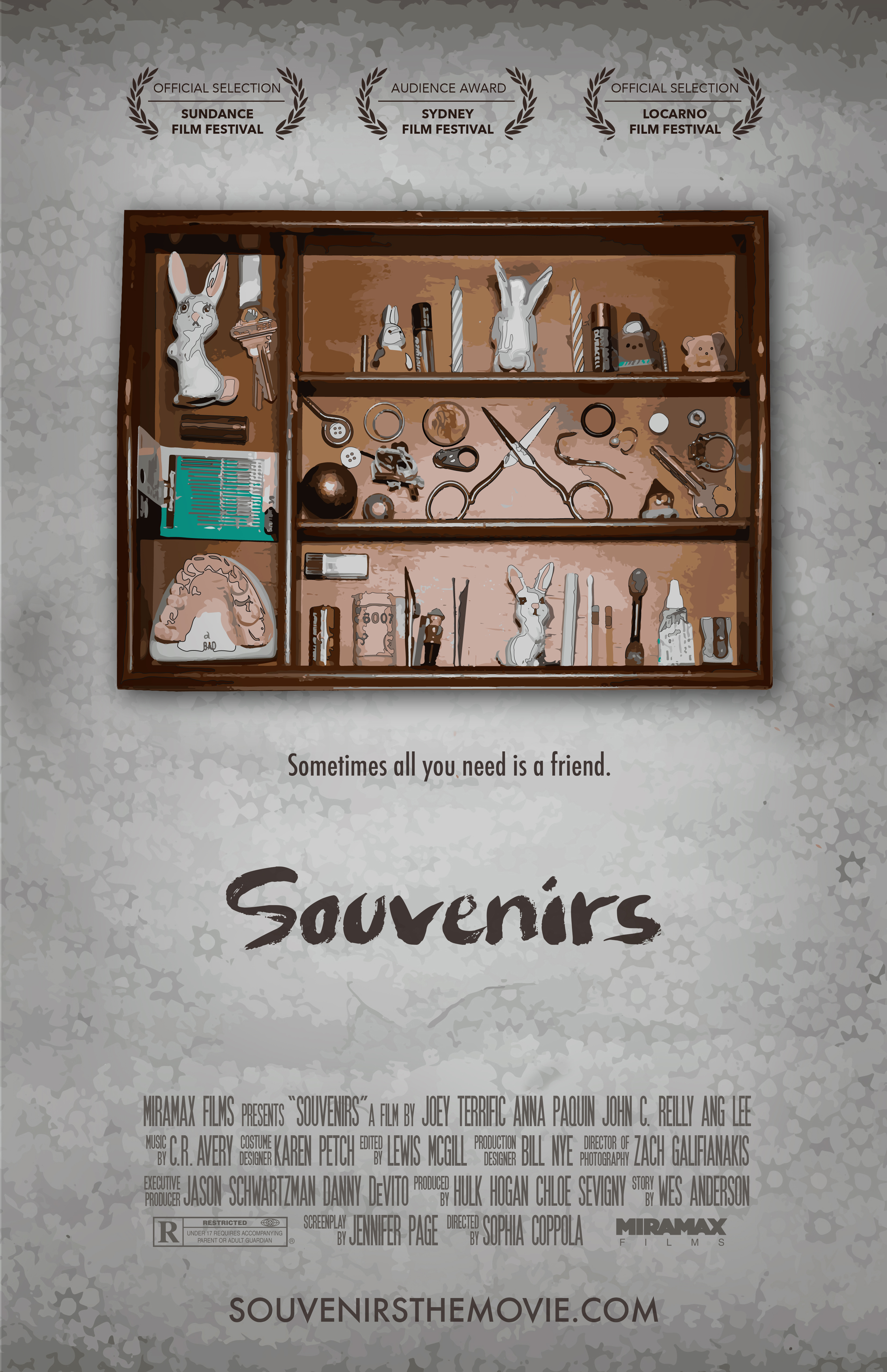
This is a movie poster I created for ad class. We were asked to come up with a one-word title that was a noun and use photo and illustration. In my brainstorming process I came up with way too many words (I love words) and ended up with a short-list of probably 15. I couldn’t make up my mind which one to use. On the day of class, I decided on the spot that it would be a movie called “Souvenirs” and it would be about hoarders.
SOUVENIRS

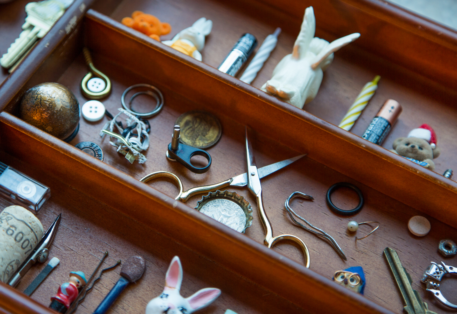
I had a lot of fun curating the objects on the “shelf” and coming up with a graphic solution for this poster. Turns out maybe I’M a hoarder because I found most of the items in my junk drawer at home (including the teeth), and the “wallpaper” is a piece of paper I had bought for another project from last year. The composition was photographed together in cool, very late (bordering on too late) afternoon light, using a piece of tin foil as a reflector. I then used Illustrator to manipulate it to look like a painting, and added the finishing touches in Photoshop. I was hoping to achieve a “paint by numbers” look, as if these objects were precious to the collector, but trashy and a little creepy to anyone else, to whom these items didn’t carry the same emotional attachment.

What surprised me the most about this project was the emotional connection I had with the composition. It took me several hours to curate the objects and several more to compose them in a way that I hoped would show the character of the collector. I sat for a long time looking at it and even left it for a day before photographing, allowing time for a few final adjustments. I even told my roommate that looking at this composition made me feel sad. I really hope that sentiment is translated to the viewer.

And here is a “the making of” photo 🙂
ElizabethOgle_LeannePoster2


Renton Campaign – video shoot

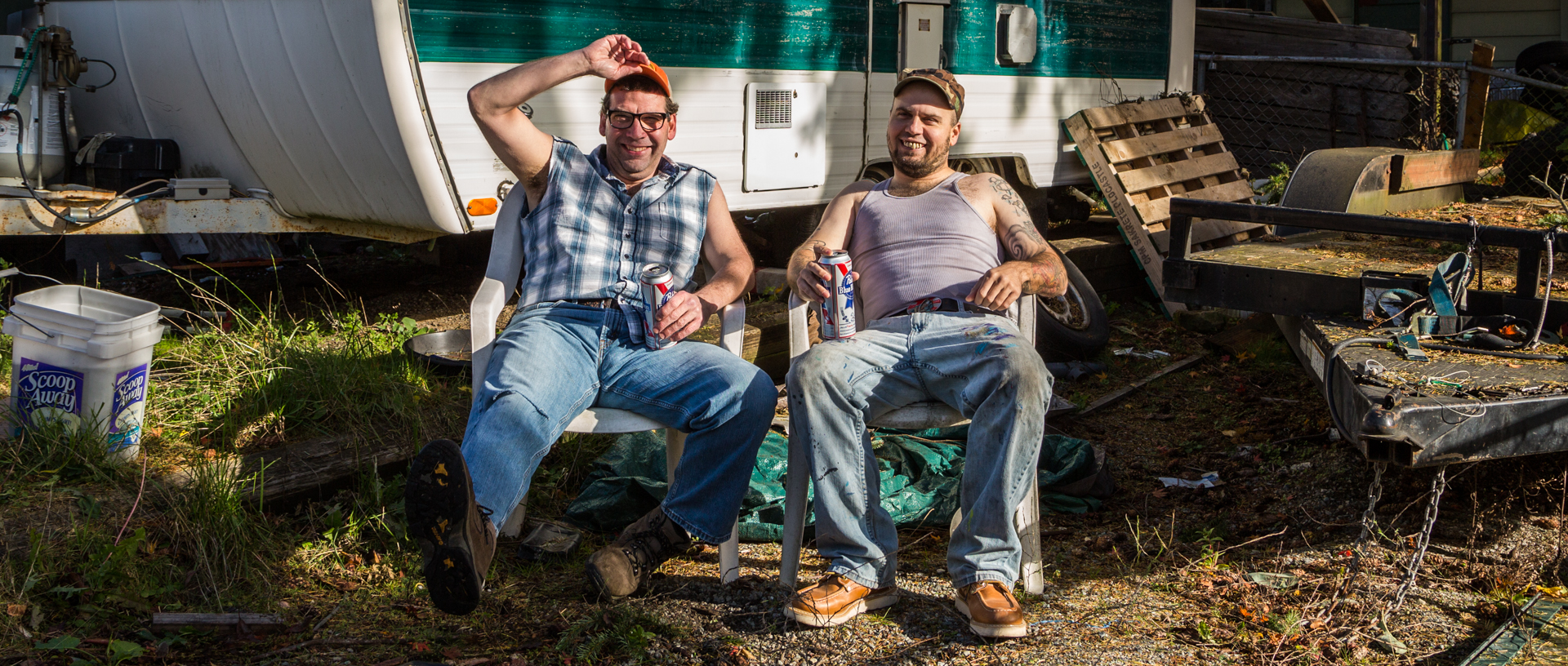
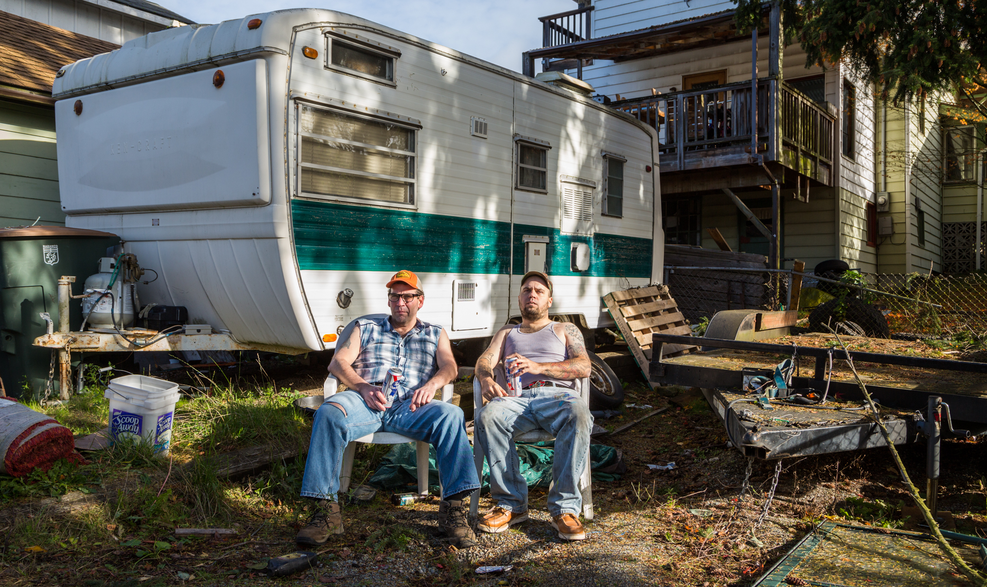
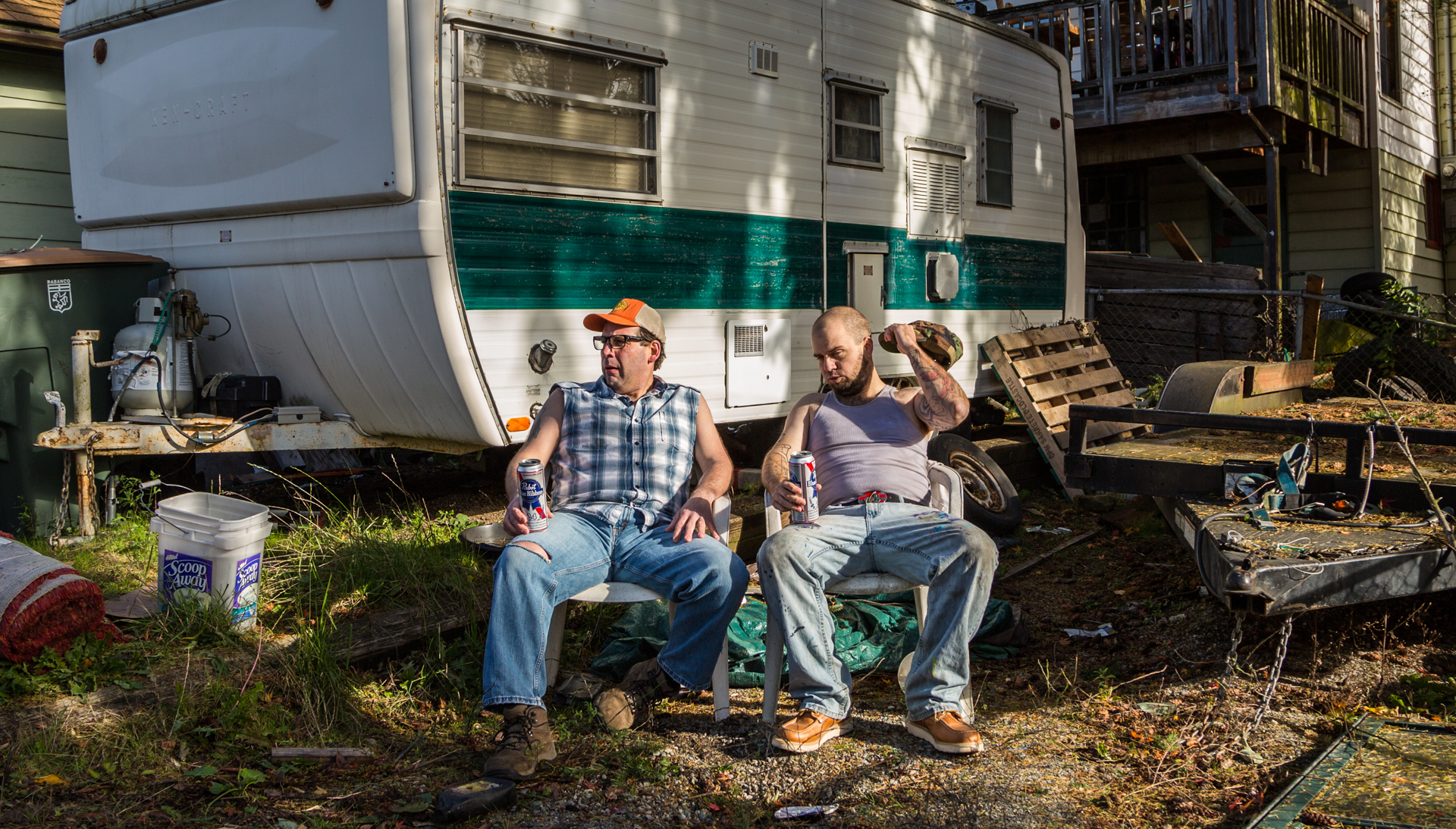
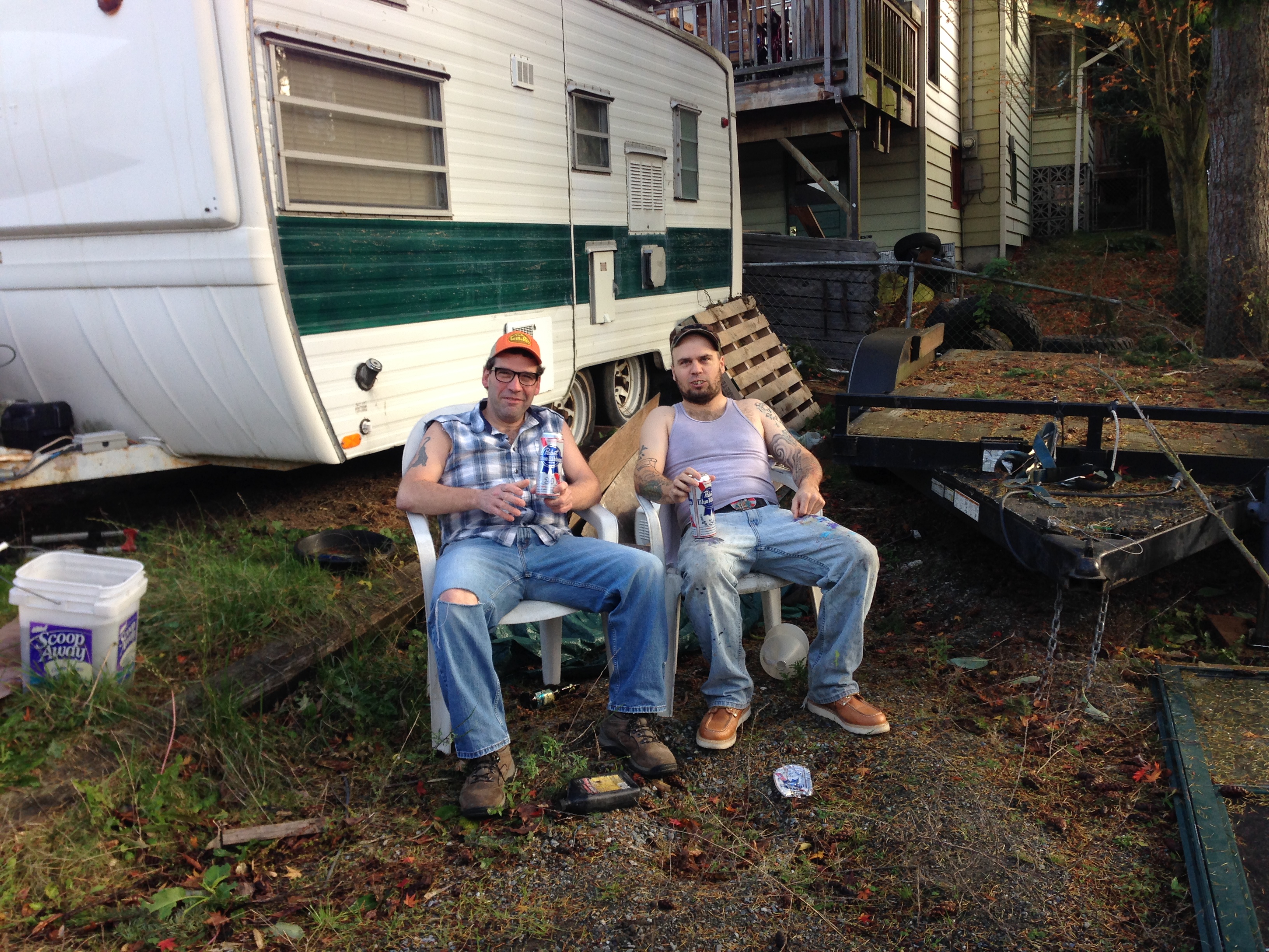
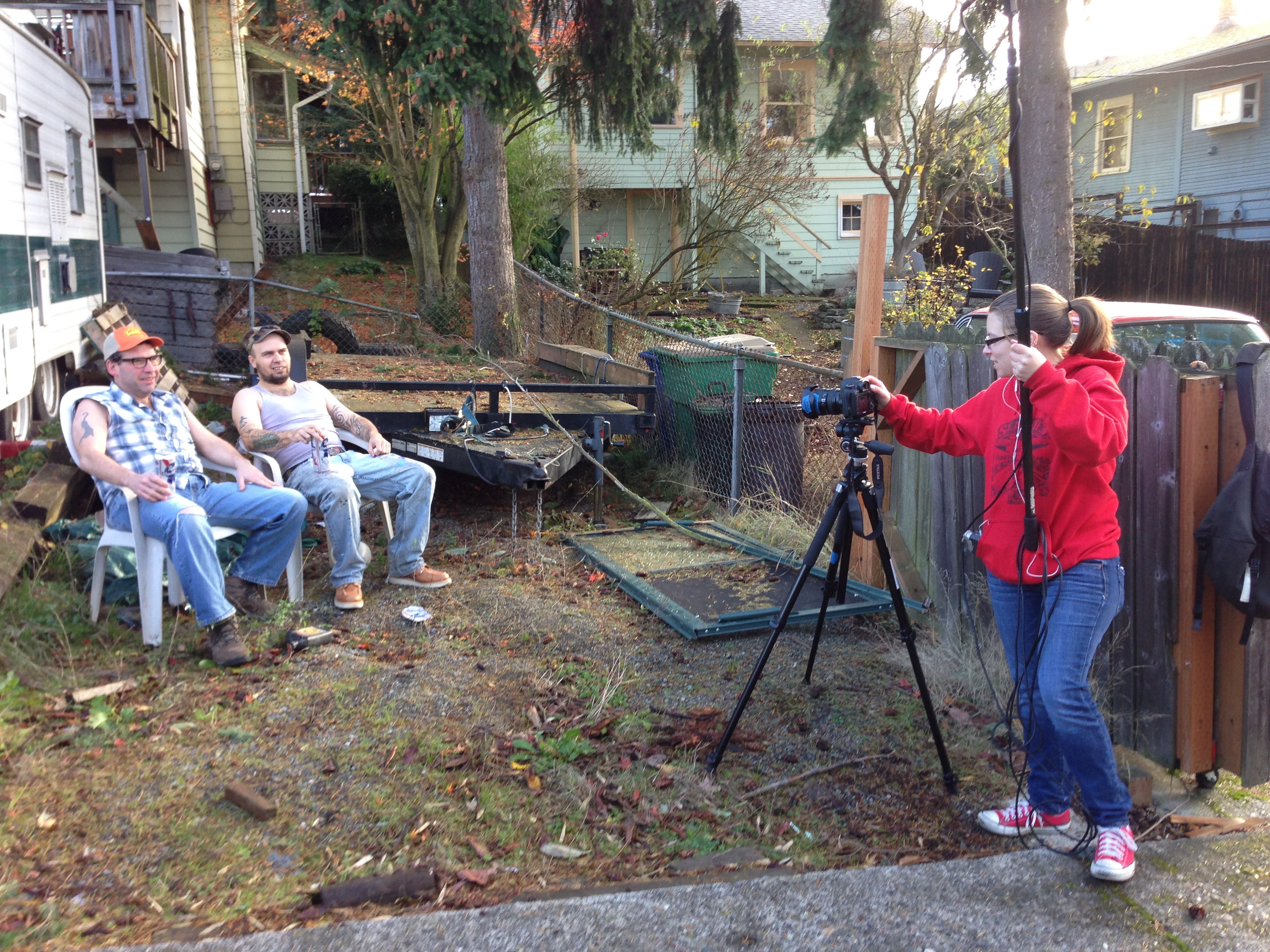
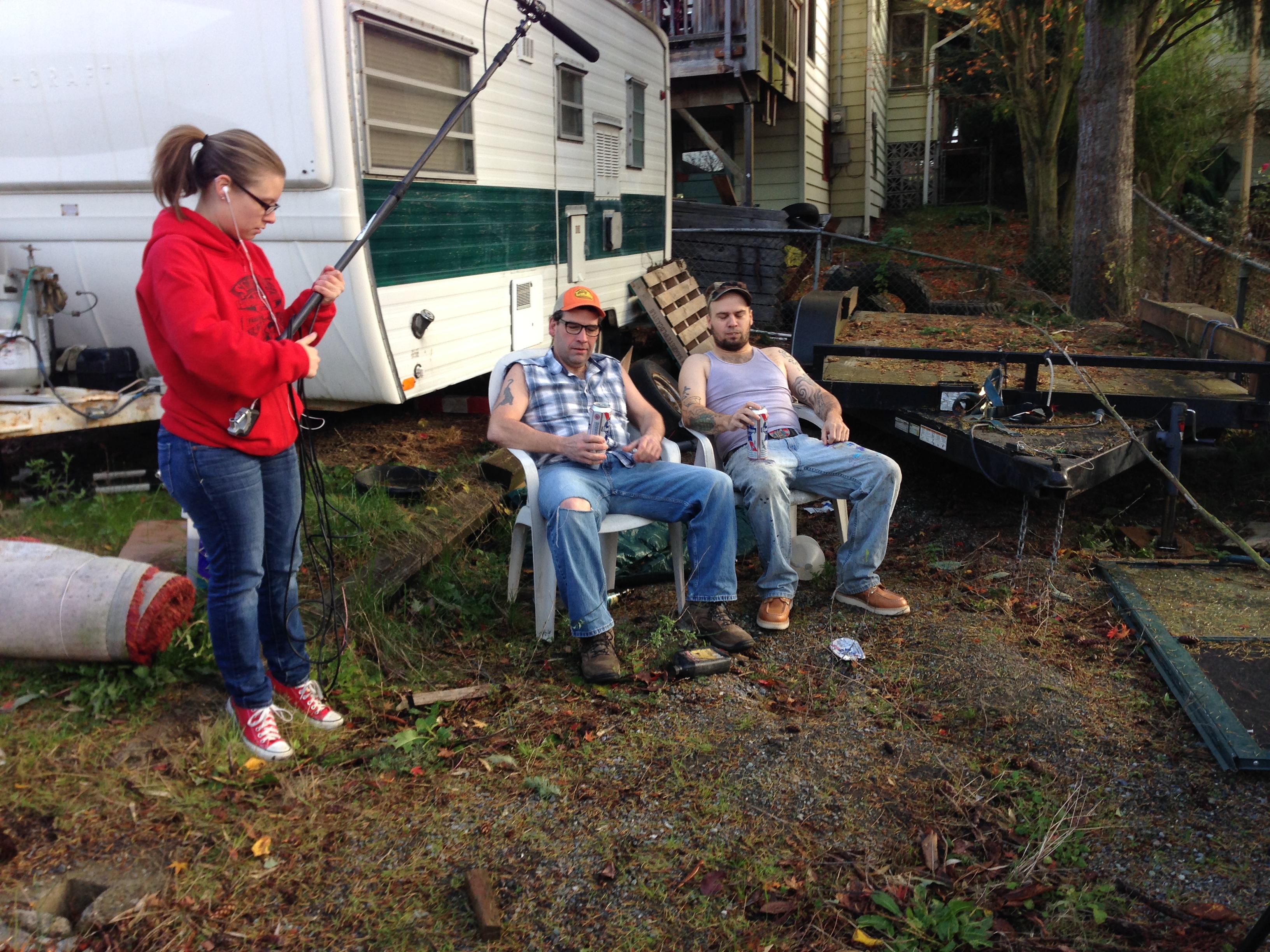
Well, we survived our Renton Redneck video shoot! The ads are busily being edited, but I thought I would post a few pictures from the shoot.

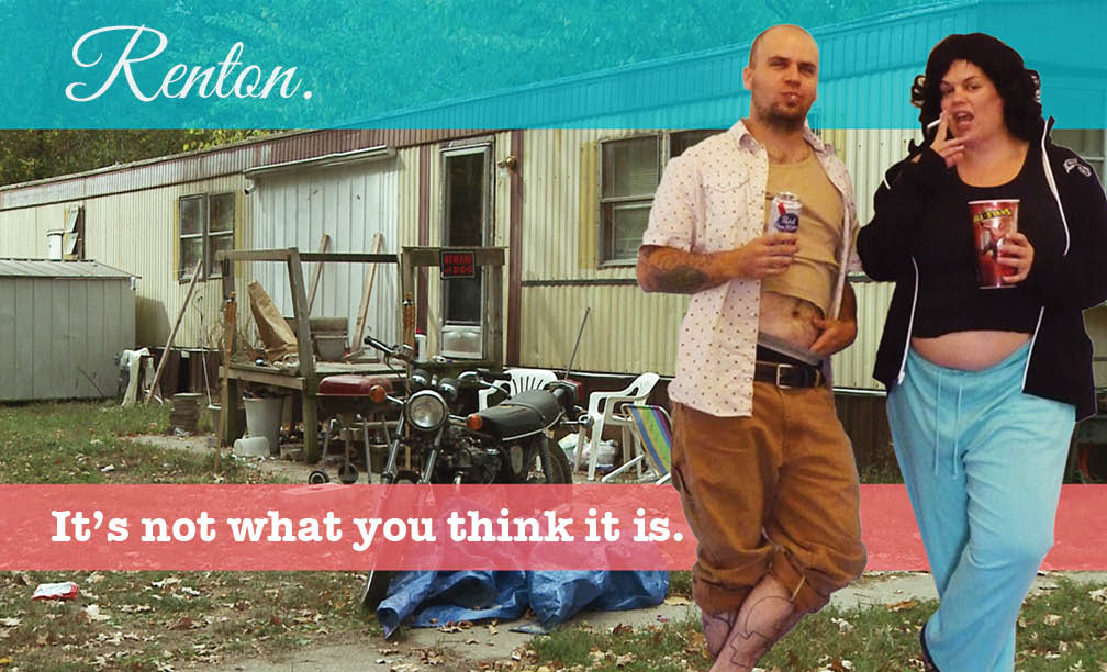
The fabulous and terrific Elizabeth Ogle scouted the most amazingly appropriate location that could not have been closer to my original ad comp. When I first showed her the below comp, she was like “hey! I know a place that looks like that!” Here’s a reminder of what we started with:

RentonPoster-M&C


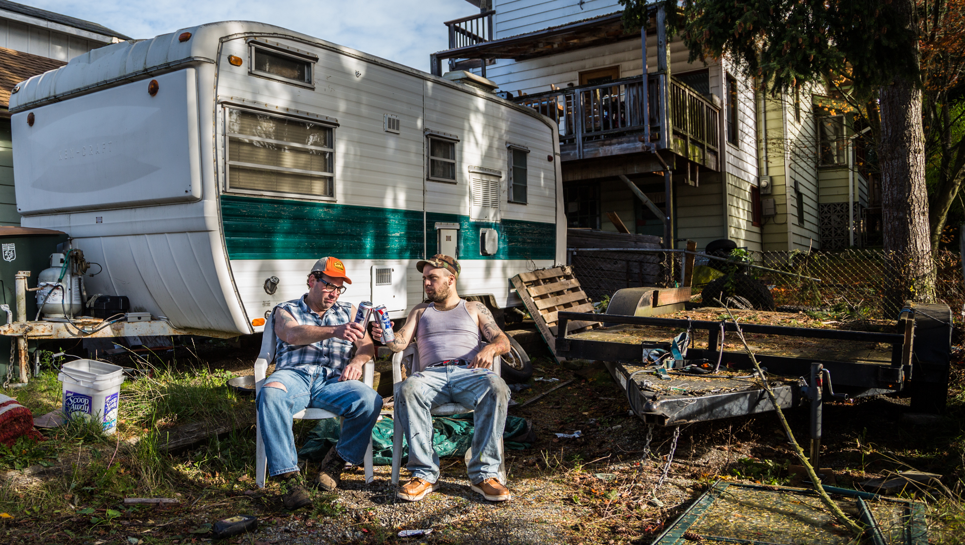
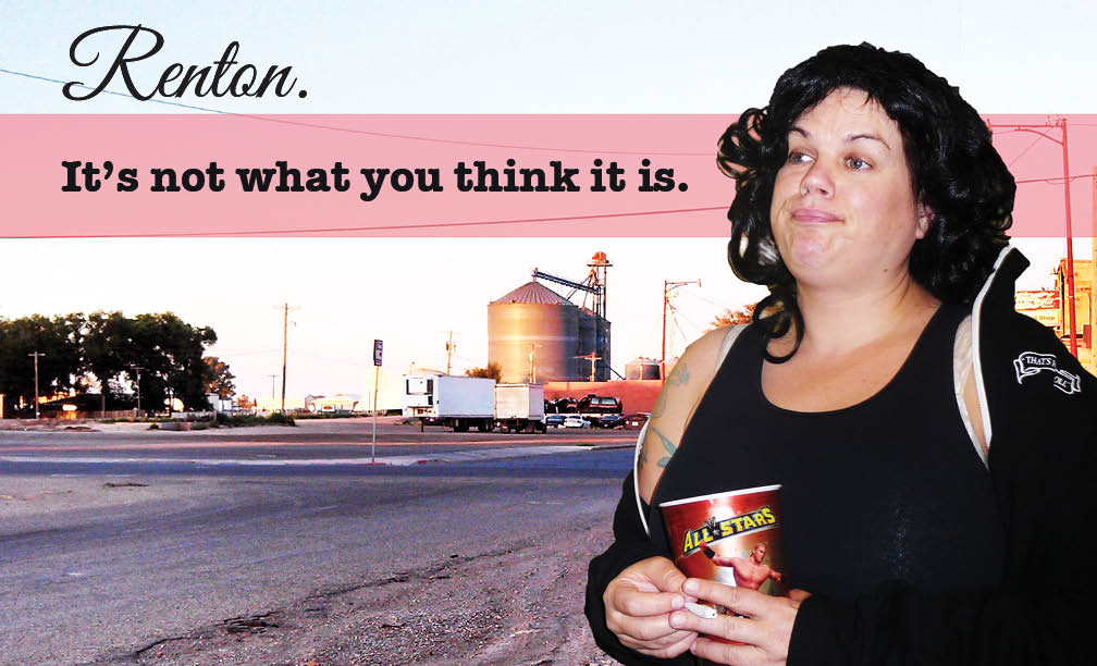
And what we ended up with:

ElizabethOgle_LeannePadgett_RentonRednecks


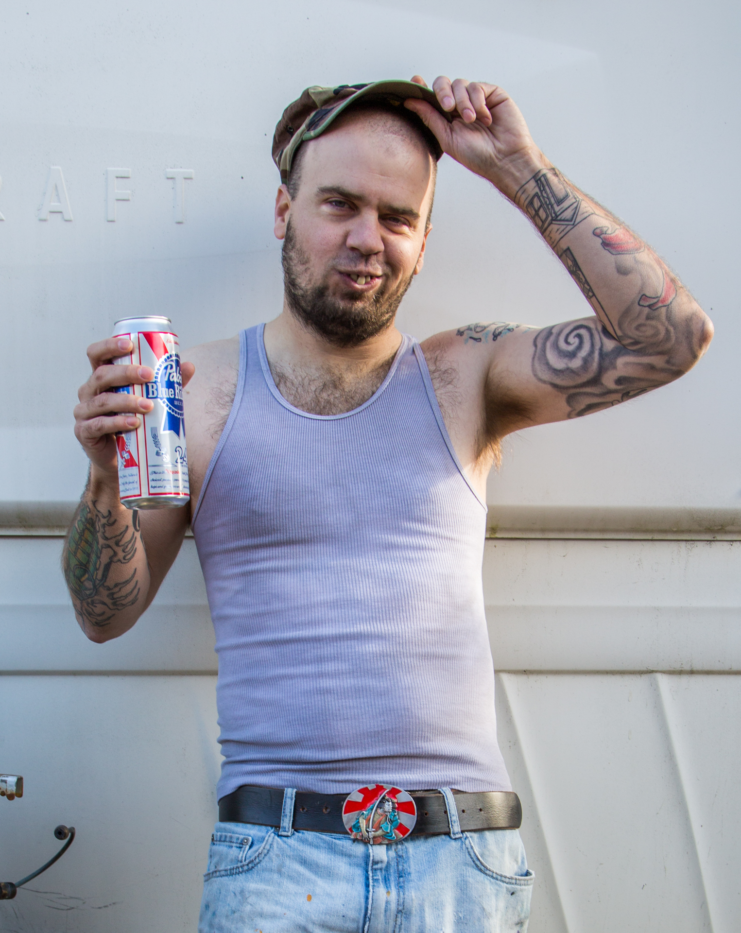
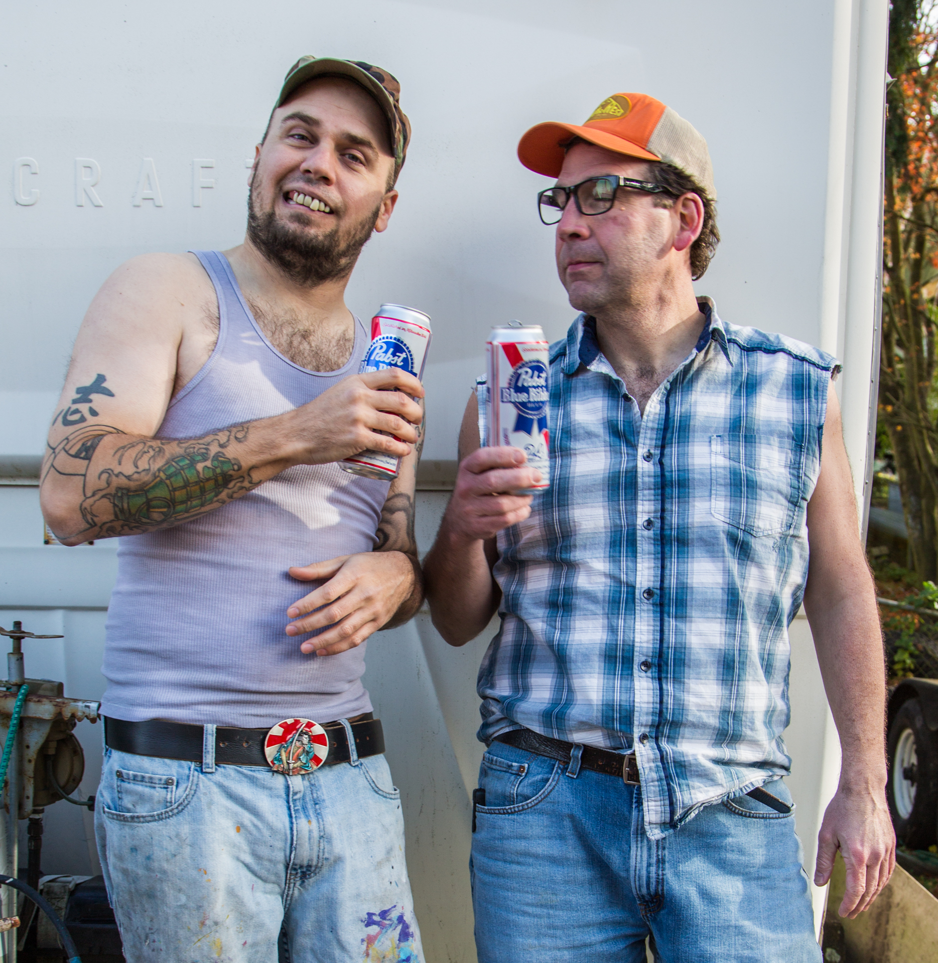
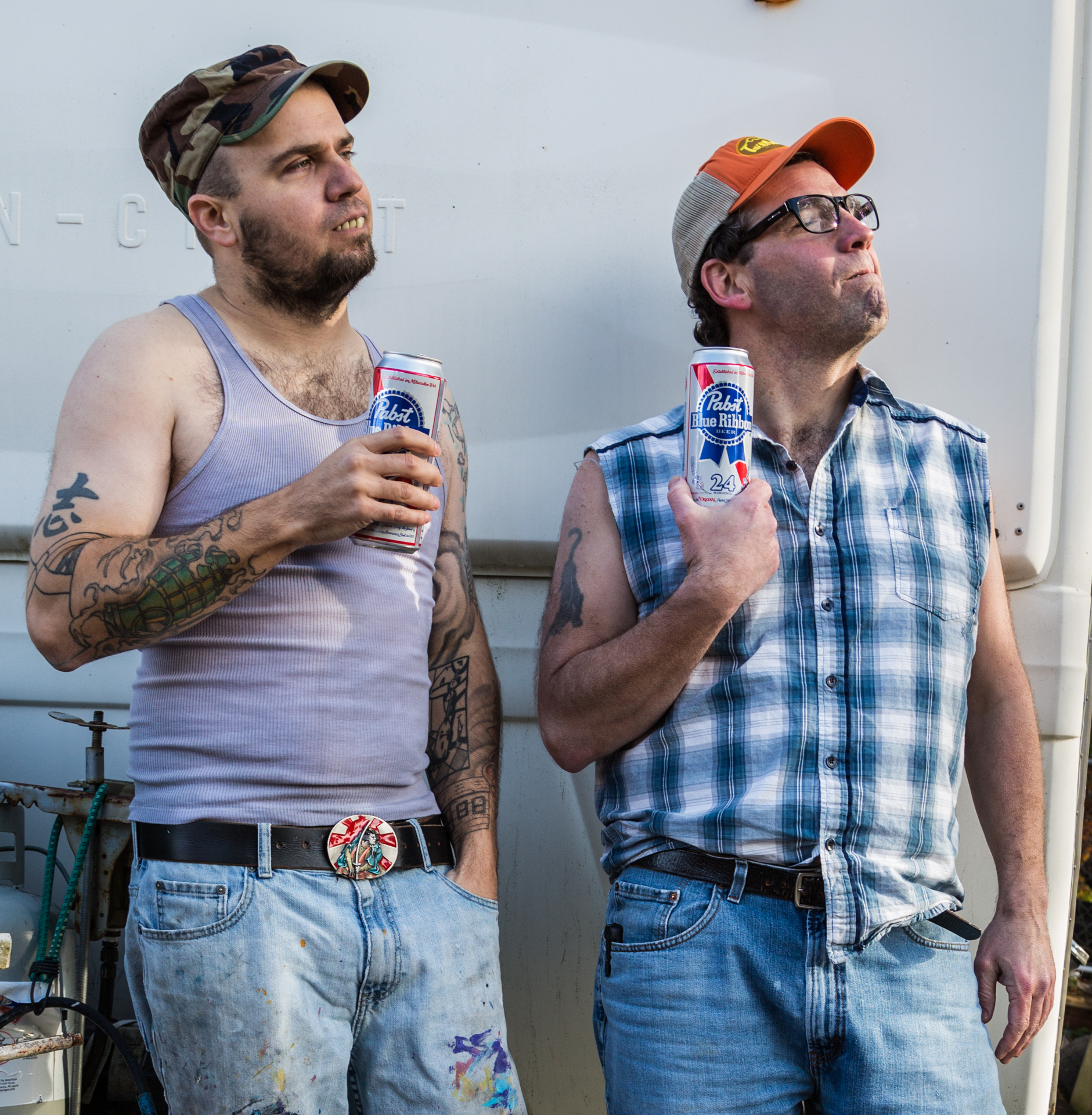
The original idea was to have a guy and a girl who were playing a couple, but our female actor had another commitment. We thought we would have to settle for one guy for the shoot, but we found him a buddy!

ElizabethOgle_redneck_whitebackground-2ElizabethOgle_redneck_whitebackground-3

The video is hilarious and I couldn’t stop laughing while we were shooting. What a fun time we had.

For now, feast your eyes upon a few stills… video to come soon enough!

ElizabethOgle_LeannePadgett_RentonRednecks-3 ElizabethOgle_LeannePadgett_RentonRednecks-4 ElizabethOgle_LeannePadgett_RentonRednecks-2

ElizabethOgle_redneck_whitebackground-4 IMG_3218 IMG_3221 IMG_3220


Hermit Kingdom Wildfire

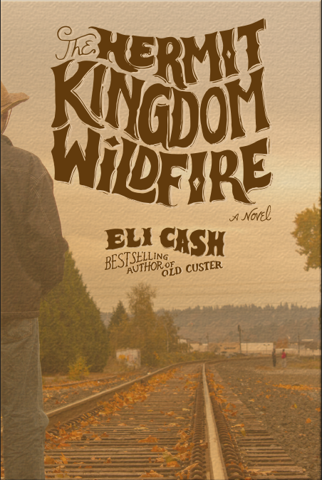
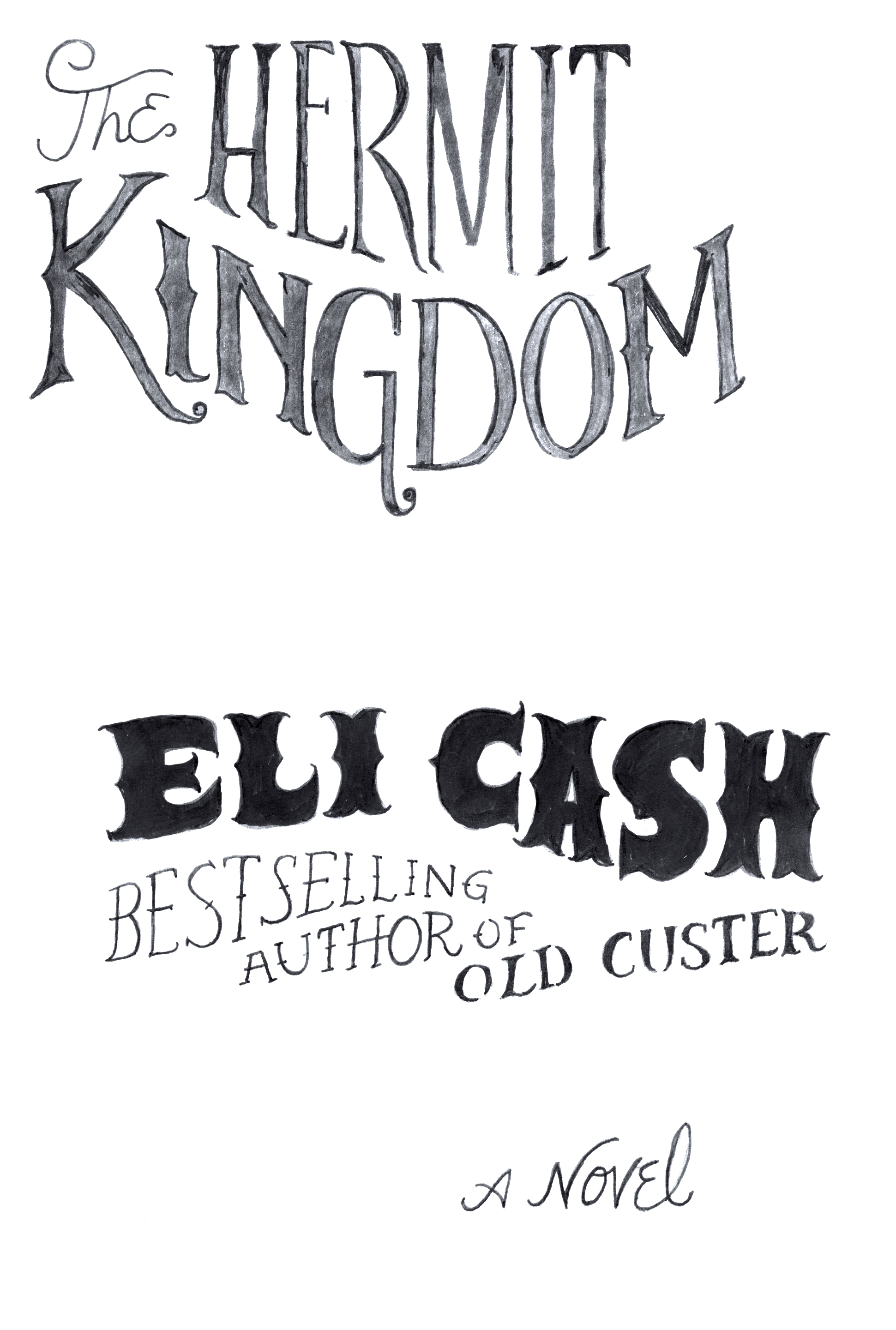
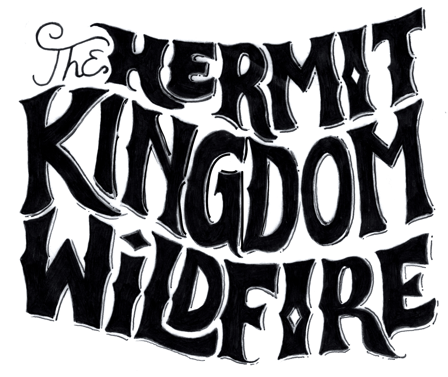
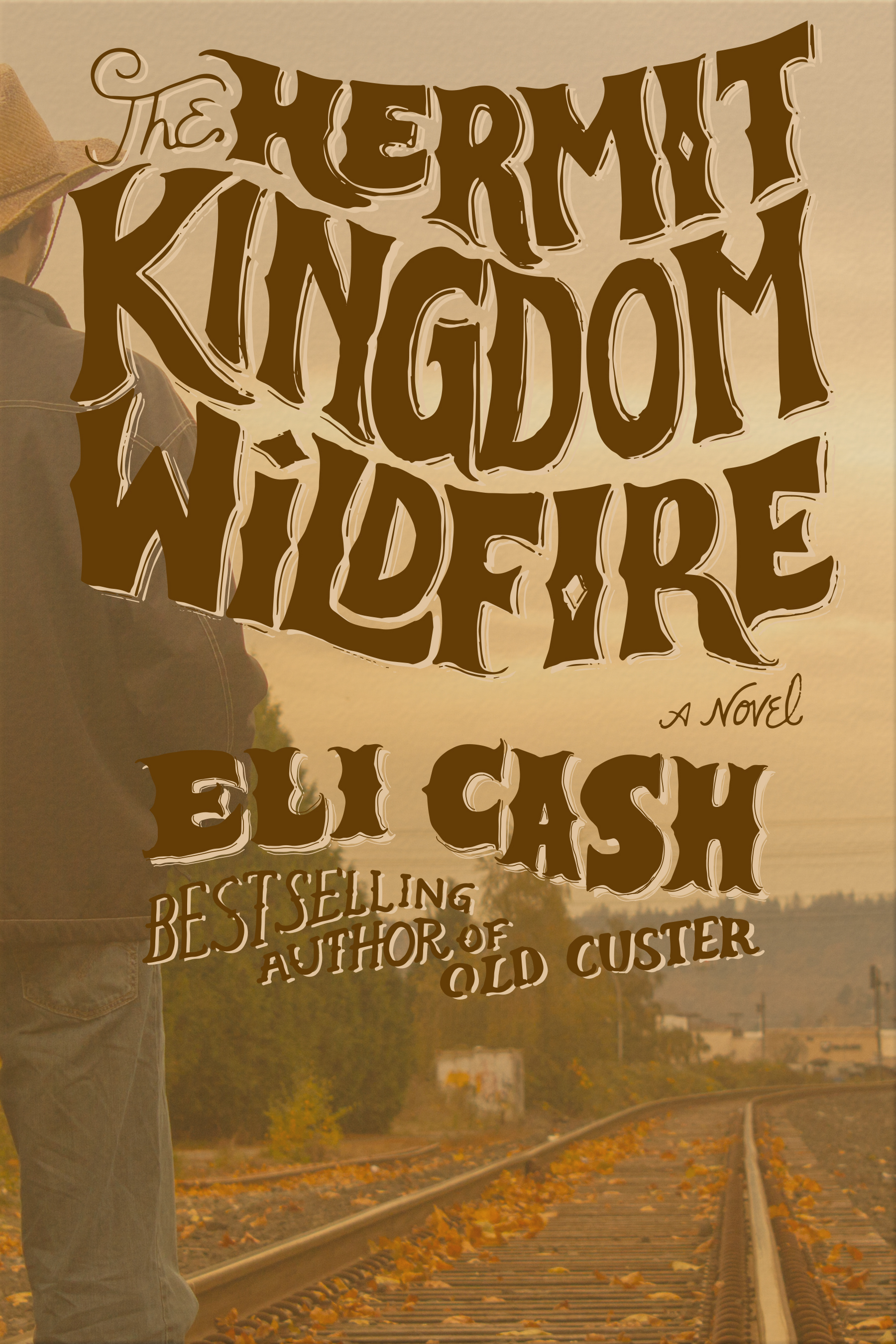
Introducing Hermit Kingdom Wildfire!! This is the final version of my layout for the book cover for my Art Direction class. The assignment was to shoot a photo ourselves to present to a theoretical client to show our idea for a book layout. Upon approval of this mock-up version of the book cover, a professional photographer would then step in and perform their magic.

Screen Shot 2013-11-06 at 8.21.36 PM

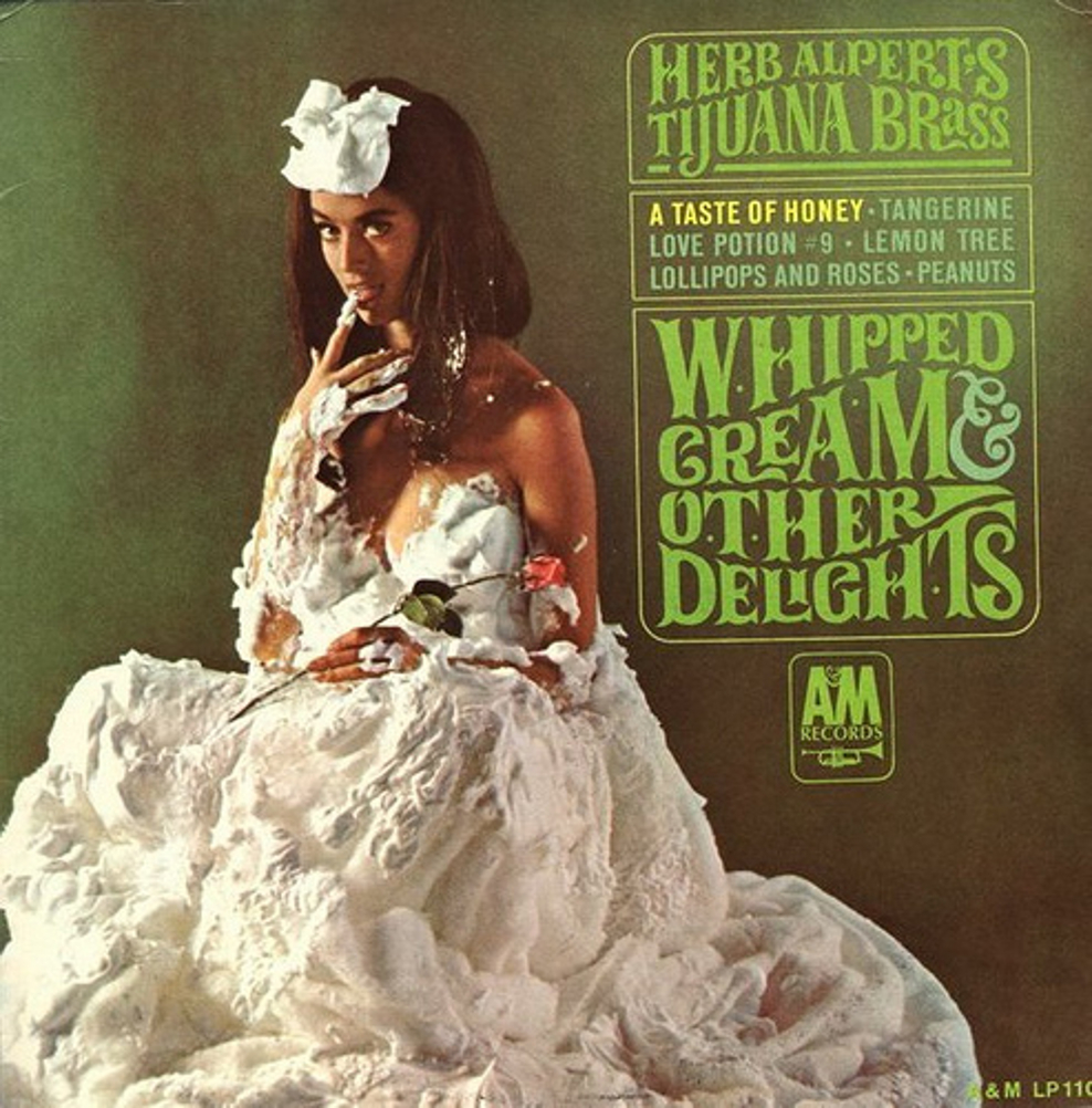
My hand-drawn type was inspired by 1960s album covers, specifically Whipped Cream & Other Delights by Herb Alpert’s Tijuana Brass, but I also wanted it to have a sweeping, adventurous, western feel. I had so much fun creating this type. I scanned the final inked versions and image traced in Illustrator. I then pasted them as a smart object into Photoshop and applied various effects.

HermitKingdom-author HermitKingdom-title

Cover-Whipped-Cream-and-Other-Delights

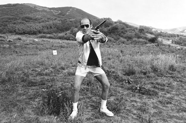
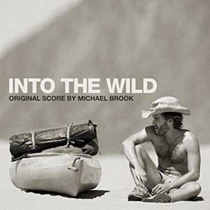
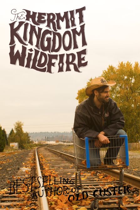
My original concept for the photo shoot was to have it be a crazy hippie guy who was on a spirit quest. Here are a few photos which I used for inspiration, followed by another iteration of the cover that I didn’t end up pursuing.

Hunter S-1148200 into_the_wild_chris_mccandless_lancastria_denali_06

Screen Shot 2013-11-05 at 8.48.31 PM

I learned a lot about composition of a photo for layout purposes. Mainly, that many of the photos I had taken were actually no good for a book cover because out of habit I had shot them in such a way that there was absolutely no blank space to feature the typography. Total bummer, because I got some great shots of Dustin in a shopping cart that I wasn’t able to use.

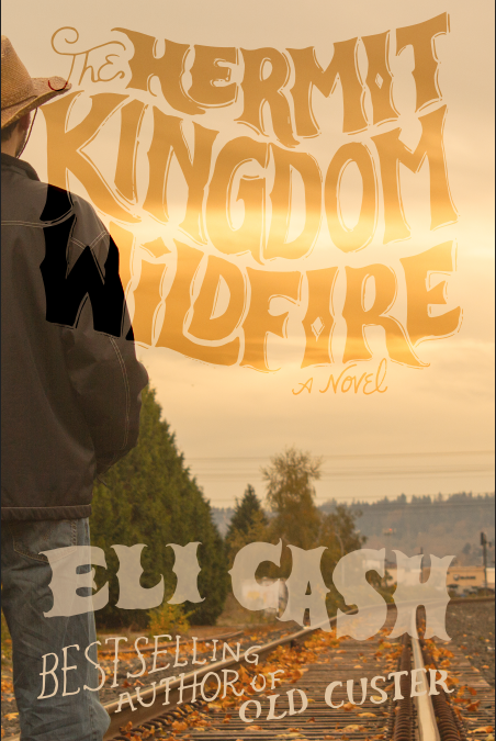
Here are some further iterations of the cover. I quite liked the first one with the bright light of the skyline bleeding into the letters, but felt that there may be readability issues so I opted to darken the type. I then decided to make the type a little bit smaller for the final version.

Screen Shot 2013-11-05 at 7.32.35 PM

Hermit-cover1-2 Hermit-cover1

For the final version, I will probably revise to move the figure into the shot a little more, but I am pretty happy with how the layout turned out and look forward to doing more hand-drawn type.


Renton Abbey

I heard this morning during the Bob Rivers show that the Almost Live folks are back with a show called The 206, which features a sketch called “Renton Abbey”. In keeping with the Almost Live tradition of butchering the hell out of a joke, these are sort of gross and not very funny. However, I decided to include a couple of them here, as it shows the set decoration I hope to achieve with Renton campaign. I pray to the heavenly Gods that my videos will be funnier than this.

[youtube=http://www.youtube.com/watch?v=sQBb1wXzbBY&w=560&h=315]

[youtube=http://www.youtube.com/watch?v=ALIBNmYiRyo&w=560&h=315]

[youtube=http://www.youtube.com/watch?v=awwT9zA0BHM&w=560&h=315]

We will begin shooting video as well as still shots this weekend. I am looking forward to seeing the results!!


Renton Campaign – ad comps

I am happy with how this project is developing! I have secured a photographer, Elizabeth Ogle, who is very excited to be contributing to this project. I wanted to collaborate with her because of her use of bright colors, animated, gestural poses and most importantly, humor in her portfolio (www.elizabethogle.com). And since humor is at the core of my concept, I knew that I needed a photographer who understands the joke. Luckily for me, she accepted the challenge!

Elizabeth and I met last Saturday morning at a cute little coffee shop in old downtown Renton (Common Ground Coffee & Cupcakes), and I shared my ideas with her for the photo shoot as well as the video. We battled the blustery weather over to the museum and met some of the people who work there, who are always super friendly and full of wonderful information. We drove around and did a little location scouting afterward and I took her to the Cedar River to see the salmon spawning.

Turns out, Elizabeth knows some people who might be interested in acting in the video and being models for the shoot. They are unemployed and keen to be compensated with six packs of PBR tall-boys. We have requested their participation and are awaiting their reply.

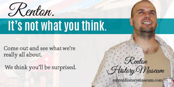
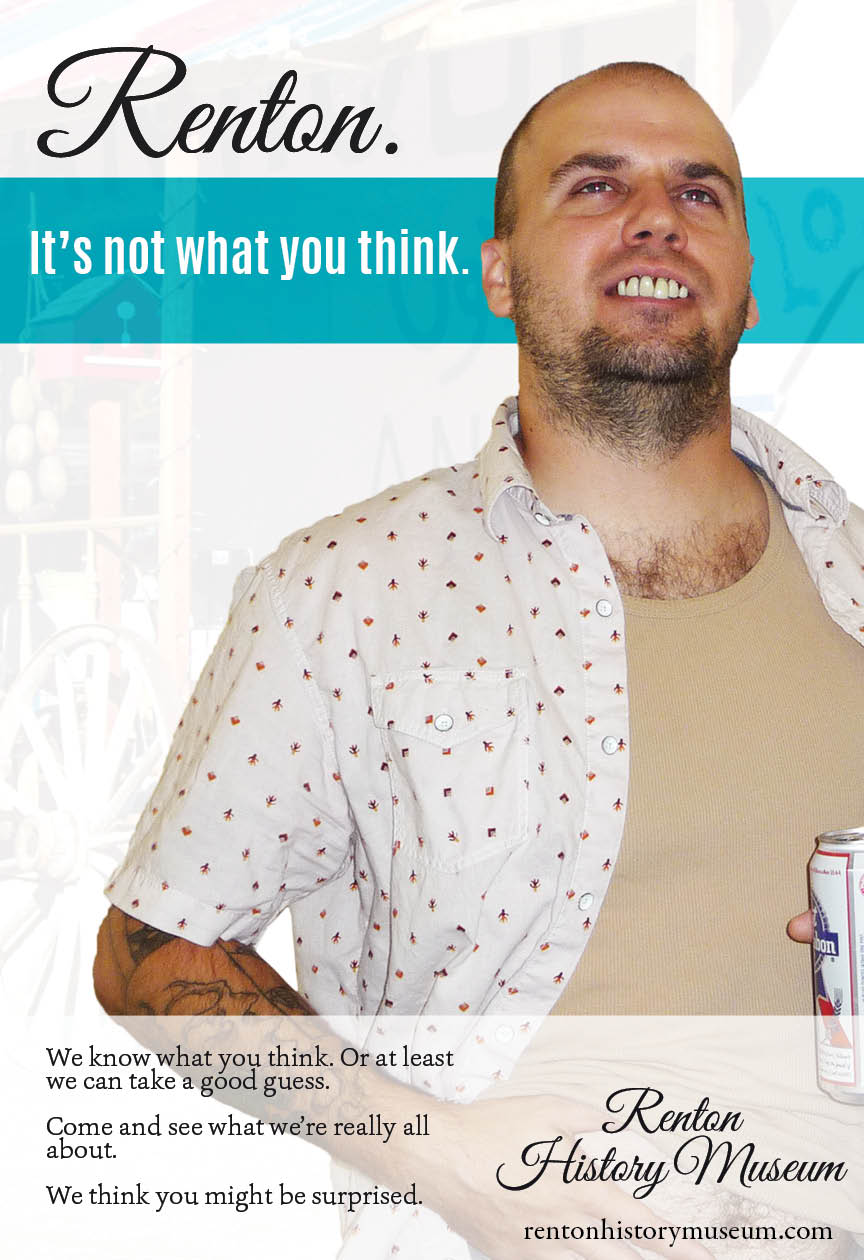
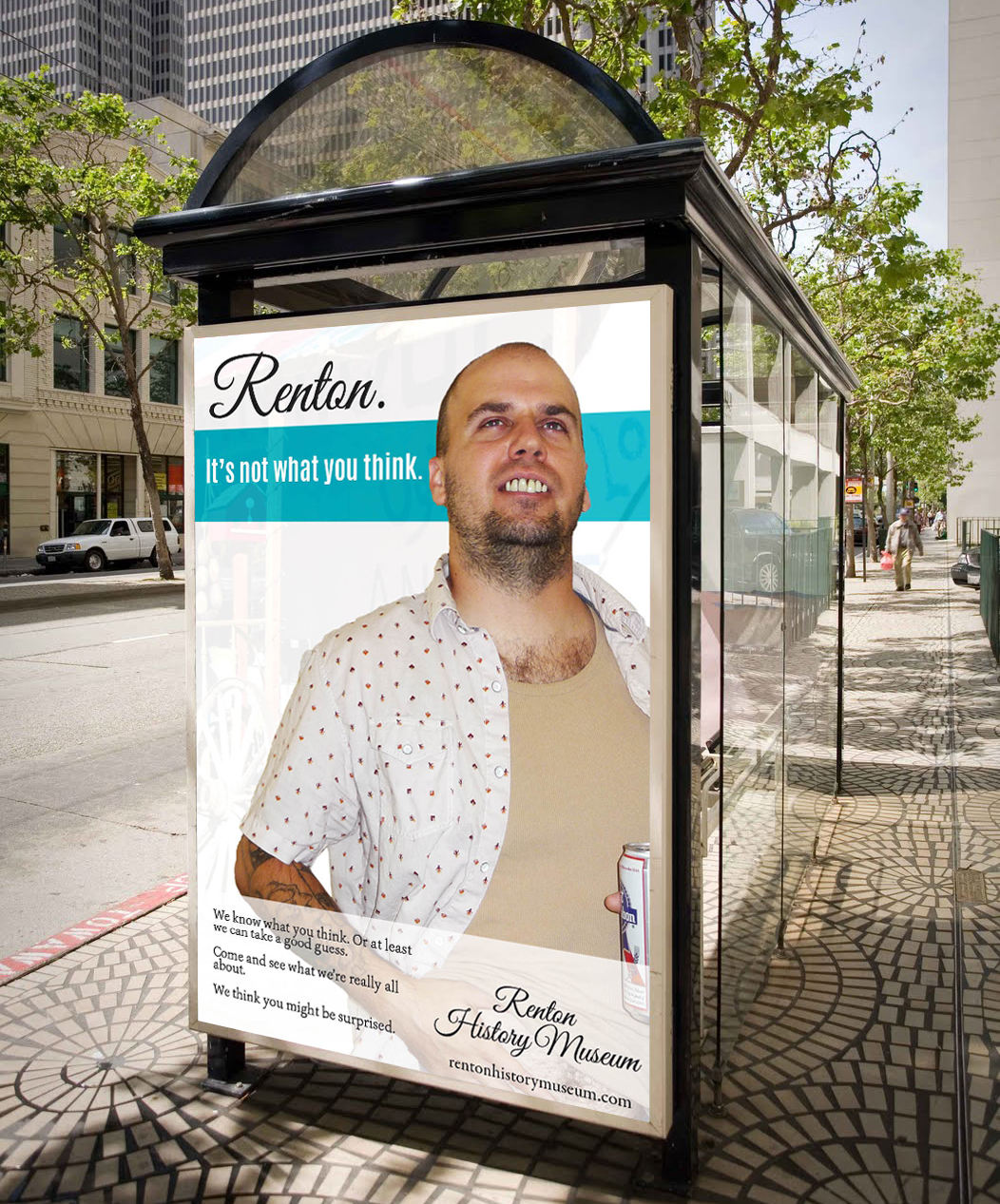
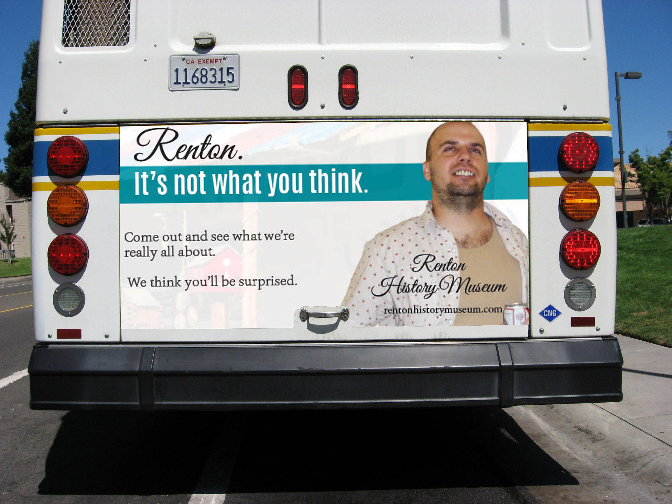
Here are some further refinements of the ads for the Renton campaign, with some comps of what they would look like in actual advertising scenarios.

Chris-BusAD

Chris-BusSTOP bus-stop-poster bus-back-ad

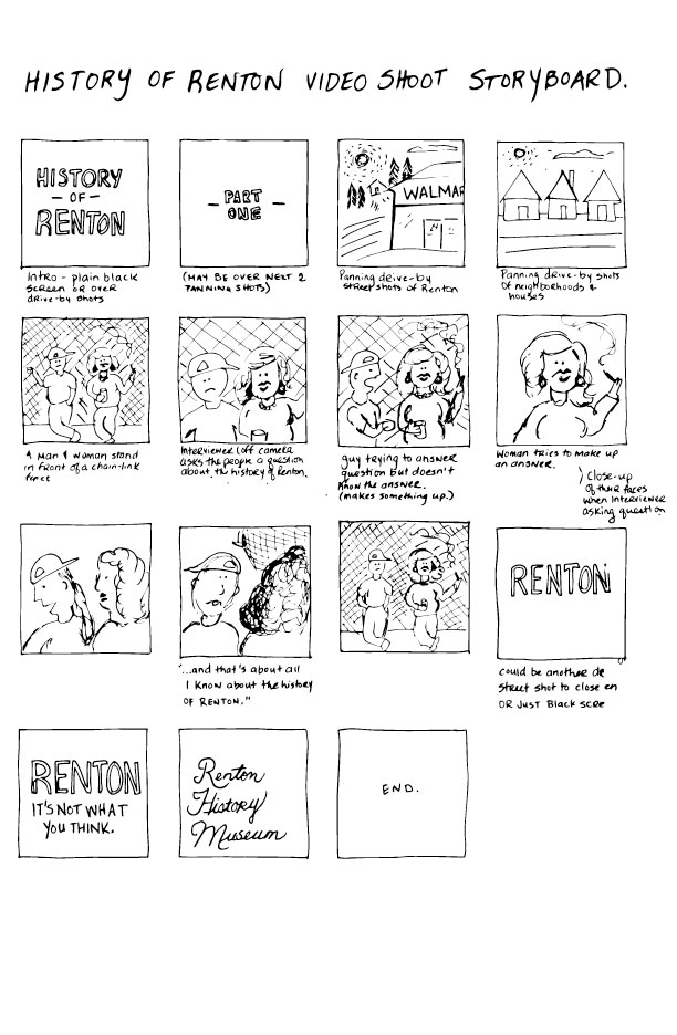
The video component of this project would consist of 2-3 short, 30 second television commercials, which would air on JoeTV in the evening from 6-8pm alongside Vern Fonk, The Jewelry Exchange and other local commercials. The ads would show the beauty of Renton, juxtaposed with the humorous perception that people have of the community. The interviewer would be off-camera, asking the actors questions about the history of Renton and the Renton History Museum, and the actors would reply with ridiculously inaccurate responses. This is my rather simplistic storyboard for the concept of the ad.

Renton-Storyboard

We won’t likely be able to start shooting for another week or so, but we are both chomping at the bit to get started on this. I think the outcome will be hilarious.


Generational Health First – week 6

Due to technical glitches with Hostgator over  the past week, progress has been slow on the coding side. I have re-started the GHF homepage several times, trying various themes and approaches. Due to hosting conflicts with required plugins, I am unable to continue coding the theme I have chosen, Pytheas, so I have decided to code the site from a subfolder on my personal domain and move it to the GHF site once it is completed. In the meantime, I will have to convince the client to move their domain to a host that will support this theme (I have installed and tested the theme and all required plugins on another host and it works perfectly there). Since my personal domain is in the midst of a transfer to Blue Host, all web coding is on hold but it seems likely it will be back up in a few days.

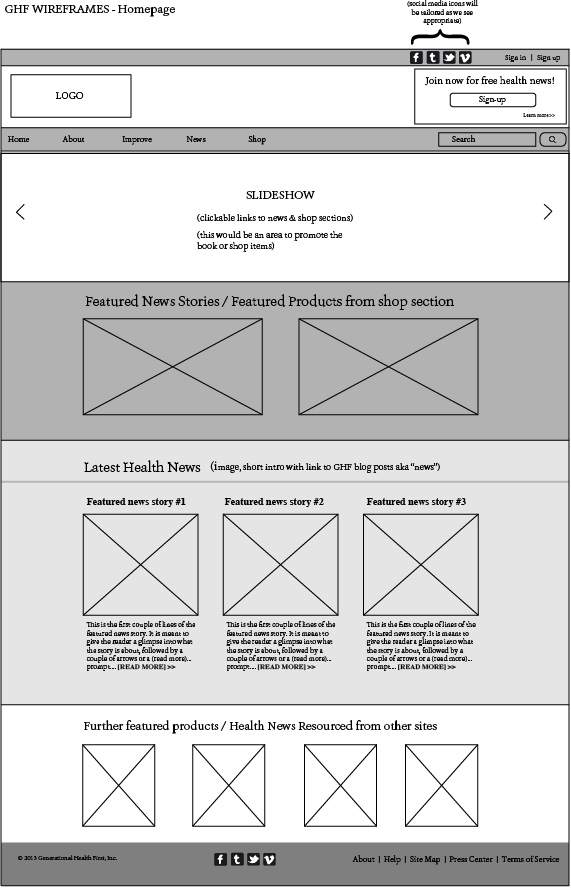
Originally, I had decided to take a more agile development approach and wireframe as I was coding. I felt that this would be better suited to illustrating to the client exactly what the site will look like. This pause in development has provided a nice opportunity to prepare some more detailed wireframes. This is the wireframe I have prepared for the homepage.

GHF-wireframes-HOME

As you can see, my wireframes are a pretty basic interpretation of the structural elements of the theme, but this was useful in determining how the client wants the content to be structured and for placement of specially requested items (eg. the client asked to have double-navigation — a second navigation bar at the uppermost portion of the screen, just above the logo).

Screen Shot 2013-10-29 at 8.01.10 PMScreen Shot 2013-10-29 at 8.01.25 PM

I shared some more refinements of the logo with the client last week. They liked #2 the best, which is the one I liked the best as well. I was instructed to further refine #2 and to provide final comps with more color and typographic approaches.

GHFlogos-comp

Aside from the domain hosting glitches, the project is on schedule. I am aiming to have the logo completed in the next week, and the basic framework of the site built for the end of the quarter. I predict that I will be refining the site into next quarter, which the client is okay with as they are still working on creating content.


Generational Health First – week 5

Last week, I installed Starkers and began to build the GHF homepage. Things were going pretty swell, albeit slow. But then, all of a sudden, Erik taught us about parent / child themes in interaction class, which blew my mind because I knew that this could potentially make building this site a lot easier.

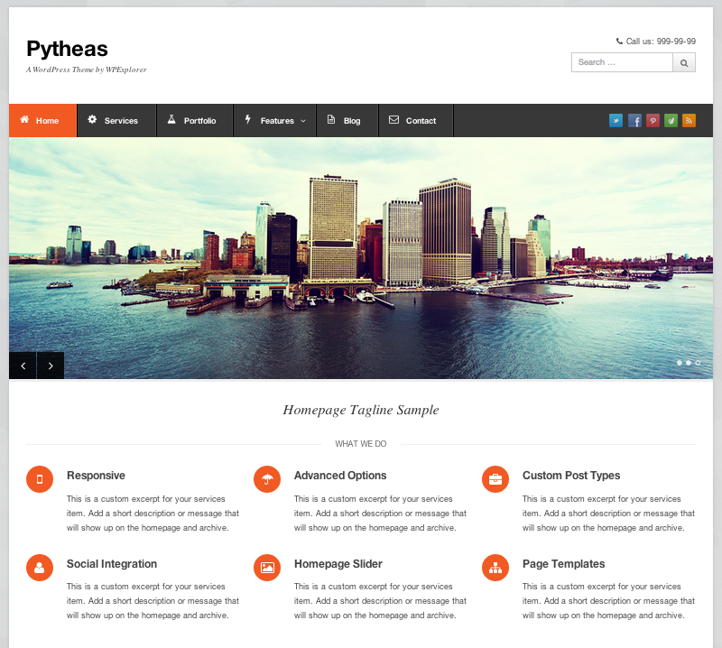
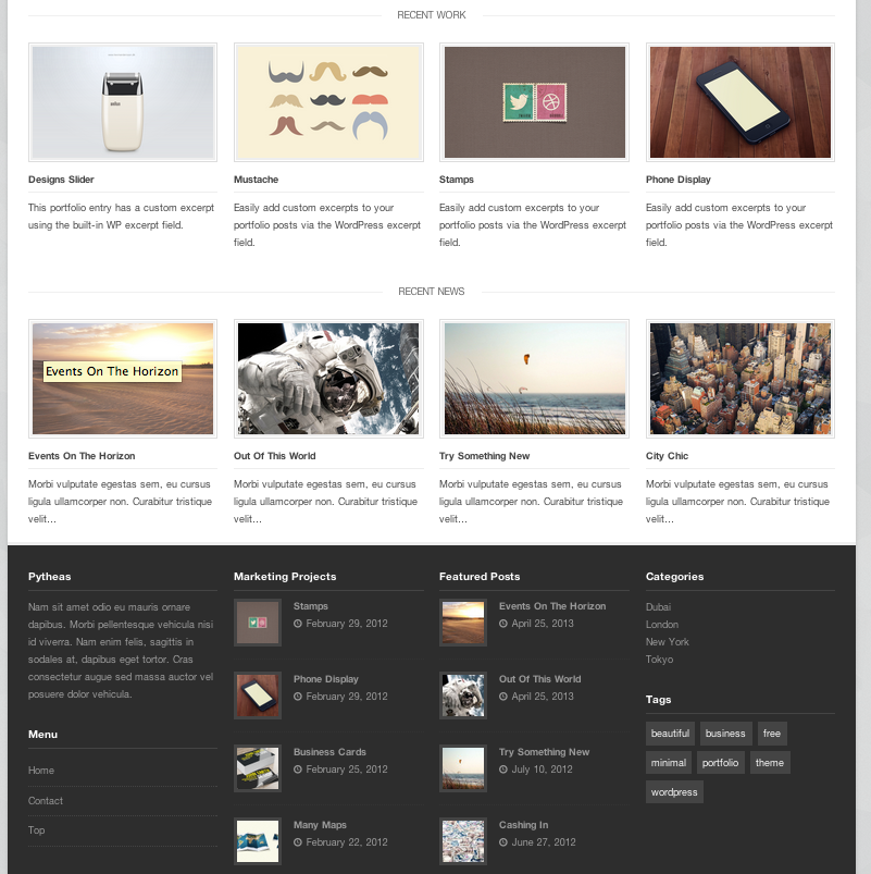
Since the onset of this project I have been a little concerned with keeping on schedule and being able to meet the fairly tight timeline I have created for myself. I know that I could build this website from scratch using Starkers, but I was not sure if I would be able to see it to completion by the end of the quarter. So, in an effort to keep this project on schedule, I have decided to use a customizable theme for the Generational Health First site. It took quite a bit of research but I think I have decided upon using Pytheas, which is responsive (of course) very customizable and already looks close to what the client said he is looking for. It looks organized and clean. Here are a couple of screen shots of Pytheas:

Screen Shot 2013-10-29 at 8.01.10 PM Screen Shot 2013-10-29 at 8.01.25 PM

After the client reviewed the logo iterations I sent, he indicated that he liked the look of the three letters all connected. Here are some further iterations of the logo.

GHFlogos2

I want the logo to express the layers of multi-generations and passing on of information from one generation to the next. I am sure a few more rounds of drafts are to come, before the logo is finalized.

I also opened an account with mailchimp last week, to aid with email newsletters that the client would like to distribute in the future.


Ad campaign: Renton. It’s not what you think.

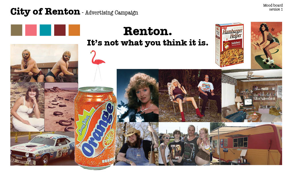
Here is my mood board for the my promotional campaign for the City of Renton.

Renton Mood Board

We did our initial planning shoot today and I got some video (the audio isn’t good, but it’s pretty funny and captures where I would like to go with this project):

[youtube=http://www.youtube.com/watch?v=zYrEIyB2nkQ&w=420&h=315]

[youtube=http://www.youtube.com/watch?v=1mgaLe94ZZk&w=420&h=315]

I would love to do a short TV ad, as well as a poster campaign. I am not sure about the third piece yet. I have a photographer lined out who is very excited to work on this project.

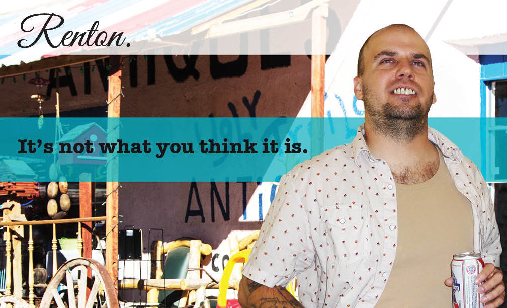
And here is my initial shot at layout:

RentonPoster-Chris

RentonPoster-Michelle

RentonPoster-M&C


Seattle Central T-Shirt Contest

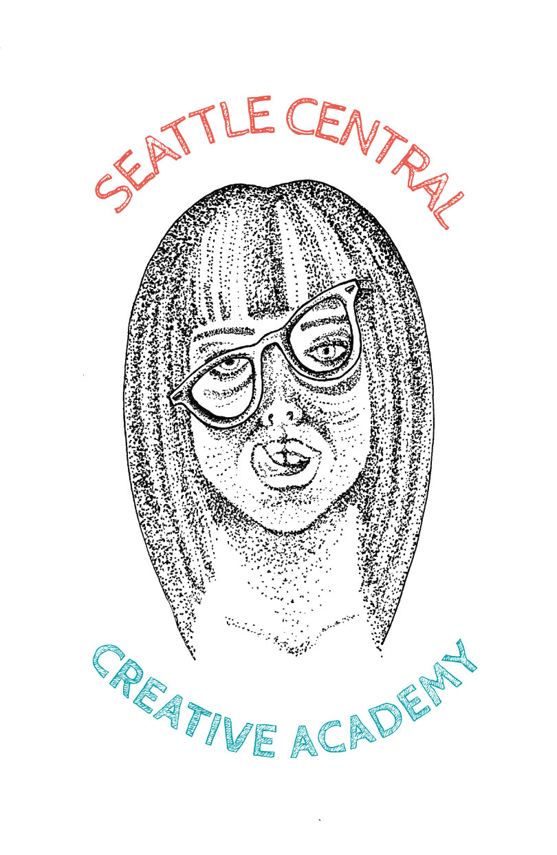
This is a design I made for a contest to design a shirt for our program. Immediately as soon as this project was due, I got sick with a terrible cold. In my delirious state, I had a detailed dream wherein I won the contest. In real life, once the fever cleared, I did not win. Oh well, at least I am rich in spirit and my mom thinks I’m cool.

SCCA-T-Shirt-web


GHF – Revised Style Tile & Logo Iterations

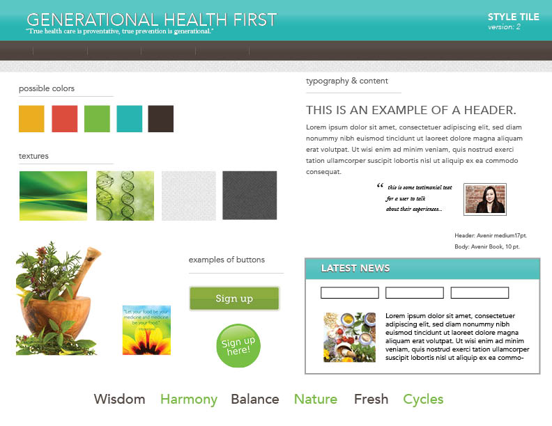
After my discussion with the client last week, I decided to refine the style tile to make it look a little more modern and fresh, and to incorporate some of the client’s wishes. Here’s version 2 of the style tile for Generational Health First. It is still very much a draft and a work in progress. I am just trying some different style approaches. I feel like it is going in a better direction.

GHF Style Tile-ver 2


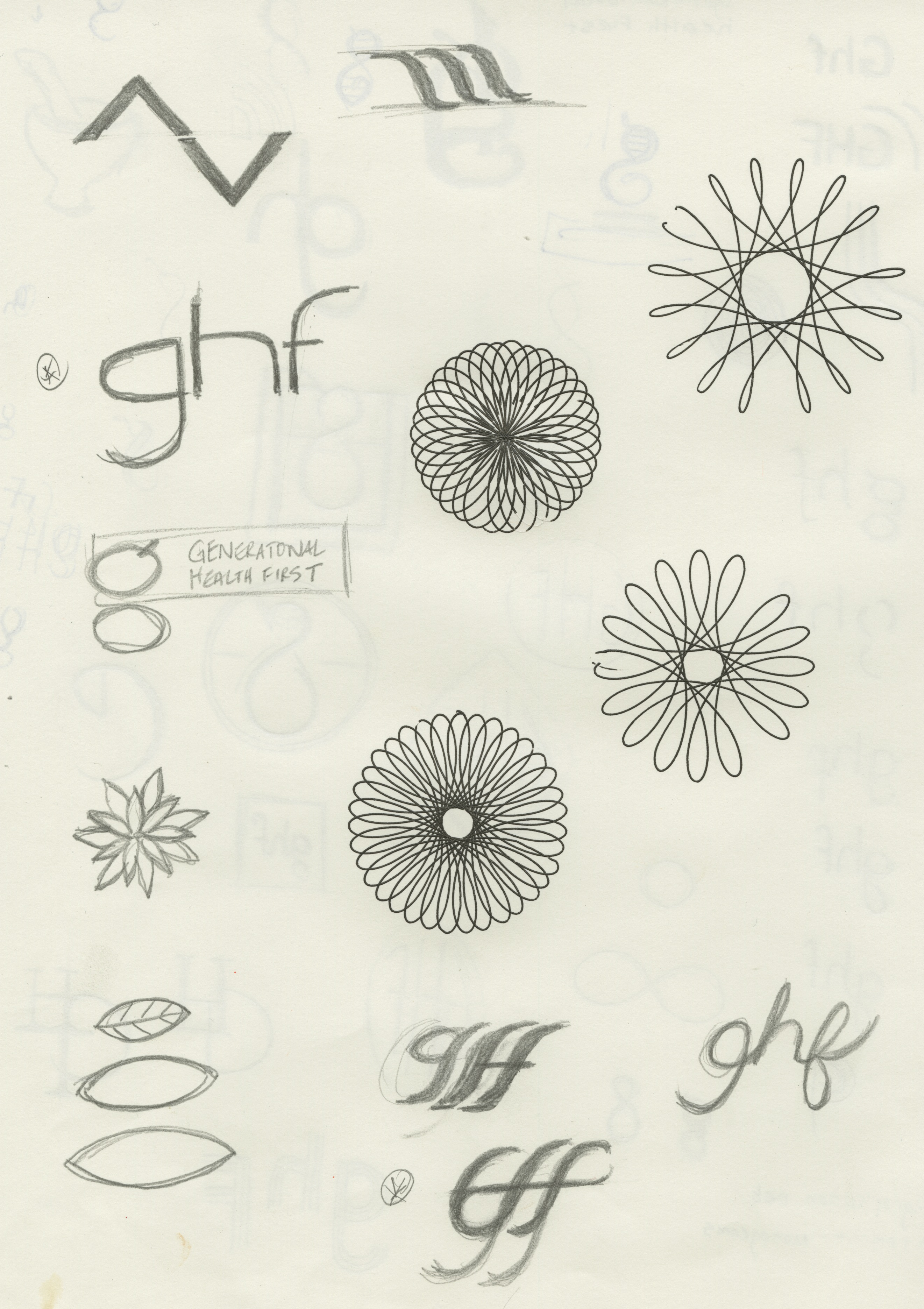
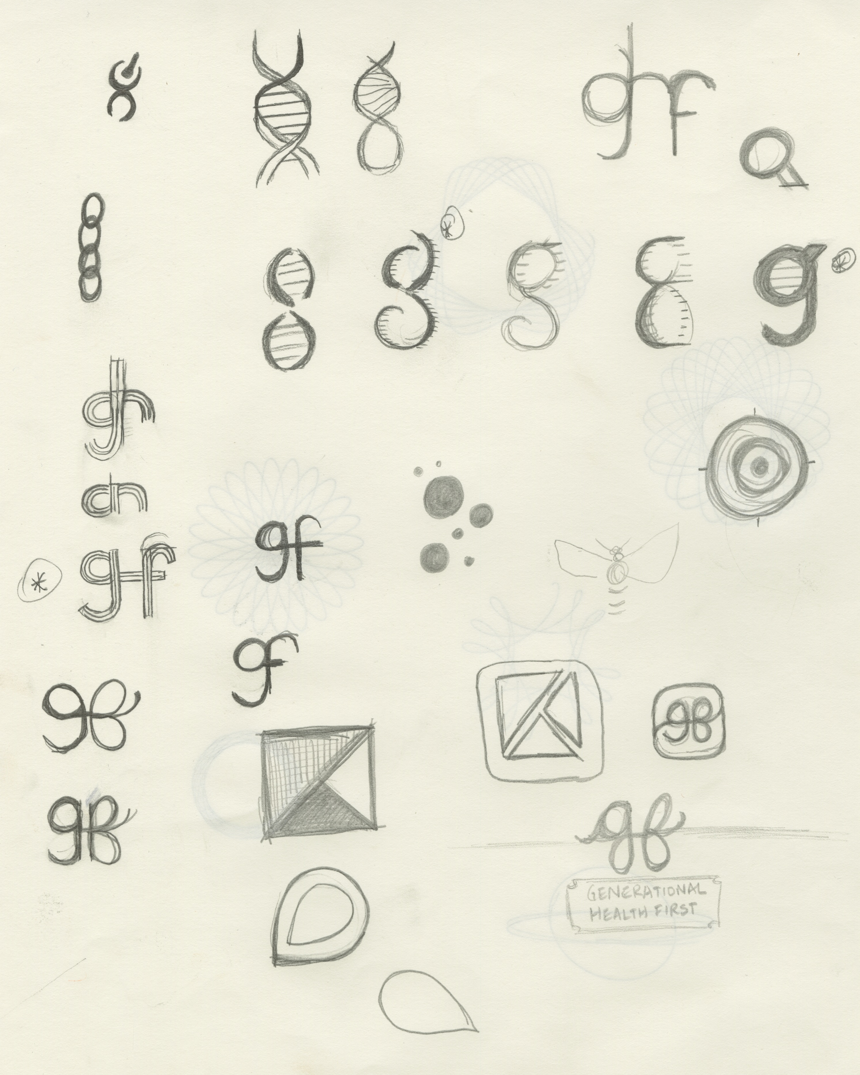
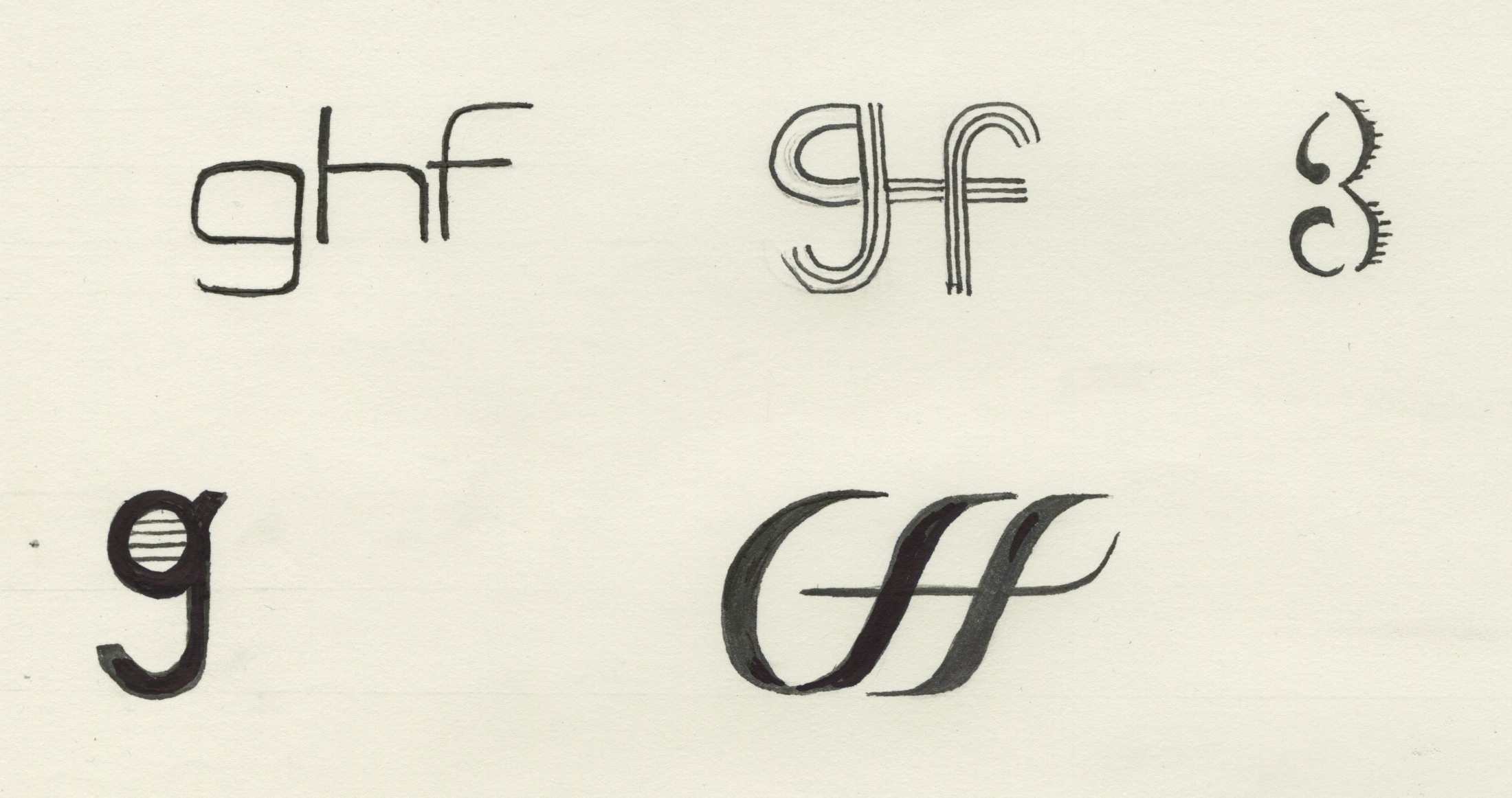
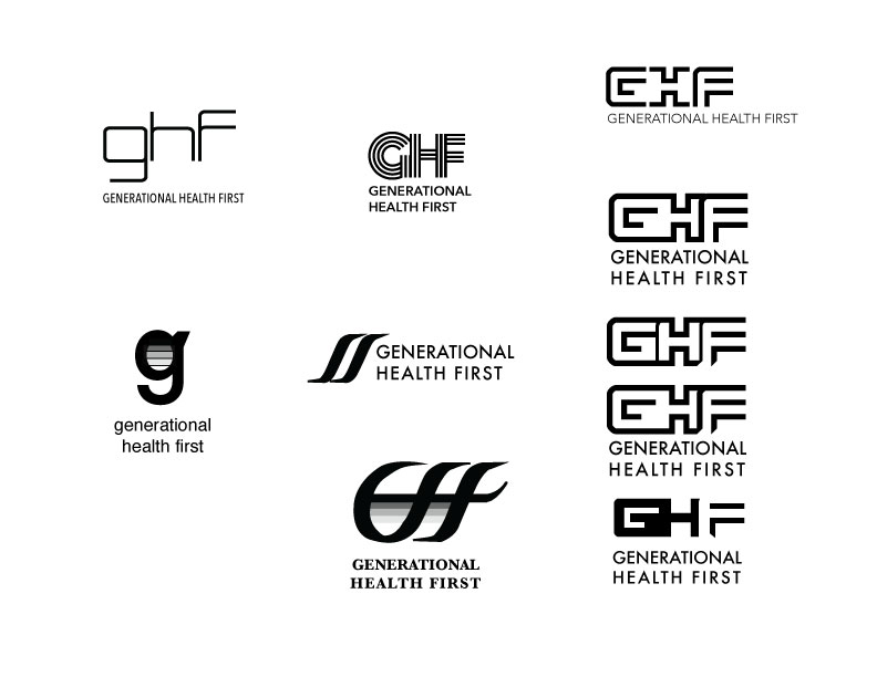
For the past week, I have been working on sketches for the GHF logo.  Here are some of my sketches and the electronic version of the initial drafts. I am expecting that the logo will go through many more iterations before we make a final decision.

GHF-sketches-1GHF-sketches-2GHF-sketches-3GHF-sketches-4

GHFlogos

I have another meeting with the client today, during which he will provide feedback on the updated style tile and logo ideas. I will proceed with finalizing the wireframes this week.