/* SC_TH_END:4.0.3:ee51d1f6 */ Uncategorized – Page 271 – Leanne Padgett Design

You Can’t Get Drunk on Butter Tarts

When a friend of ours from Vancouver, T. Paul, passed away, I hadn’t been to a funeral or memorial in a very long time and I wasn’t sure what to expect. I didn’t know whether it would be dressy or casual. I didn’t know if there would be a formal presentation or if we would just all hang out or what. It took me a long time to get ready that day.

The memorial was hosted at a friend’s home, and the attendees were each asked to bring an item to share. I didn’t know what to bring, but I had never tried to make butter tarts and I thought they would be perfect. I got all the ingredients together and made a huge batch. They weren’t just good — they were a miracle! I felt like a domestic goddess! I was so proud of myself for learning how to make them for the first time! I was super excited to share them with my friends.

On the morning of the memorial, I carefully packed them into a big huge box and waited for my ride to pick me up.

At the time I didn’t own a car, so my friend, Bill McNamara, offered to carpool. I was the last person to get picked up. As I was cramming myself and my huge box of butter tarts between two other people into the back seat of Bill & Diana’s 2-door Volkswagon Rabbit, Bill said, “Whatcha got there, Padge?” To which I proudly exclaimed, “I made Butter Tarts!” Bill raised his eyebrows and without skipping a beat, he said “You can’t get drunk on butter tarts, Padgett.”

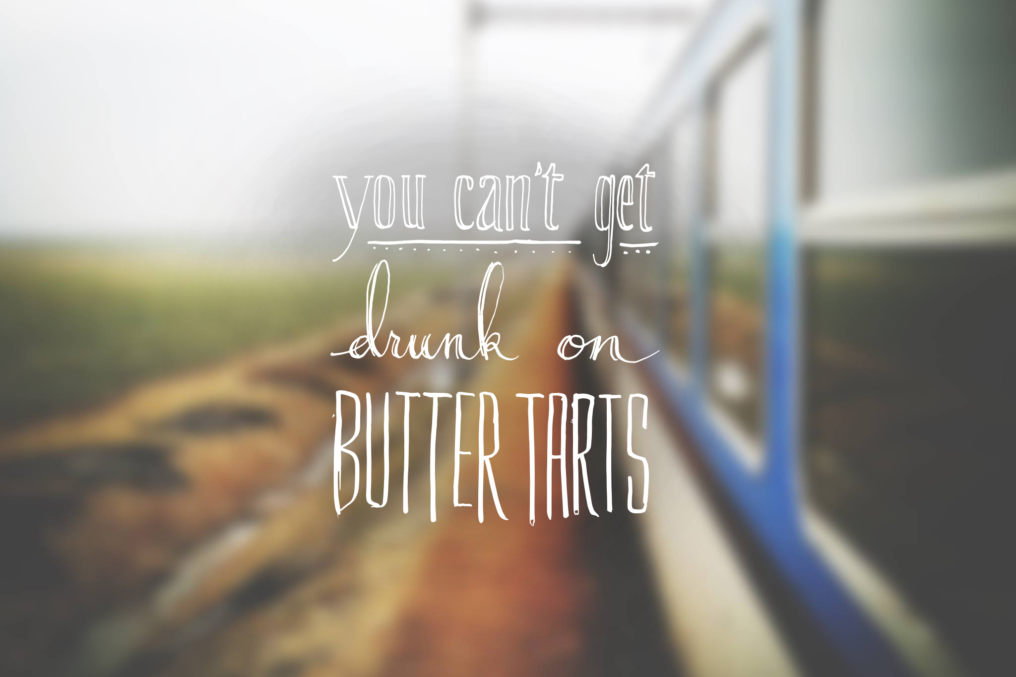
Recently, a staff member at my school (who happened to be Canadian) suddenly and tragically passed away. I was asked to bring a dessert item to share at his memorial. The choice was obvious! I had to make butter tarts. I told my classmates the story above and Izzy and Kim made this for me! What a thoughtful and amazing present 🙂
cantget


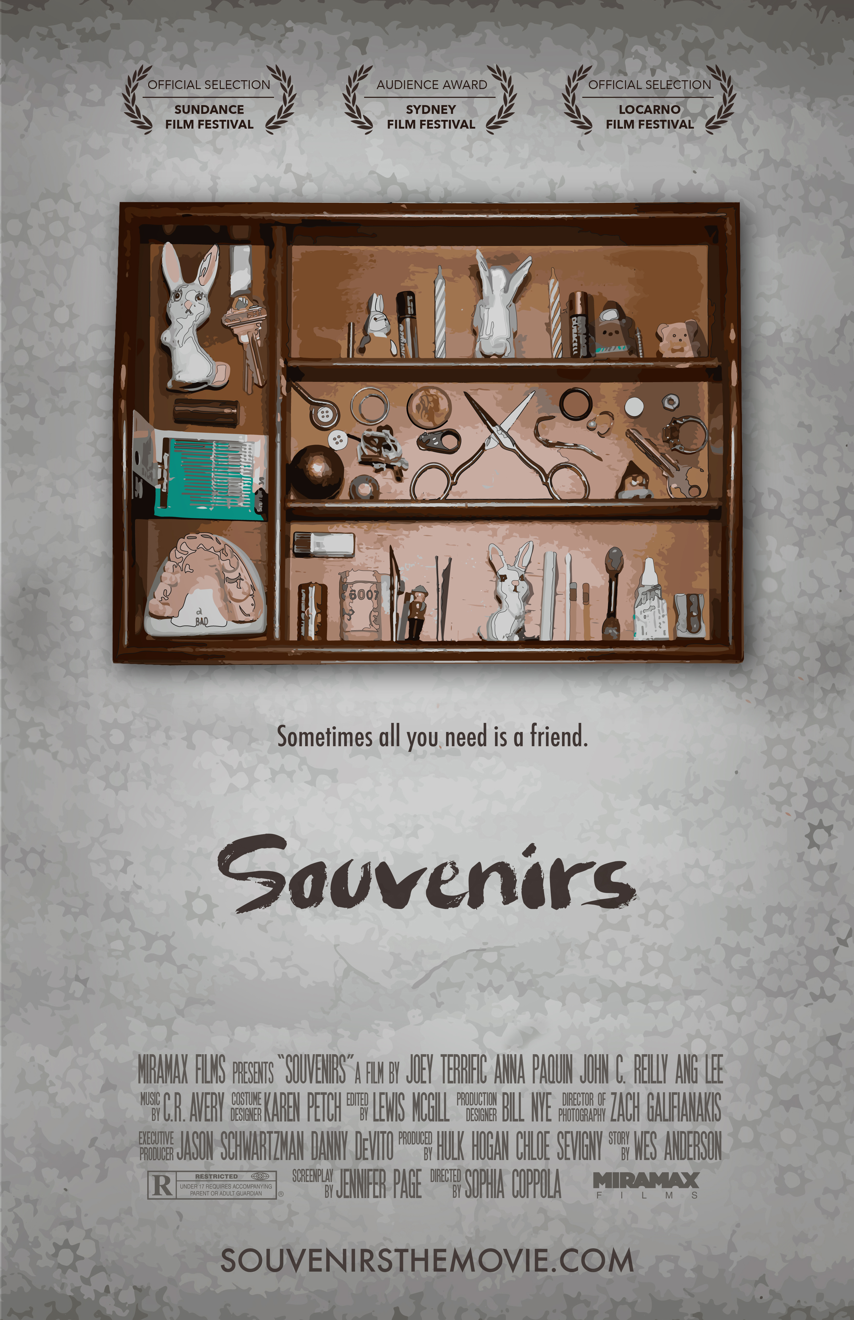
Souvenirs Movie Poster

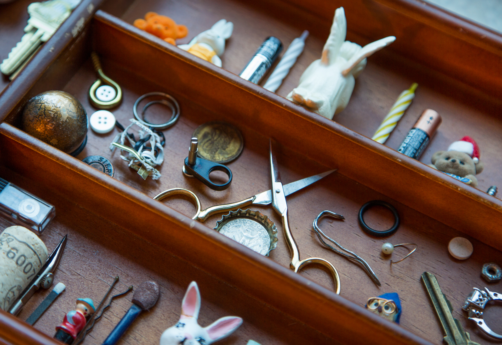
This is a movie poster I created for ad class. We were asked to come up with a one-word title that was a noun and use photo and illustration. In my brainstorming process I came up with way too many words (I love words) and ended up with a short-list of probably 15. I couldn’t make up my mind which one to use. On the day of class, I decided on the spot that it would be a movie called “Souvenirs” and it would be about hoarders.

SOUVENIRS

I had a lot of fun curating the objects on the “shelf” and coming up with a graphic solution for this poster. Turns out maybe I’M a hoarder because I found most of the items in my junk drawer at home (including the teeth), and the “wallpaper” is a piece of paper I had bought for another project from last year. The composition was photographed together in cool, very late (bordering on too late) afternoon light, using a piece of tin foil as a reflector. I then used Illustrator to manipulate it to look like a painting, and added the finishing touches in Photoshop. I was hoping to achieve a “paint by numbers” look, as if these objects were precious to the collector, but trashy and a little creepy to anyone else, to whom these items didn’t carry the same emotional attachment.

What surprised me the most about this project was the emotional connection I had with the composition. It took me several hours to curate the objects and several more to compose them in a way that I hoped would show the character of the collector. I sat for a long time looking at it and even left it for a day before photographing, allowing time for a few final adjustments. I even told my roommate that looking at this composition made me feel sad. I really hope that sentiment is translated to the viewer.

And here is a “the making of” photo 🙂

ElizabethOgle_LeannePoster2


Hermit Kingdom Wildfire

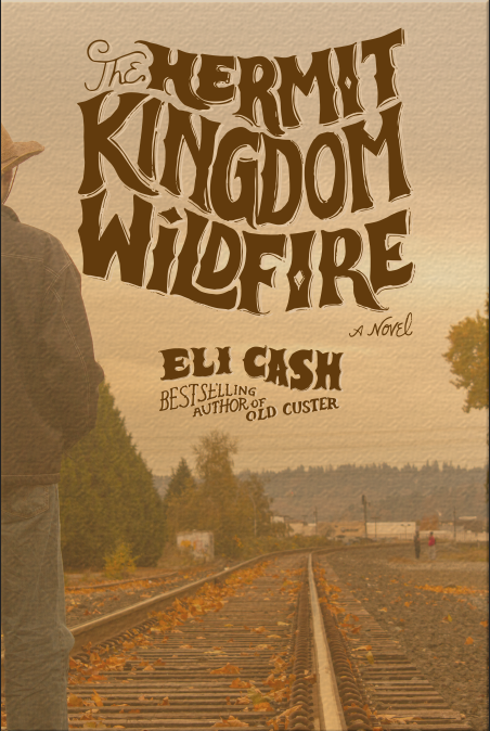
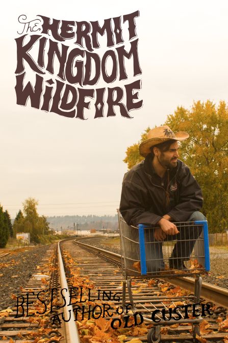
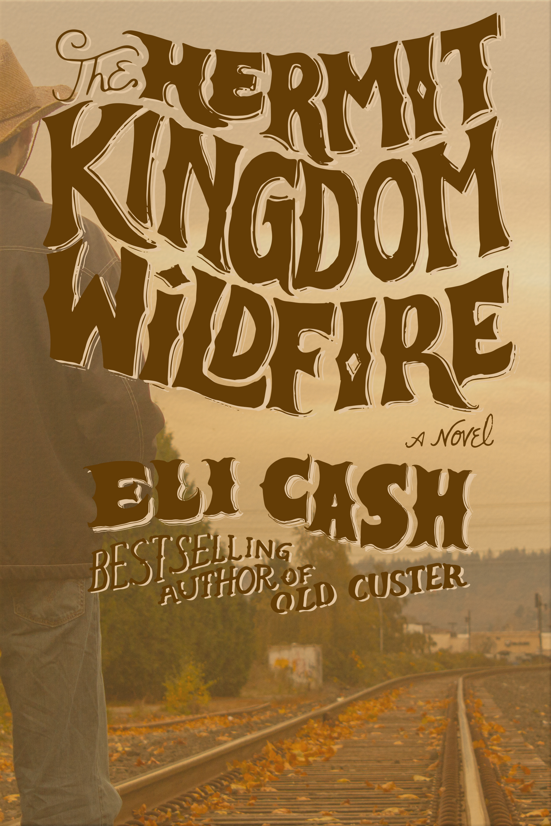
Introducing Hermit Kingdom Wildfire!! This is the final version of my layout for the book cover for my Art Direction class. The assignment was to shoot a photo ourselves to present to a theoretical client to show our idea for a book layout. Upon approval of this mock-up version of the book cover, a professional photographer would then step in and perform their magic.

Screen Shot 2013-11-06 at 8.21.36 PM

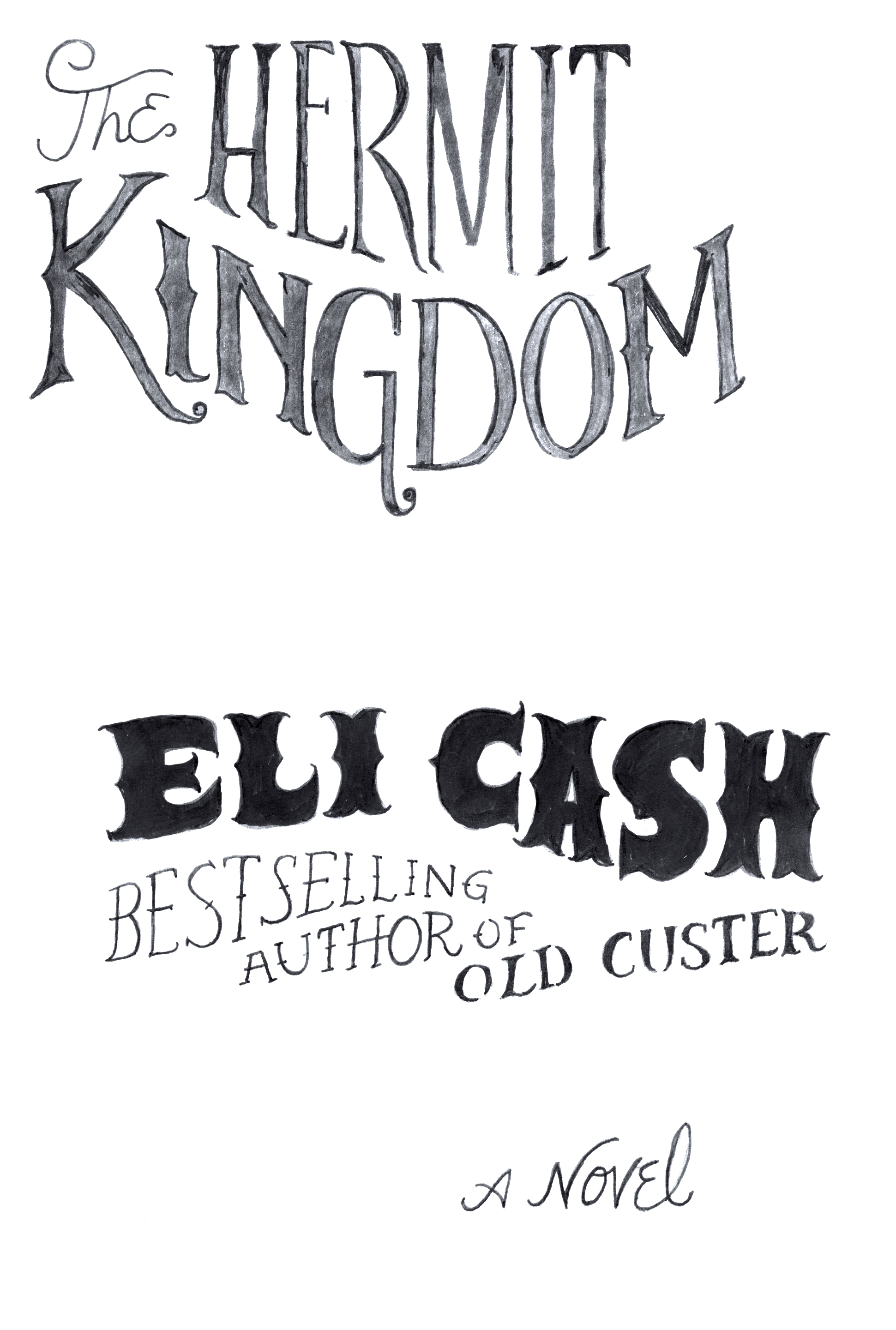
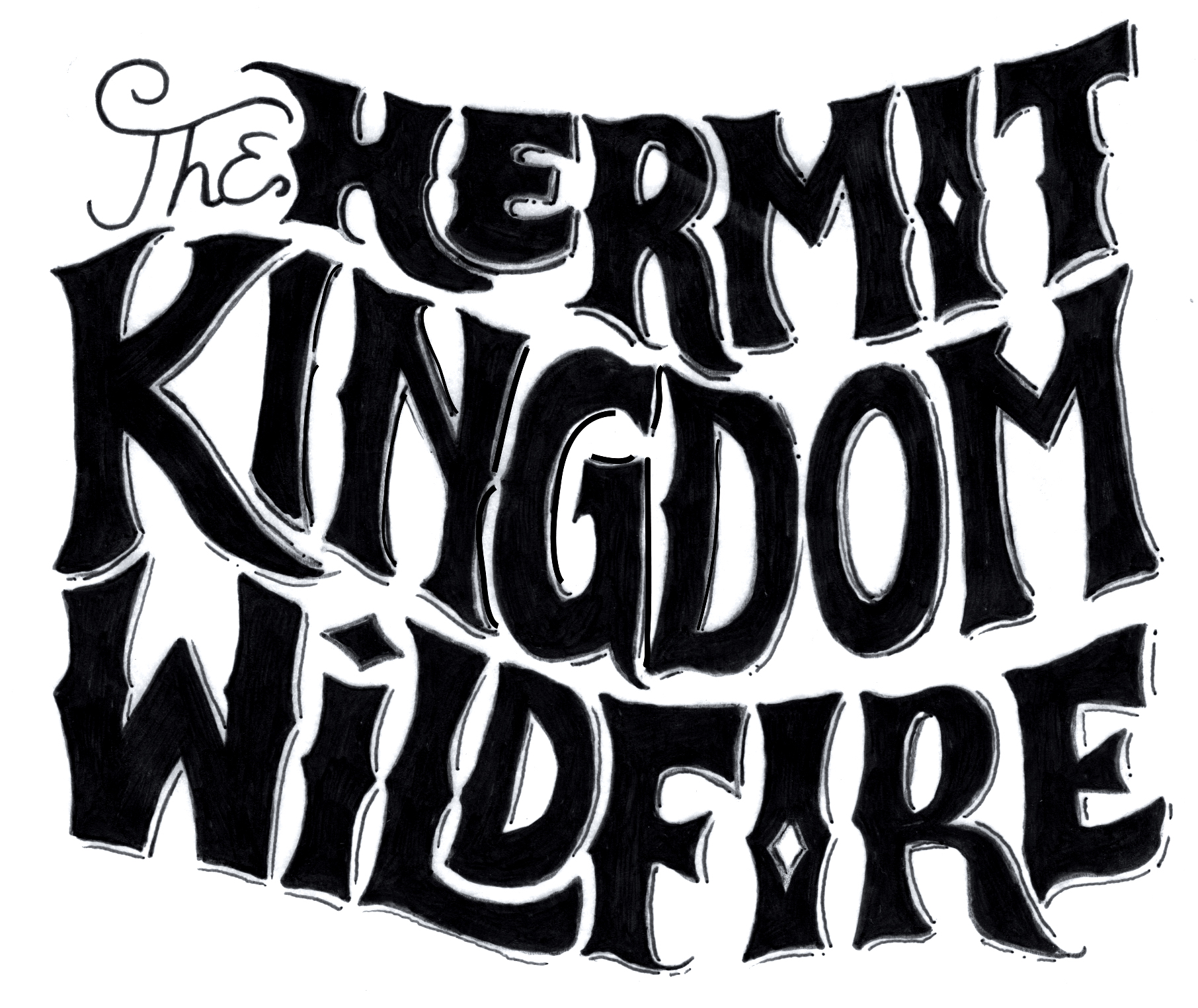
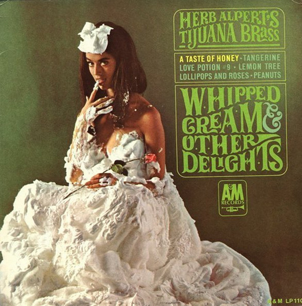
My hand-drawn type was inspired by 1960s album covers, specifically Whipped Cream & Other Delights by Herb Alpert’s Tijuana Brass, but I also wanted it to have a sweeping, adventurous, western feel. I had so much fun creating this type. I scanned the final inked versions and image traced in Illustrator. I then pasted them as a smart object into Photoshop and applied various effects.

HermitKingdom-author HermitKingdom-title

Cover-Whipped-Cream-and-Other-Delights

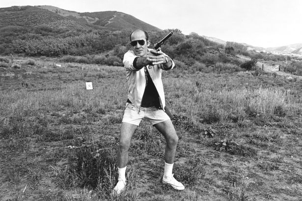
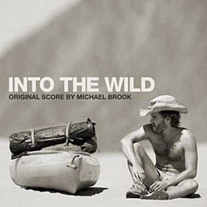
My original concept for the photo shoot was to have it be a crazy hippie guy who was on a spirit quest. Here are a few photos which I used for inspiration, followed by another iteration of the cover that I didn’t end up pursuing.

Hunter S-1148200 into_the_wild_chris_mccandless_lancastria_denali_06

Screen Shot 2013-11-05 at 8.48.31 PM

I learned a lot about composition of a photo for layout purposes. Mainly, that many of the photos I had taken were actually no good for a book cover because out of habit I had shot them in such a way that there was absolutely no blank space to feature the typography. Total bummer, because I got some great shots of Dustin in a shopping cart that I wasn’t able to use.

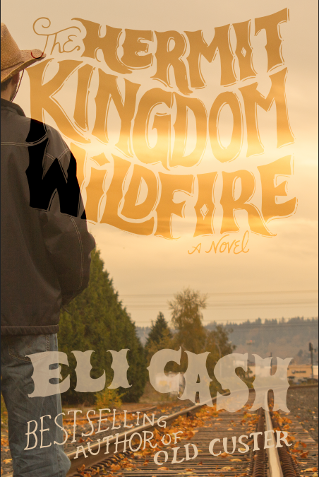
Here are some further iterations of the cover. I quite liked the first one with the bright light of the skyline bleeding into the letters, but felt that there may be readability issues so I opted to darken the type. I then decided to make the type a little bit smaller for the final version.

Screen Shot 2013-11-05 at 7.32.35 PM

Hermit-cover1-2 Hermit-cover1

For the final version, I will probably revise to move the figure into the shot a little more, but I am pretty happy with how the layout turned out and look forward to doing more hand-drawn type.


River Hog Flapjacks

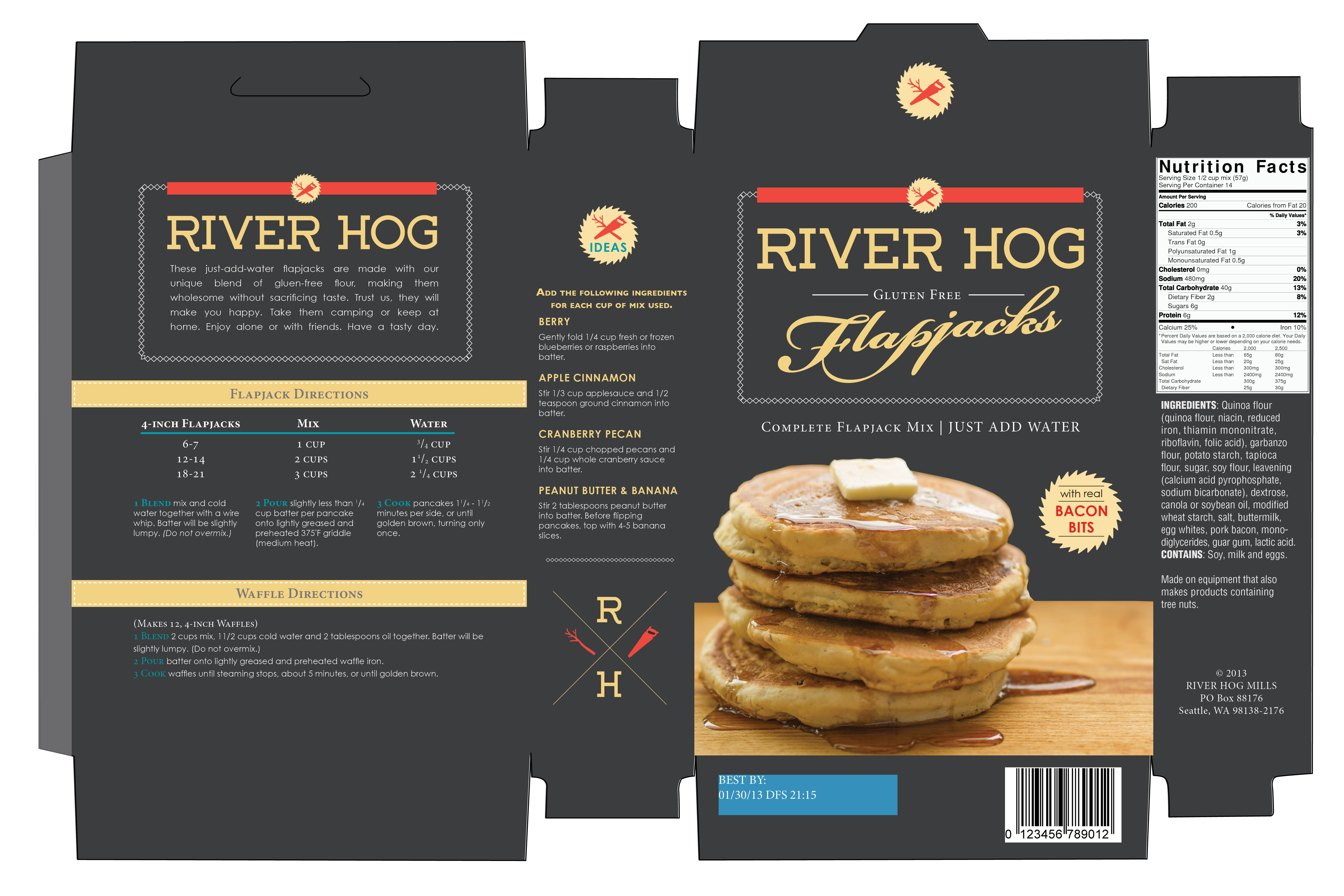
Introducing River Hog Flapjacks!  This has been the most fun part of my school experience so far — this making up of companies. For my second package design assignment, I decided to do a pancake mix. In Canada, sometimes a pancake breakfast is called a “lumberjack breakfast”, and so I decided to incorporate a lumberjack concept. In my research, I found that “river hog” is a term for loggers that use river water to transport wood, and I thought that sounded like a great name. I wanted to design something hip and sophisticated, something unique that would stand apart from the competitors on the grocery shelves. I opted for a dark color for the box and a modern typeface combined with a more old-fashioned looking script typeface. I even cooked the pancakes and took the photo myself! This was my first time photographing food for a label, and I have to say I was pretty impressed with the results. Thanks to my teacher Tom who challenged me to find the button on my computer that makes things look good.

River_Hog_Flapjacks_Box


Space Between Poster

Space Between


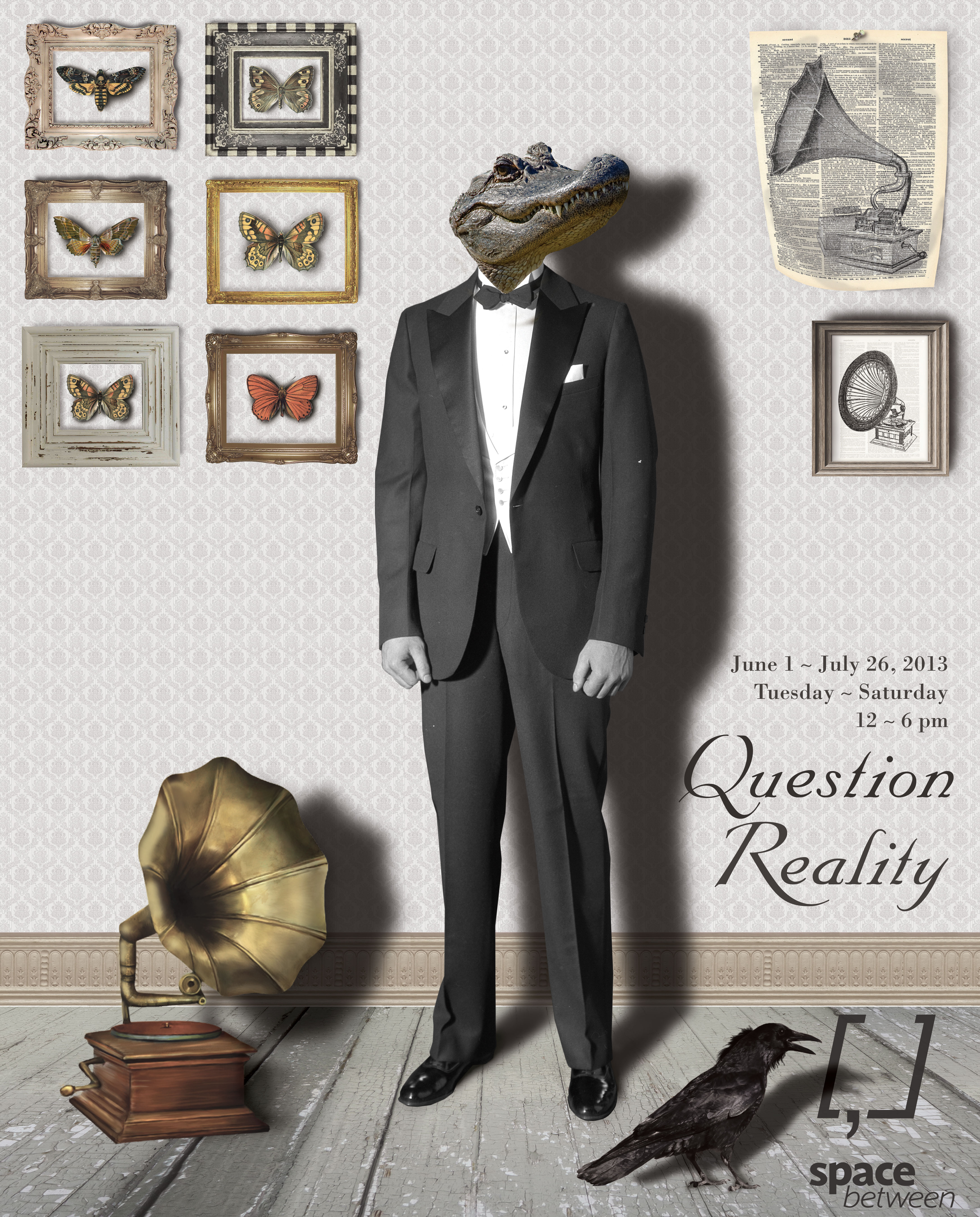
This is my latest project for my Graphic Productions class.  It was a poster for an exhibition called “Question Reality” for an art gallery called Space Between.  This was totally the coolest and most fun thing by far I have ever made on a computer, and I had so much fun making it.  I even bought a really cool book on how to tell stories with photoshop compositions, and I can’t wait to make some more.

Whoop whoop!


Diamond Horseshoe Cocktail Sauce

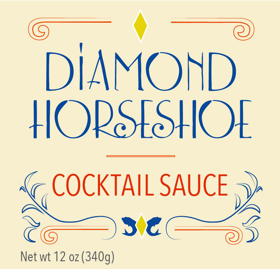
Our first task for our package design class was to pick a jar or round container and come up with a product name.  I chose cocktail sauce, because I knew it would be challenging.  In my research for my creative brief, I discovered that the American version of cocktail sauce was invented during prohibition and it is suggested that cocktail dishes (shrimp cocktail, fruit cocktail, etc.) were invented as a creative way to make use of unused stemware. For my concept, I decided upon 1930s supper clubs, which was the birthplace of cocktail sauce.

And so gave birth to Diamond Horseshoe Cocktail Sauce, named after a well-known supper club of the 1930s.

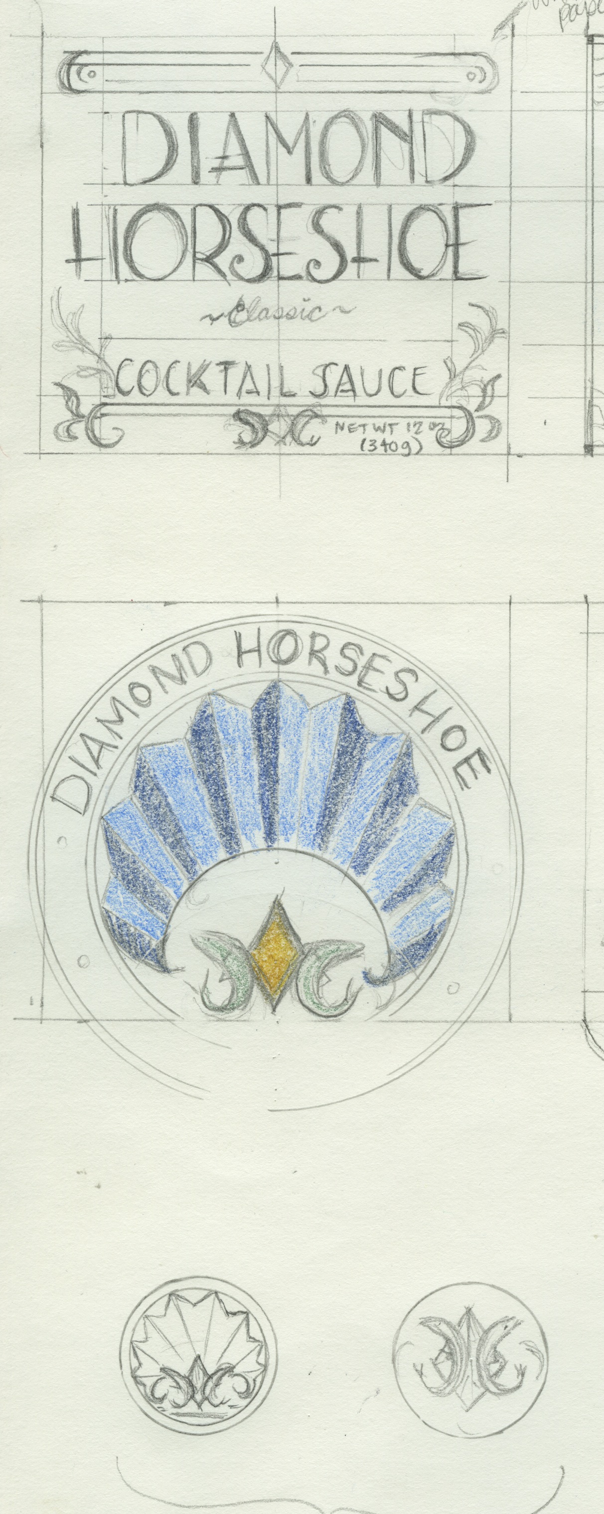
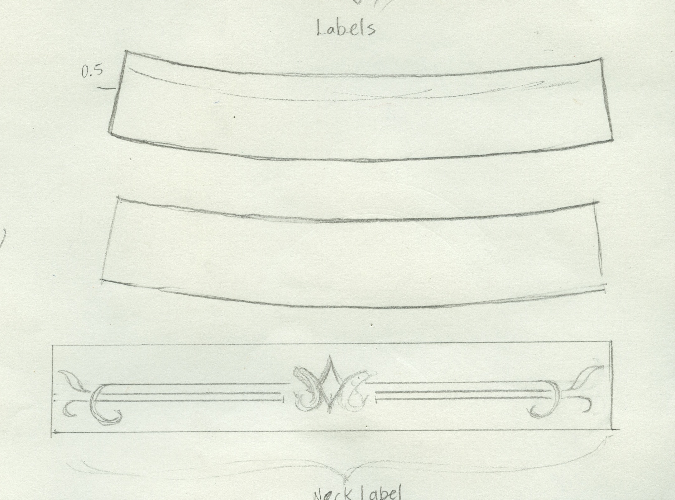
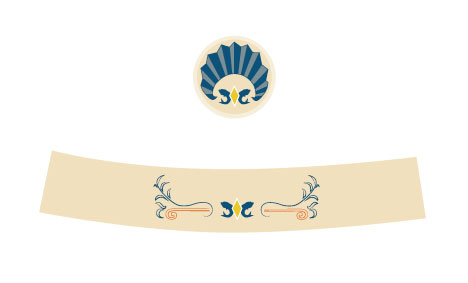
I had a lot of fun sketching for this concept; looking at art deco, movie posters, billboards and a lot of 1920-1940 signage.  I picked up the typeface “Lemon Chicken” for free on fontsquirrel and altered it to give it more of a vintage flair.  The flourishes, fish and diamond logo and shell seal are all hand-drawn.  The two bottom images are the seal for the lid of the bottle and the wrap label for the neck of the bottle.

Here are a couple of my final sketches:

Scan-label and lid Scan-neck label


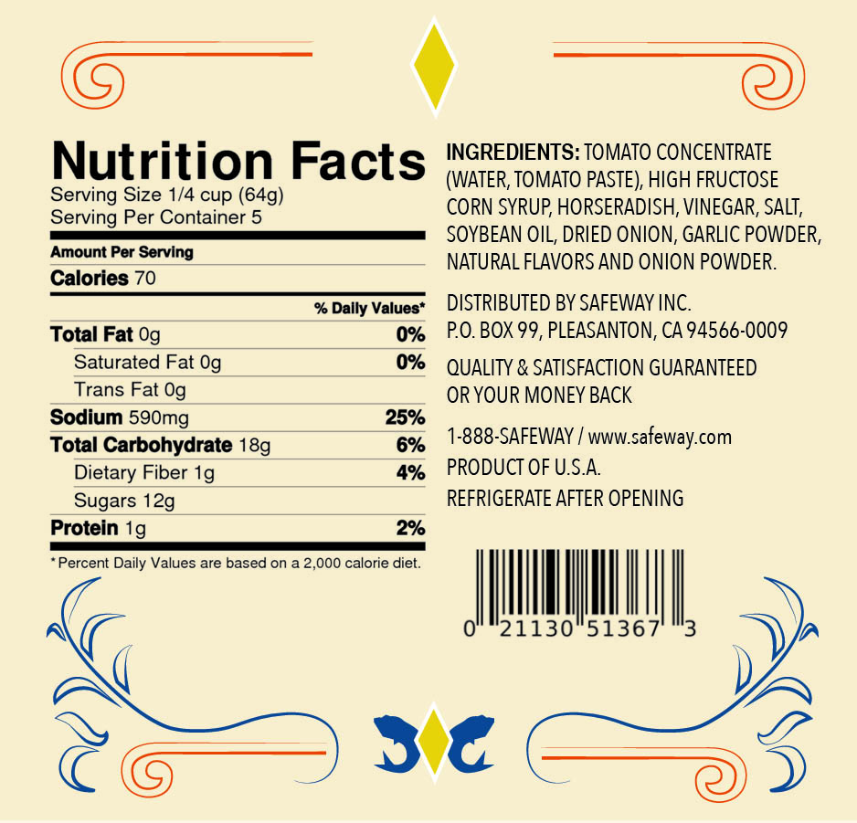
And the finished product:

Label-front & back Label-front & back2


Label-Neck-and-Lid


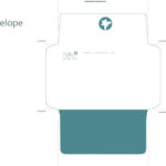
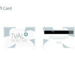
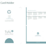
Tval Skincare Rebrand

Our project for the quarter for our typography class was to perform a rebrand for a real company.  We had our choice of four different companies.  I chose Tval Skincare, an online skincare distributor based out of St. John’s, Newfoundland, Canada.

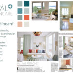
When I thought about St. John’s, Newfoundland, I thought of weather.  When the project was assigned, at the beginning of January, St. John’s had just been on the news for having “the storm of the century” — businesses and schools had been closed due to subzero temperatures and snow.  I was walking through the park on my way to my car after class, my umbrella buckling against the wind, battling a little Seattle version of an ice storm.  That got me thinking about protection from the elements.  After all, that’s what any skincare product’s primary function is: to protect you from the sun, UV rays, the wind, and the cold.  Then I thought — wait a second.  The owners and operators of the company, a husband and wife, both have PhDs in biology.  Then I thought of the periodic table of elements, and decided that my concept would be “Elements” as in, protection from the elements, as well as the periodic table, and the science behind the manufacturing their skincare products.

Logo

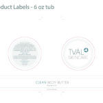
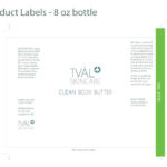
I made the custom typeface for the logo typeface and “Clean Body Butter” letters, and the “blossom” in the logo is a drawing I made of an atom, raised ‘to the power of’ the Tval Skincare name.  My mood board and concept incorporated the five elements: earth, water, metal, fire and wood.

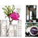
A special thank you to Sean Balko, product photographer extraordinaire, for doing an amazing job of my promo photo.  I am still completely blown away with his finished product, not to mention his outstanding professionalism.  Even though he was doing me a tremendous favor, he treated this project with professionalism and integrity.  Thank you so much, Sean.  I owe you a big one!

Here are my slides from my final presentation.


Markie Poppins!

Our final project for this quarter of New Media!  Dustin and I had so much fun making it!  Obviously a special thank you goes out to Marc Salverda, who was beyond accommodating in playing the role of Markie Poppins (we realized later that we would have to misspell his name for the title, otherwise it would look like Marcy).  In fact, I think Marc may have been having a little bit of fun, but don’t tell anyone 🙂

[youtube http://www.youtube.com/watch?v=WbsZIJa5cmU&w=560&h=315]


Things I Learned About Cat Massage

What was the most fun was showing it and making everyone laugh.  That was a very fun morning, because most groups came up with really funny concepts!  Everyone was laughing so hard our faces were hurting.  It was so cool to see what everyone came up with!!  My favorite was the cat massage lady!  I watch it whenever I’m feeling crappy and it makes me laugh every time.  So here ya go.  I hope you enjoy it as much as I do!

[vimeo http://www.vimeo.com/61667181 w=500&h=281]


Glyph Moth

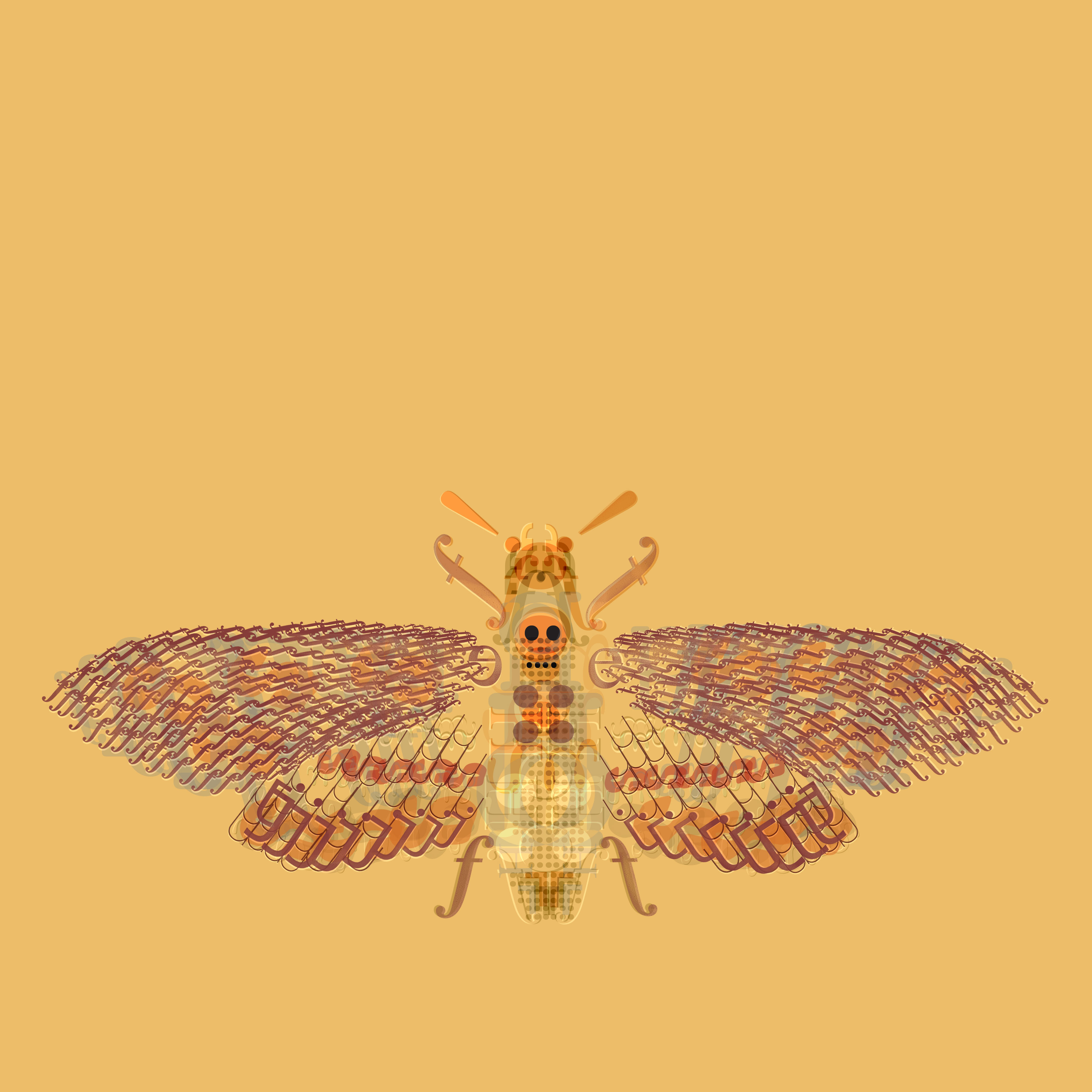
Last week our homework assignment was to construct something that occurs in nature out of 10 letters and glyphs that were provided by the teacher.  We were not to use anything other than the symbols provided, and were to use only blending modes in Photoshop to create a neat effect.  I totally shocked myself with how much I loved this — it reminded me a lot of my drawing process.  I had a lot of fun with this.  I had wanted to try and do something like Adam Gale does with the insects (I posted about him on here a few weeks ago), and now I want to try some more.  This was my first try and blending modes and I am really proud of the results.

Glyph Moth


House Project

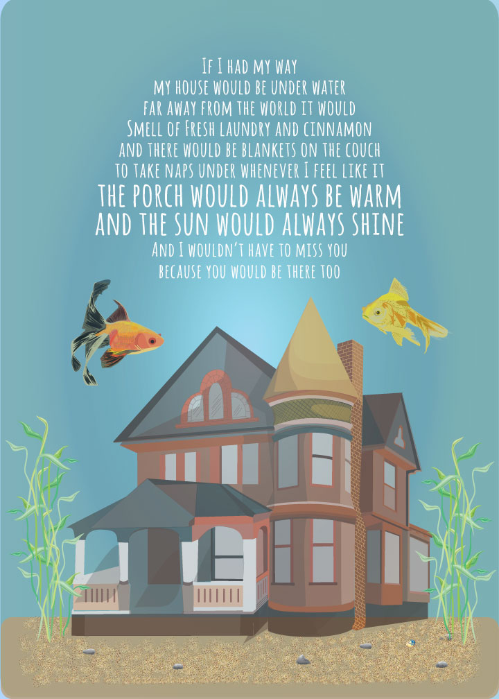
As one of our final color theory assignments we were tasked with creating a poster in Illustrator that depicted a house or any kind of dwelling of our choice.

Here’s mine!

House Project

This poster illustrates several color relationships.  The tetradic (double complementary) set of yellow, orange, blue and violet.  I used analogous relationships for the fish: yellow, yellow-orange and orange.  For the house, I used various tints and shades of the primary colors red, blue and yellow.

I used a muted color scheme and lots of shades and opacities to show highlights and shadows.  I used a radial gradient in the background to indicate the light source.

I worked on the words quite a bit.  I wanted to put something poetic on there, but couldn’t really come up with what I was looking for, so I opted for something still poetic but more childlike.  I feel like the typeface expresses the mood of the words well.